ASO — 25 Sep 2020
Evidence-Based Tips on Designing App Store Screenshots
 Lina Danilchik
Every day mobile publishers are playing the lottery. Not literally, of course. After all, even if users are not looking for a specific brand, mobile game or app in the App Store or Google Play, they already know what they need, that is, their search is intent-driven. But they still have to choose among a huge variety of apps like yours, and whether they hit the coveted get button or not – will depend largely on what they’ll see on your app store product page.
So it’s kind of a lottery you could win by doing everything in your power to develop visuals for your app store listing that will catch user attention in a split second.
In this article, you will learn how to develop screenshots with text captions, calls to action and mobile game characters, along with hypotheses for app store A/B tests, based on neuroscience and in particular psychology. This will help you optimize your app store conversion rate and consequently – generate more revenue.
This is the third article in a series covering evidence-based insights and recommendations for developing and optimizing app store visuals. In case you missed them previously, you may also read the first and the second one.
Let’s see how and where to place text captions on your app store listing screenshots to induce users to download your mobile game or app.
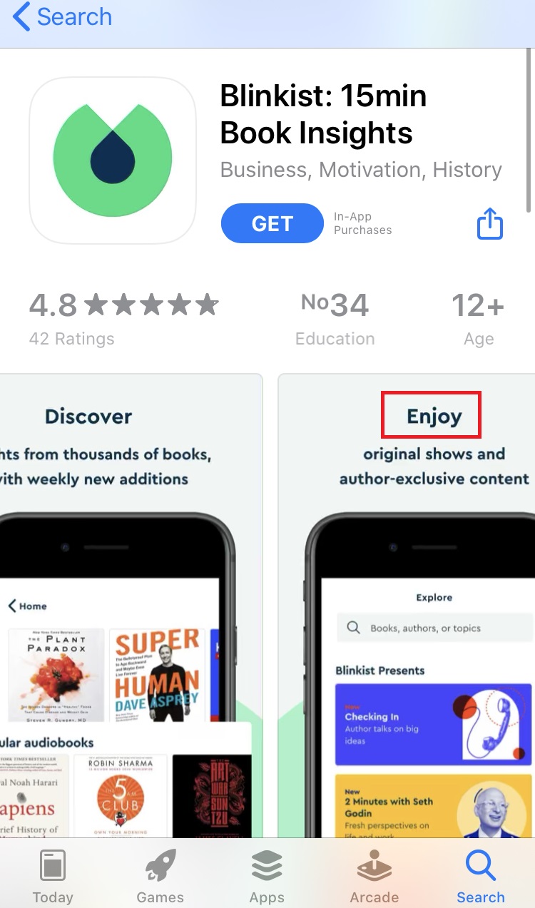
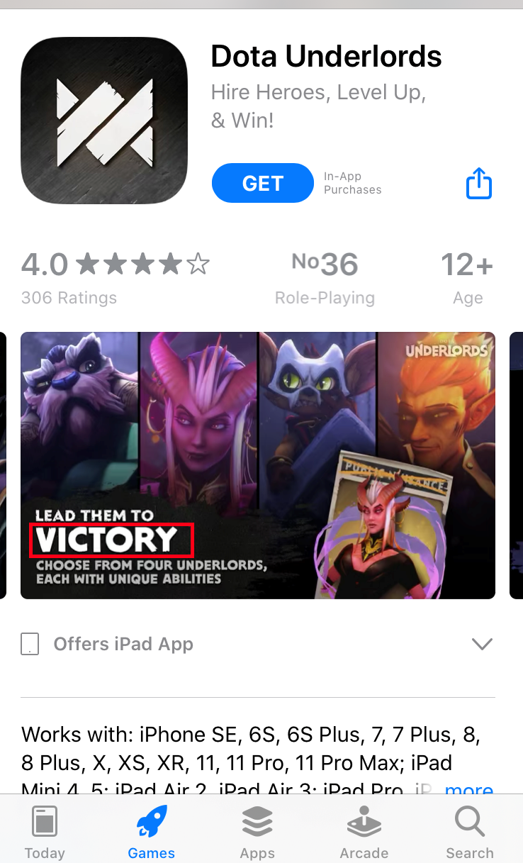
In the first article of this series I shared evidence-based tips that included using contrasting colors for icons and screenshots in the app stores. The same works for text captions you put on screenshots, describing the most interesting features or inducing users to download your mobile game or app.
Contrasting colors for text captions on screenshots, and especially for calls to action, increase processing fluency – the ease with which the human brain processes information. High processing fluency will bring users the sense of liking and they will be more likely to click the get button on your app page.
And some more examples where individual words are highlighted with a contrasting color:
If you use colors for your captions and calls to action that are similar to your screenshots background color, they will be really hard to notice.
According to the research by Jelena Ristic and Alan Kingstone, arrows grab user attention. Just take a look at these screenshots, and your gaze will perforce fall upon arrows:
So you might want to add an arrow to one of your screenshots and point it toward a call to action or caption.
Besides arrows, you may use other figures that will focus user attention on the message.
Tip: before adding arrows to your app store screenshots, check this hypothesis with the help of SplitMetrics – app store A/B testing platform.
Although these recommendations are evidence-based, you should be one hundred percent sure that any change you make will improve the conversion rate and not vice versa. So rely on science-based tips, but also rely on data you get from your own experiments that confirm these hypotheses.
The importance of optimizing your app store creatives for Halloween, Christmas and other holidays & seasonal events is beyond question.
In order to not miss out on holiday season opportunities, make your app or game festive, add features adjusting it to a specific holiday or event. But there is also a very important component:
Add calls to action to your screenshots urging users to download your app and get holiday related features within a limited time period.
This advice is based on the research on loss aversion and its findings by Amos Tversky and Daniel Kahneman.
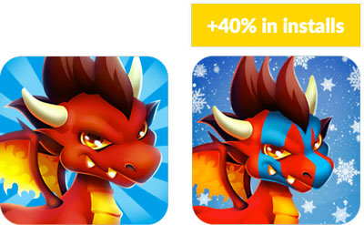
If by adjusting your app store visual assets you’re able to get such an uplift in conversion, just imagine which results you will get with calls to action enriched with a sense of urgency.
For text captions on app store screenshots aimed at capturing user attention, size is what really matters. Research by Andrea de Cesarei and Maurizio Codispoti shows that images people see elicit emotions depending on their size: the bigger the image, the more and the stronger emotions it sparks.
There are also other studies proving this evidence. Exploit these findings by increasing and/or highlighting those keywords in your screenshot captions that cause more emotions and are more likely to motivate users to hit the get button.
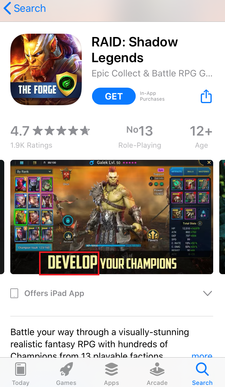
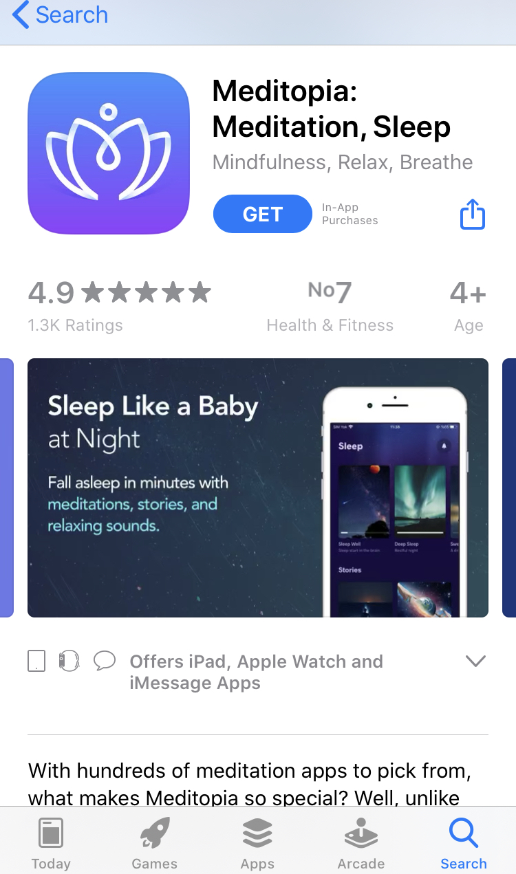
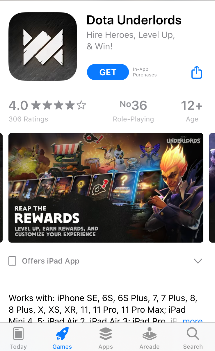
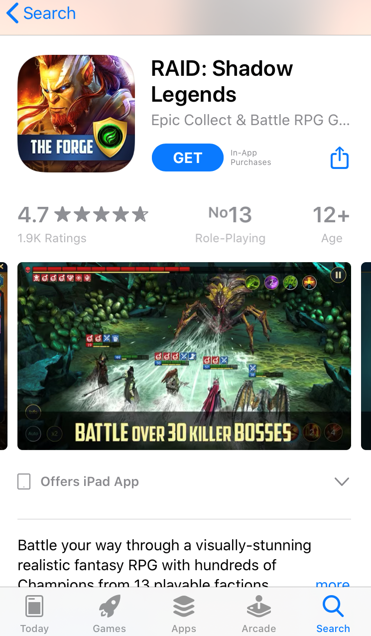
According to the research dedicated to fonts, thin typefaces are associated with beauty and lightness, while bold types are most often related to something strong, masculine and even aggressive.
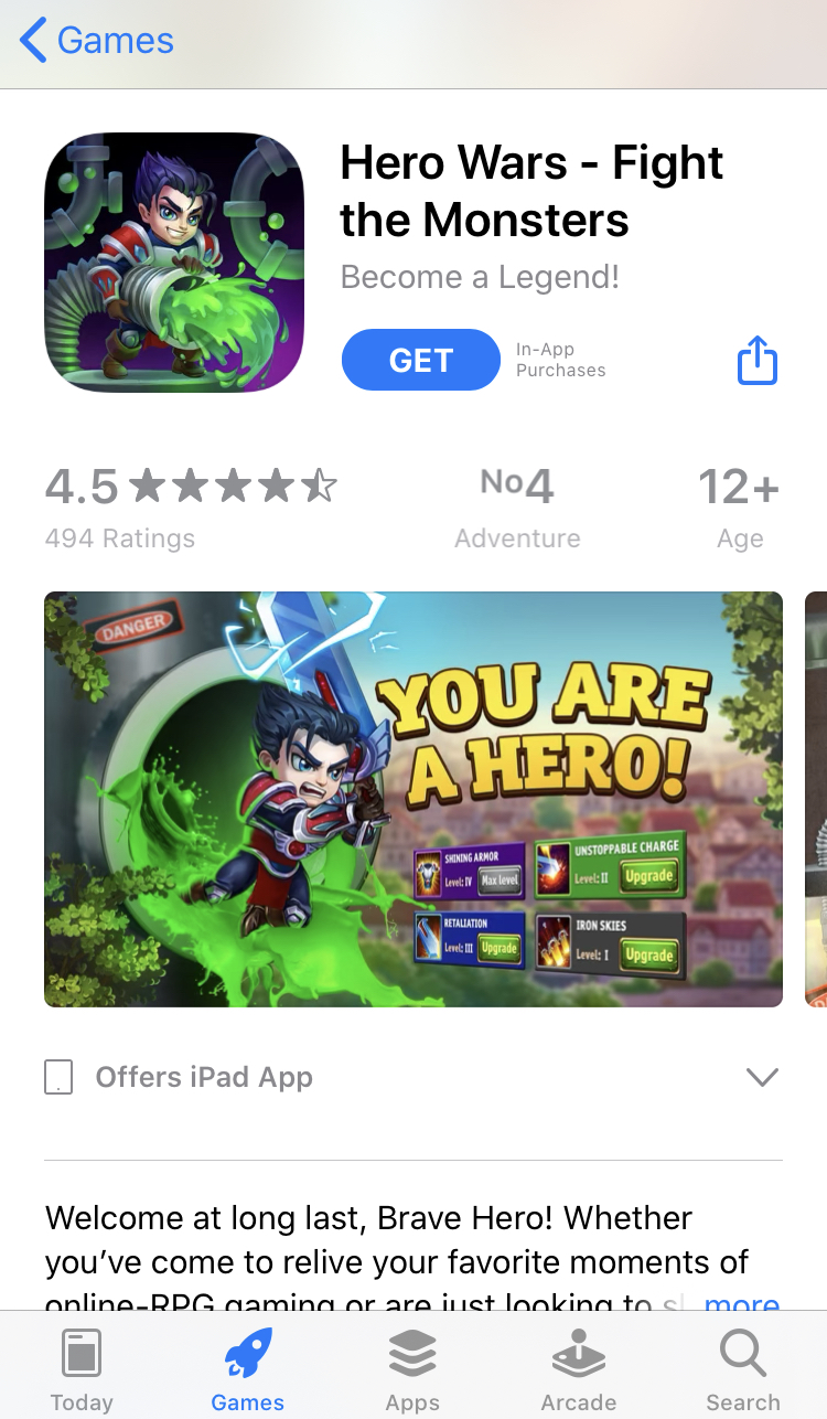
That is why to optimize your app store conversion rate, use thin and “beautiful” fonts if you want your app to be identified with ease, beauty, health – for example, for your meditation app or mobile game for girls. And likewise, use heavy, bold types for battle-related, RPG games.
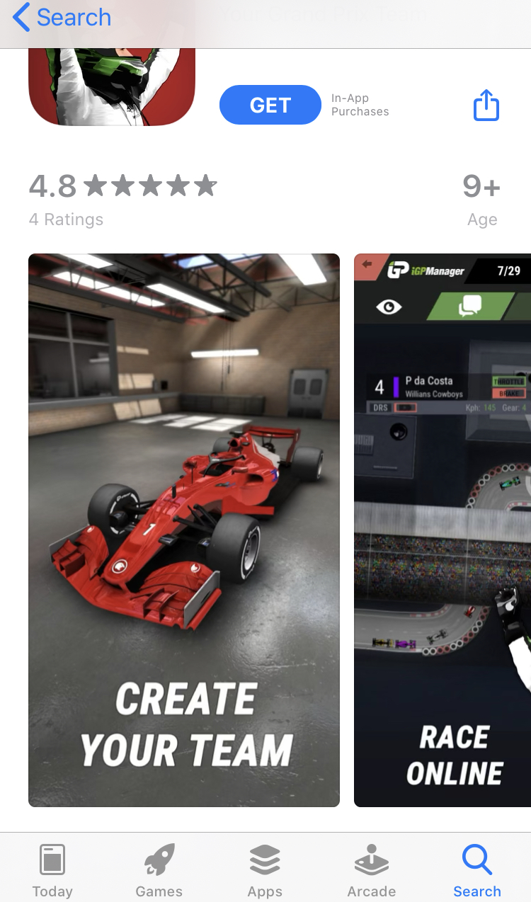
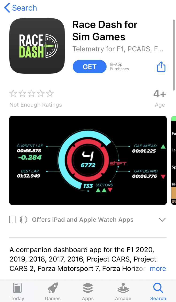
Peter Walker in his work on depicting visual motion reveals that items leaning forward depict movement, while greater leaning conveys greater speed.
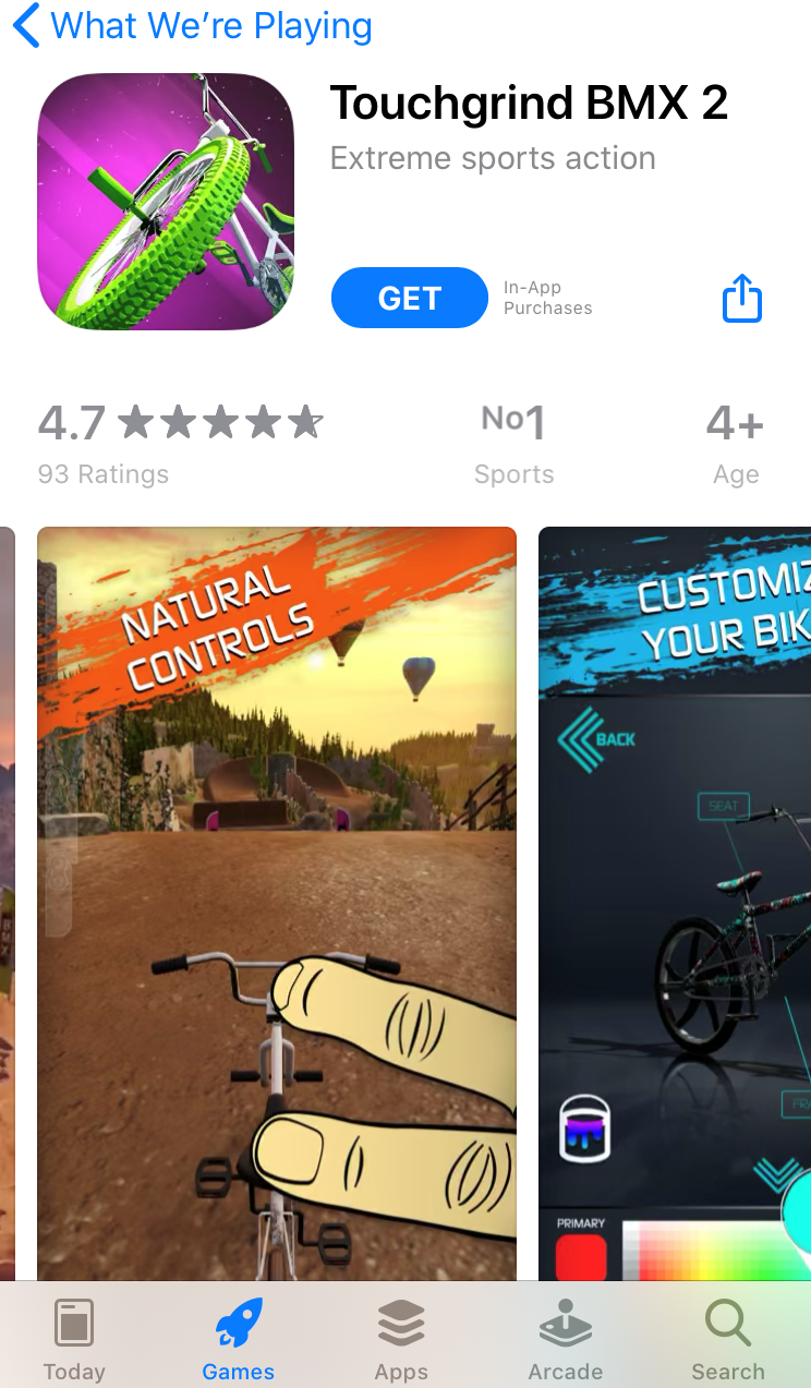
How can you apply this insight? Сhoose tilted or italic fonts for texts and calls to action on your racing game screenshots. Some of your competitors are already taking advantage of this hack:
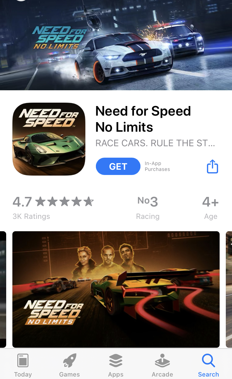
This tactic might also work for other apps where calls to action and caption demonstrate quickness of doing or achieving something.
The left brain hemisphere processes information you see on the right and vice versa, the right side of the brain processes information you see on the left.
According to the research by Jerzy Grobelny and Rafal Michalski, the right side of the brain is better suited to process graphic information, while the left hemisphere is more logical and verbal. So placing images on the left and text on the right increases processing fluency.
That’s why if you opt for landscape screenshots, place images and characters on the left side of your screenshots, and text, including calls to action, – on the right.
Experiments show that the corresponding visual depiction of a product encourages users to make a purchase.
So in order to induce users to download your app, develop screenshots that would make them mentally interact with your game or app.
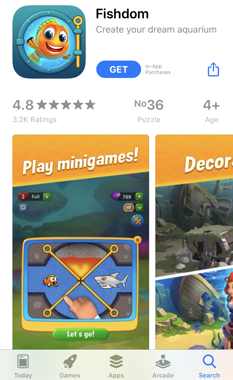
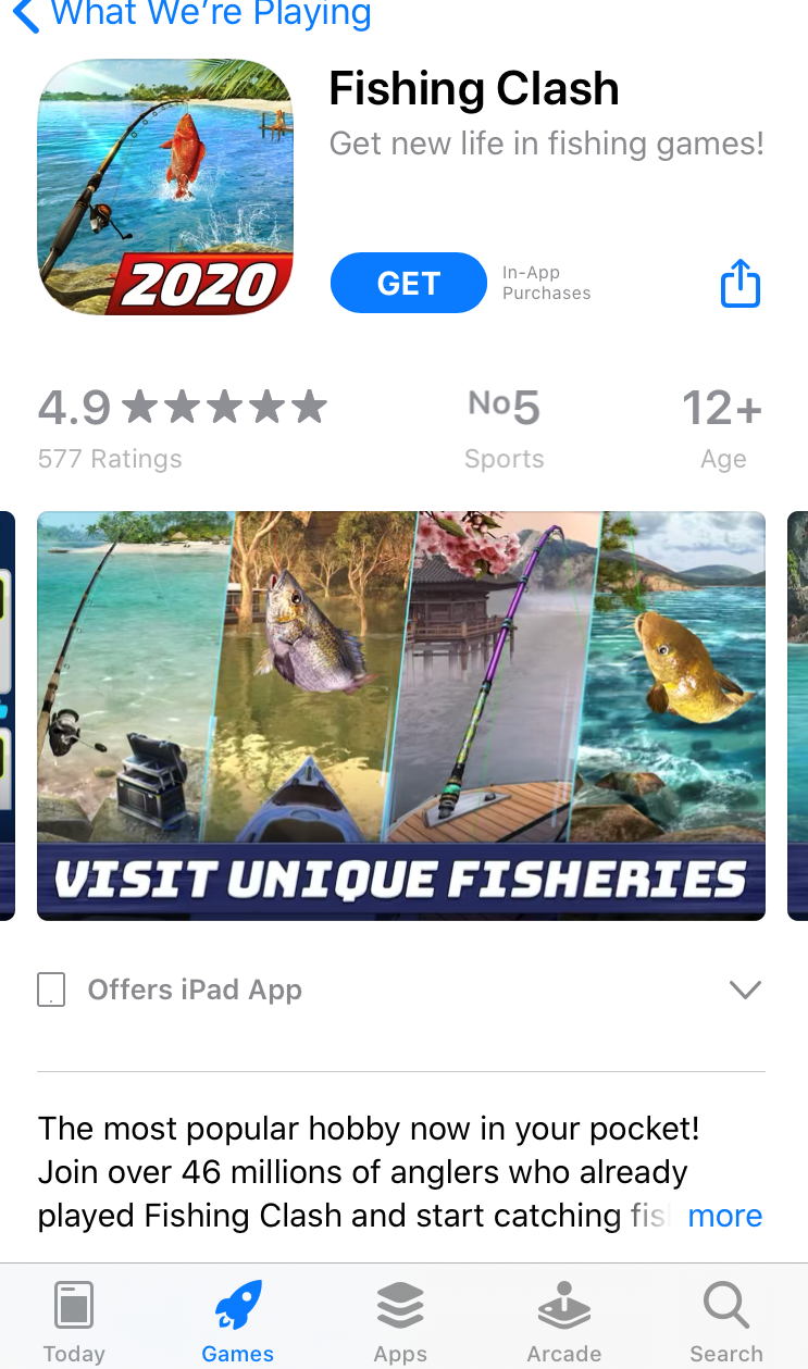
For example, if you have a fishing game, add a hand with a fishing rod to your screenshots or even icon, so that users could associate themselves with your game.
All these evidence-based tips and recommendations for developing app store screenshots are aimed to help you in conversion rate optimization. However, remember to reinforce these hacks with even more data: before changing anything in your store listing, run A/B testing experiments to prove these hypotheses.