As any publisher, ZiMAD wants to equip their store product pages with the most converting app screenshots, icons, and other elements. However, the optimization process may become quite confusing. It’s really hard to guess which ideas for app screenshots are worth uploading to the store at times.
ZiMAD felt that the page of their match 3 puzzle shooter game Bubble Birds 4 could do much better. So they decided to opt for SplitMetrics to check if a personal approach to app screenshots design influences the conversion rates of their game page.
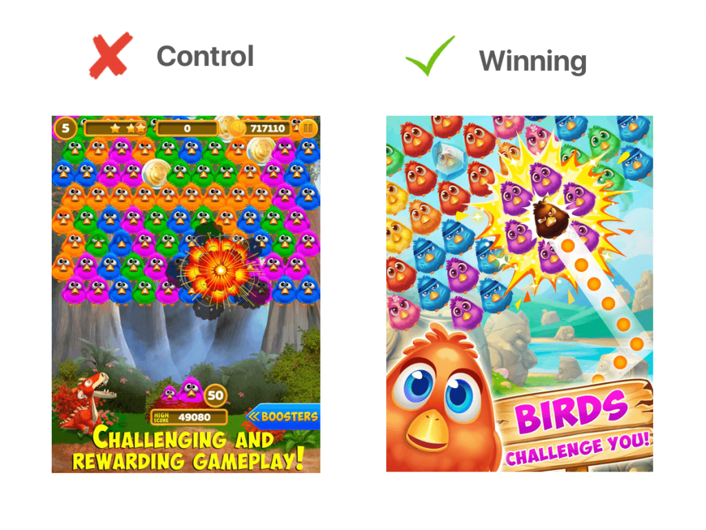
The teams of ZIMAD and SplitMetrics applied the following changes to the original app screenshots of Bubble Birds 4 product pages:
This way, a bird acts as a storyteller that speaks to users and represents what to expect from the game. Additionally, the character becomes the main element of the app screenshot which helps in catching user attention and raising interest.

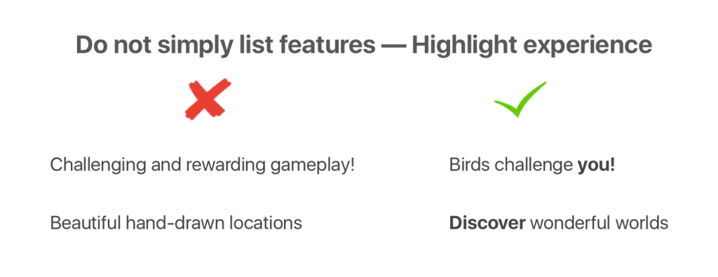
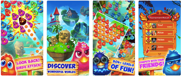
New app screenshots with shorter action-packed captions highlight game experience instead of just showing the list of features:

Plain app screenshots were replaced with a healthy mix of art overlays, real screenshots, and gameplay elements. Normally, such changes give your app screenshots a composition with a key focal point that first catches attention and then leads the eye of a viewer to wander around the whole visual.

The results of this test showed that 32% more users clicked the install button. It means that ZIMAD got way more installs uploading new app screenshots to the store.
However, increased conversion is not the only thing publishers gets thanks to successful A/B experiments:
1. You start cutting down your cost of user acquisition.
It’s not that evident but once you’ve improved product page conversion with app screenshots or any other element, you start paying less for each of the next users. It’s easy to calculate.
Let’s assume you have a 20% conversion rate for your page, spend $15K per month on traffic and it costs you 1$ to drive a user to your app page. In case if you managed to increase your conversion rate to 25%, you start saving $3000 per month or $36000 per year. Impressive, isn’t it?!
2. More qualified users.
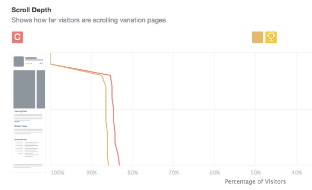
Thanks for getting SplitMetrics in-depth statistics, we were able to see that the first app screenshots are the turning point for users’ further scroll on your page.
So, if you manage to make your first screens more engaging, more users will study the rest of your app screenshots increasing the number of informed users liable for installing your app.

It’s important to realize that creating a good test often means not only changing a single element of your app screenshots but applying combined changes that follow the tested idea:
