Darby Smart: Updated Easy to Understand Mobile App Icon Brings 10% Conversion

Scaled By
10%
Publisher
Darby Smart
Category
Lifestyle
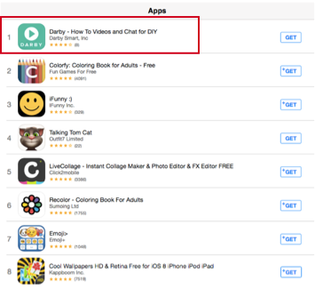
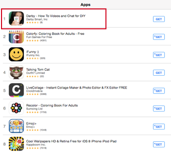
Darby Smart used A/B testing to optimize the mobile app icon of their ‘How To Videos’ app. In the course of the first experiment, it turned out that their original icon was misleading. In the end, the publisher managed to come up with the new performant icon that helped to reach 10% conversion.
Darby Smart is one of the market-leading video platforms. It unites more than 7,500 creators of ‘how to’ videos turning their hobbies into side hustles. The videos within Darby Smart cover such fields as beauty, recipes, and DIY and reach over 60 million viewers per month.
Share this case

Problem

Although mobile app icon might be physically small, optimization of this product page element normally has a positive effect on each step of a user’s journey in the App Store. In fact, a mobile app icon is the only graphic asset that’s shown on the category page.

While 65% of App Store downloads come directly from searches (this is why  app store SEO is very important), one of the best ways to find out how well your mobile app icon stands out from the crowd is by testing your variations on the category page.

Furthermore, experimenting with category pages is a great idea as these are the only pages where you can minimize the impact of other factors on your conversion rates (e.g. the impact of screenshots when testing mobile app icons in the search results).

That’s what the developers from Darby did with their ‘How To Videos’ app. Their original mobile app icon felt a bit off and slightly misleading so they decided to test it against competitors in the lifestyle category.

Solution

The main objective of the experiment was to test two competing approaches to mobile app icons design:

  1. relying on trends and popular styles;
  2. creating an easy to understand icon.

The Darby Smart team did a great job reviewing mobile app icons of the top performing apps across their categories. They found a wide variety of styles and started with creating a series of mobile app icons in wildly different directions inspired by different top-performing apps.

Each version of a mobile app icon was designed with a different idea in mind:
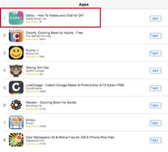
  • Would a simpler, sleeker mobile app icon seem more legitimate?
  • A/B testing simpler app icon
  • Would a more branded mobile app icon with a prominent name be easier to identify in a list?
  • A/B testing branded mobile app icon
  • Would a photograph make a mobile app icon stand out from the crowd?

experimenting with icon with photo

Result

As it turned out simple things always work better, no matter what you do. People are afraid of something they don’t understand and, therefore, don’t install such apps.

A mobile app icon has to reflect the main idea of what to expect from the app.

In terms of conversion, the winning mobile app icon managed to achieve 73,7% more clicks on “Get” button and the same amount of clicks as the closest competitor. Alternative variations were likely confused for Photo & Video apps.
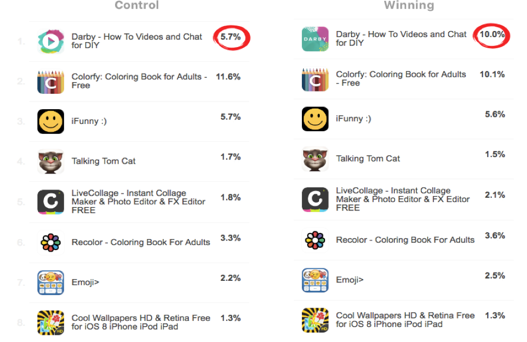
results of icon tests with SplitMetrics

However, increased conversion is not the only thing developers received. Due to the fact that there were mobile app icon designs that had very little impact, a clear losing design, and a clear winning design, developers managed to find exactly what’s working for their app and what’s not.
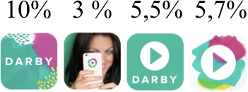
Performance of mobile app icons

Mobile App Icon Takeaways of Darby Smart

  1. A mobile app icon should not only grasp users attention but also convey the concept of the app accurately.
  2. The most difficult part of testing mobile app icons is generating variations for testing. To start with, you can simply review some of the top performing apps across your categories and you will see a wide variety of the styles of designs you could try in the design of your mobile app icon.
  3. When testing mobile app icons, make use of category testing. Doing this helps you find out how good your app performs against your competitors.
Want to achieve similar results?
Schedule a demo call with one of our optimization experts
Book a Demo
Share this case
Take your app performance to a whole new level
Empower your app conversion rates on the App Store and Google Play perfecting product page assets
Book a Demo