
Although mobile app icon might be physically small, optimization of this product page element normally has a positive effect on each step of a user’s journey in the App Store. In fact, a mobile app icon is the only graphic asset that’s shown on the category page.
While 65% of App Store downloads come directly from searches (this is why app store SEO is very important), one of the best ways to find out how well your mobile app icon stands out from the crowd is by testing your variations on the category page.
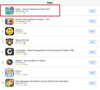
That’s what the developers from Darby did with their ‘How To Videos’ app. Their original mobile app icon felt a bit off and slightly misleading so they decided to test it against competitors in the lifestyle category.
The main objective of the experiment was to test two competing approaches to mobile app icons design:
The Darby Smart team did a great job reviewing mobile app icons of the top performing apps across their categories. They found a wide variety of styles and started with creating a series of mobile app icons in wildly different directions inspired by different top-performing apps.
Each version of a mobile app icon was designed with a different idea in mind:
As it turned out simple things always work better, no matter what you do. People are afraid of something they don’t understand and, therefore, don’t install such apps.
In terms of conversion, the winning mobile app icon managed to achieve 73,7% more clicks on “Get” button and the same amount of clicks as the closest competitor. Alternative variations were likely confused for Photo & Video apps.
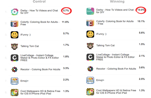
However, increased conversion is not the only thing developers received. Due to the fact that there were mobile app icon designs that had very little impact, a clear losing design, and a clear winning design, developers managed to find exactly what’s working for their app and what’s not.