Empire City Casino: How to Achieve 31% Conversion Lift with Simple Edits of Screenshot Template

Scaled By
31%
Publisher
Empire City Casino
Category
Games
Empire City Casino managed to boost conversion by 31% merely playing around their screenshot template. A/B testing minor changes with SplitMetrics helped the publisher to identify the best possible background for their screenshot template.
Empire City Casino is one of the largest entertainment and gaming destinations in North America. They extended their business online with the emergence of the application Empire City Casino Slots in major app stores.
Share this case

Problem

When mobile publishers get down to the optimization of their screenshot template, it might be hard to know where to start. The truth is, it makes sense to begin with experimenting with such screenshot template aspects as background, orientation, caption position, etc.

It’s important to understand that every detail matters when it comes to nailing perfect screenshot template.

Let’s say, background color. The test ran by Empire City Casino is a perfect example of how minor changes can result in major effects.

Solution

For their first test, developers at Empire City Casino decided to check what background of screenshot template works better:

  • an eye-catching one
  • calmer gradient

It’s no surprise that concentrating users attention on the app itself rather than on the background of screenshot template leads to more installs. But what is surprising is that attention and conversion boost can be achieved through a simple yet thoughtful change in the design of background image.

Empire City Casino tested two screenshot template variations:
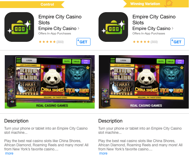
Slots app tests screenshots with SplitMetrics

Result

As a result, screenshot template with gradient image generated 31% more installs than its alternative. Great result, isn’t it? And here is what led to such good outcome:

  1. Empire City Casino tested only one change at a time. The mobile developer had a clear idea of what kind of screenshot template they wanted to test.The hypothesis was whether a neutral background, that is not eye-catching would convert more users or not.
  2. The team prepared screenshot template alternatives very carefully. The alternatives were not just different in one element, such as the text color or additional objects in the image. Combined changes were applied to follow the targeted hypothesis.
  3. Empire City Casino ran the test long enough, it was given a sufficient amount of time and number of users. This generated a very high confidence level of 98.6%, ensuring developers that they can rely on the results of this screenshot template test.

These are the simple principles that helped Empire City Casino to succeed in the first test with SplitMetrics.

We do recommend all publishers to follow these rules. Especially, it concerns companies that are new to A/B testing and set up their first test. Next steps can be optimize your creatives for seasonal trends, for example optimize your christmas app store icon.

This case proves once again that even small elements are definitely worth testing.  So, don’t wait for great updates of your product, change a minor thing, set up a test and wait for the major effects.

Want to achieve similar results?
Schedule a demo call with one of our optimization experts
Book a Demo
Share this case
Take your app performance to a whole new level
Empower your app conversion rates on the App Store and Google Play perfecting product page assets
Book a Demo