
Each year, more and more developers take note of the annual Halloween tradition. Some even dress up their app icons and screenshots in “Halloween costumes” to draw additional attention to their apps. MyTona was eager to сatch the moment of Halloween rush.
So, they decided to A/B test Halloweeny app icons to be on the safe side.
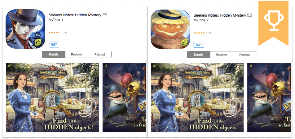
As we know, the main purpose of placing a character in the game app icons is to try and promote the sense of action which intensifies the user’s desire to start playing right now. Developers from MyTona in their test for their game Seekers Notes: Hidden Mystery decided to test which character serves this purpose the best.
In the course of the first experiment, two app icons were tested:
As it turned out, a pumpkin head won. In terms of conversion, the app icon with the pumpkin head did 9,3% better than the control version.
Analyzing this result Mytona decided that the main factor which helped to achieve this result was the replacement of the human-like character with an inanimate object.
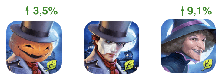
MyTona launched a follow-up test with 3 app icons. The third variation depicted a smiling witch which supported Halloween theme as well.
The pumpkin app icon trumped the serious man once again, but the breakdown was more humble this time, only 3.5%. The witch image beat the first two app icons, with a 9.1% conversion growth.
This proves that it’s always worth creating several versions of a single idea. If a human-like character competes with an inanimate one, consider designing a few versions of app icons representing each of them.
By following this strategy, you are more likely to find the right formula for performant app icons that entice users to download the app.
In the above-mentioned app icons case, all versions with ‘action mouth’ characters performed far better than the control icon depicting the man with his mouth closed. The fact that this app icons trick works still surprises many mobile marketers, but you can’t argue with numbers.
It’s also important to mention that details really matter when it comes to app icons design. Take a look at the angle that each face is looking back at you, the hats on their heads, and the clothes they’re wearing.
All these elements help influence the particular expressions on the faces and convey particular emotions to potential players via your app icons.


