A while ago I built a jigsaw puzzle app – Super Puzzle. Designed for small children, it had sweet cartoon graphics and simple, yet intuitive interface. To polish the game I acquired professional translations for my App Store listing, crafted an appropriate promo image and android app icon.
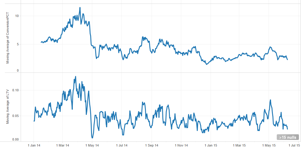
The game is free, and I did everything I could think of in terms of ASO. The conversion rate (the percentage of users who buy the IAP to unlock all the puzzles) was relatively high compared to some of my other applications. It is about 2.5% for the US in recent years, sometimes getting higher.
I’m quite aware of the importance of constant experimentation with product page and decided to try something new with my android app icon.
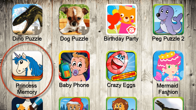
When I built a cross-promotion system in the form of the “More Games” page and did ASO competitive research, its statistics showed that my other game, “Princess Memory” was one of the best apps in terms of click rate. Even if it was displayed ‘below the fold’, it was one of the most popular applications out of more than 20 android app icons.
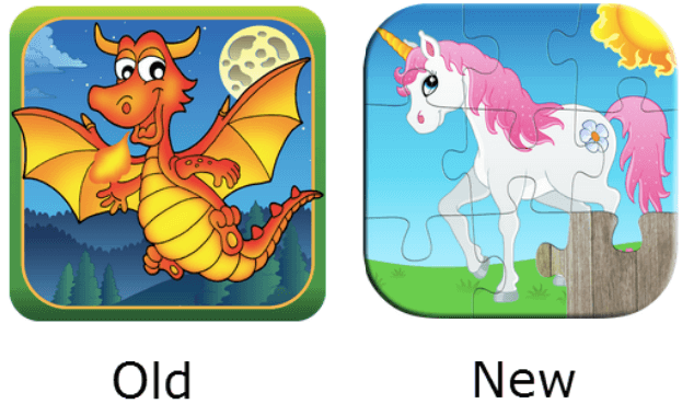
I changed my original android app icon to one with a unicorn. Surprisingly, my daily downloads, as well as daily revenue, doubled!
Honestly speaking, my old android app icon was not really a piece of art and was a little outdated but I could not expect such a huge difference. I guess that the unicorn one is:
I checked my demographic and found out that two-thirds of current users of the application are women. I don’t really know why it is like that but, I suppose, women might be more likely to download apps for their kids and give them their phone or tablet.
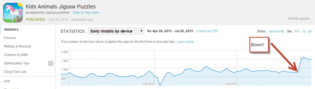
Thanks to the new Android app icon, I managed to increase download by 5%. Encouraged by these results, I plan to test out borderless icon variation and keep on testing different designs.
It is a great way to scientifically prove if you can drive downloads just by changing your android app icon.