ASO — 9 Feb 2016
10 Tips On Designing Screenshots That Convert
 Alexandra Lamachenka
Your app’s story starts with the first page…your app store page. One of the key things that make your story stand out in the overpopulated marketplace of apps is your screenshot design. After testing hundreds of screenshot sets for a variety of apps, we’ve observed that some design approaches tend to work better than others. This article will discuss common pitfalls and best practices in designing app store screenshots that convert.
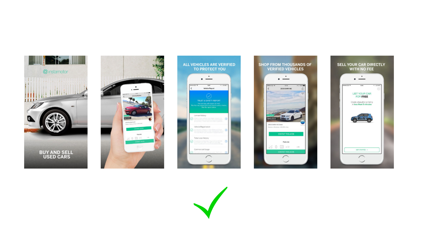
1. Put the most eye-catching screenshot first. Rule number one: your first screenshot is the most important one. Many publishers assume that users expect some kind of logical sequence or a screenshot “story”. They put screenshots to show user flow and outline steps. You only have a couple of seconds to get the attention of your page visitor. Put the most eye-catching screenshots first. Forget sequences, choose the brightest front-runner.
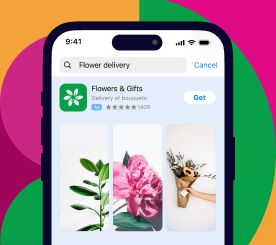
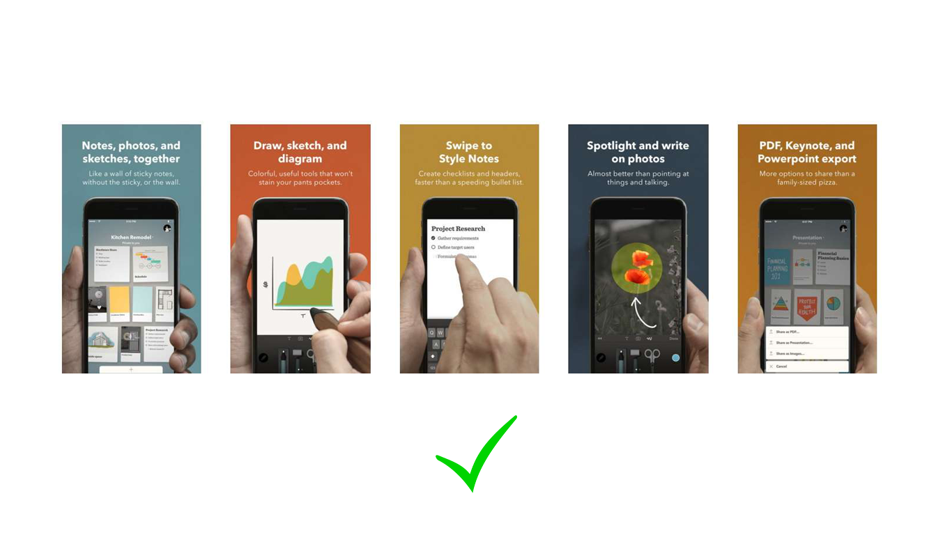
2. Experiment with screenshot frames on a single canvas. When app store visitors see only one piece of the “puzzle”, they are more likely to scroll further to see what’s missing. Use different frames on a larger picture canvas to explain the key app features. People will engage with the store page more, and you’ll get a couple additional seconds of their “scroll time” to show and tell more.
3. Keep your screenshot captions short. Brevity is the fundamental principle of good writing, and with screenshot captions, we’re taking this rule taken to the extreme. Let clarity, not eloquence, guide your writing. Pack some strong and confident action verbs and snappy nouns in your caption stories. Make the point quickly and shrewdly. 3 words or less.
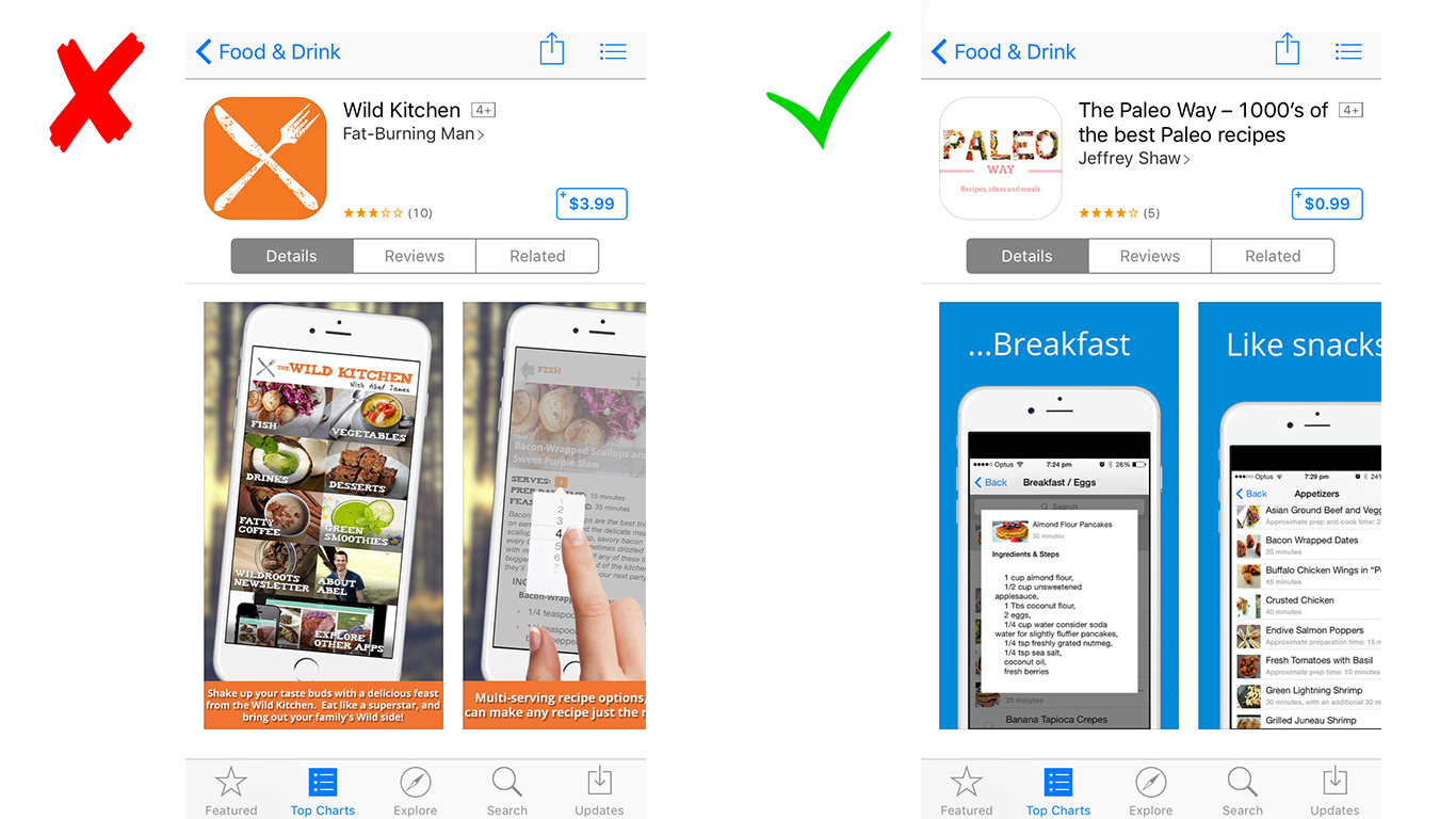
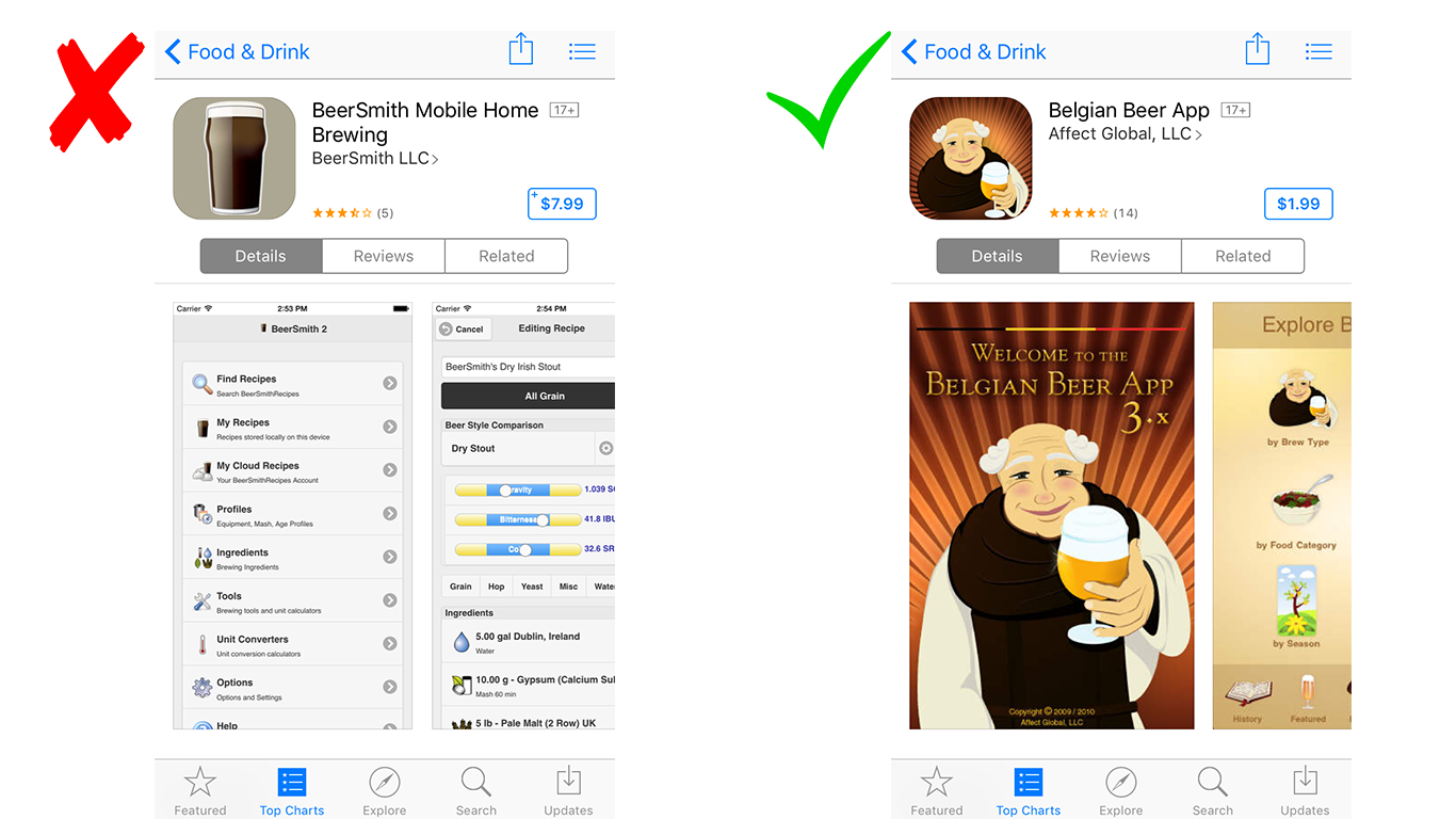
4. Contrast text and background color. Low-contrast design, driven by trendy “cool” minimalism, is straining our eyes and hurting user experience. Screenshots and captions with insufficient contrast can be hard for people to read. Maximize the contrast on your app page among graphics, captions, and background.
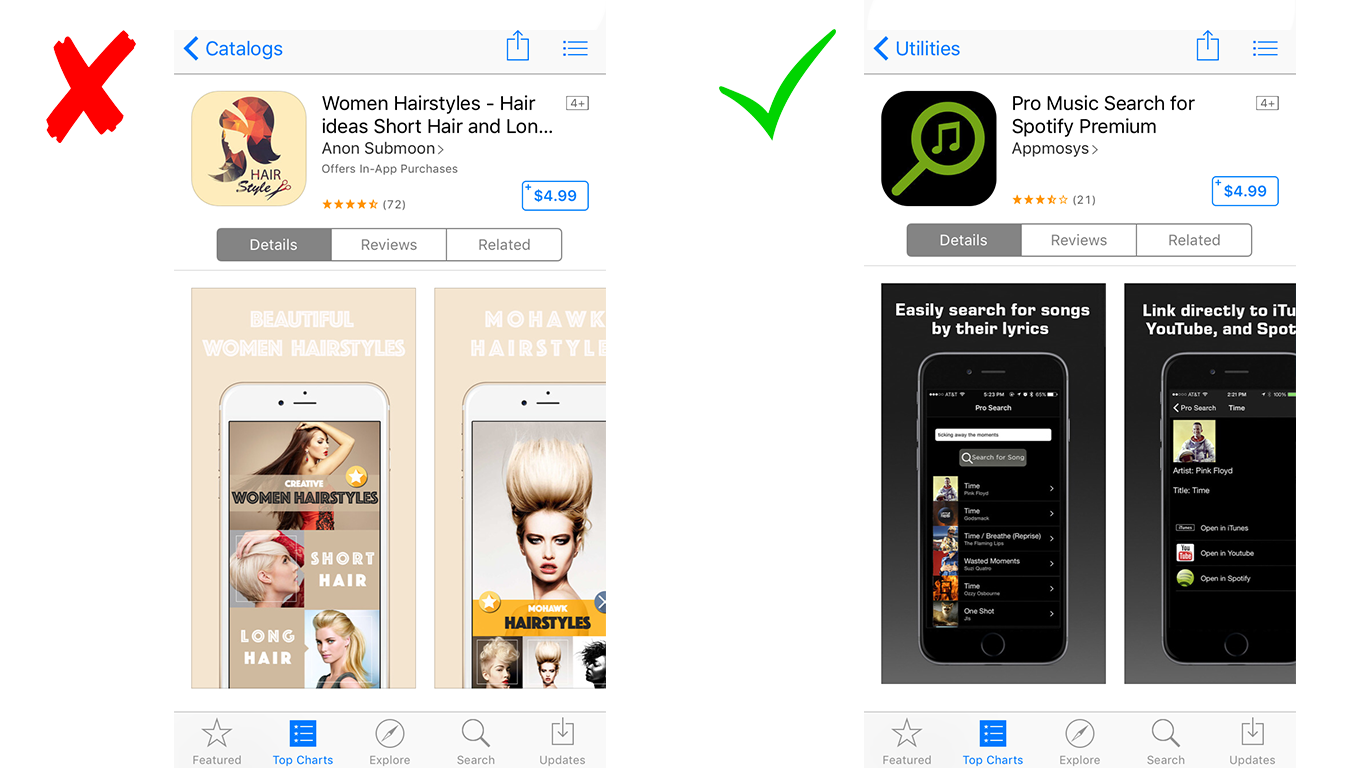
5. Use bigger fonts for your captions. Many people don’t open full screen images when they browse in the app store, so you want to have your text readable across all devices without having to zoom in on it. People don’t “read” screenshots, they scan and focus on specific words and graphics. So make it easy for them.
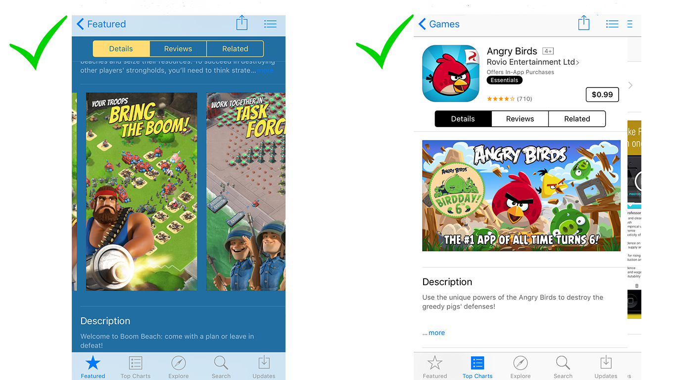
6. Use custom colors for each screenshot. Work with a color scheme that fits your app’s design or experiment with something radically different (while maintaining your product theme and style). Our test with Paper app (see screenshots below) showed that custom color for each screenshot drives better visitor engagement on the app store page (and ultimately improves app conversion).
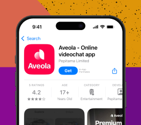
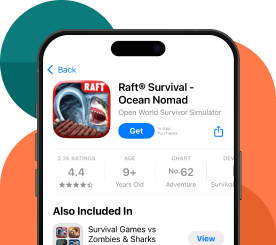
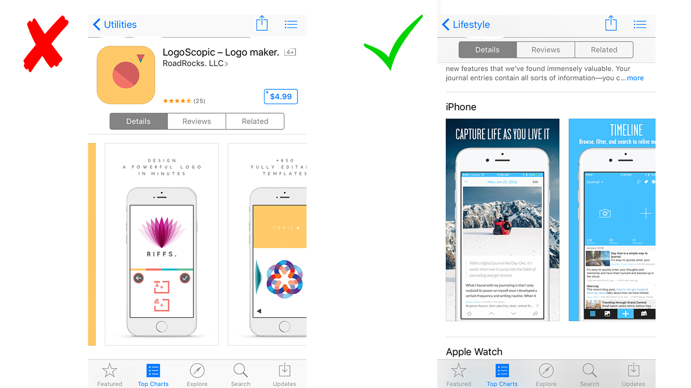
7. Choose one main subject of a screenshot. This one element should grab the attention and be the focal point of the picture. Let the visitor’s eye wander around, but always have it land to “rest” on this one important thing or person. For games, it’s usually the main character.
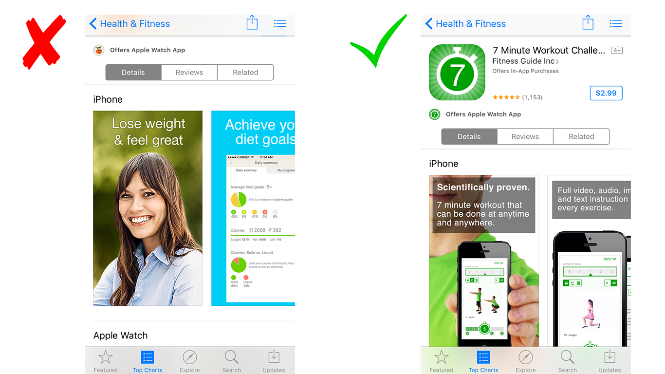
8. Show unique selling proposition. No matter what problem you’re trying to solve with a new app, there’s probably one or, likely, dozens and more apps that are doing the same thing. With over 2 million apps on the store, a first-timer is a rare find. Usually, you’ll find multiple variations of the same idea, so you want to be clear and direct at what is it that you do better. If it’s a health and fitness app, for example, you may want to highlight that your USP is bodyweight exercises (like Freeletics app) or that your workouts are just 7 minutes, as shown in the example below.
9. Zoom in on the key elements of a screenshot. Most visitors won’t open full screen and zoom in on a specific screenshot part to figure out important product features. Simplify their flow and magnify what you want them to pay close attention to.
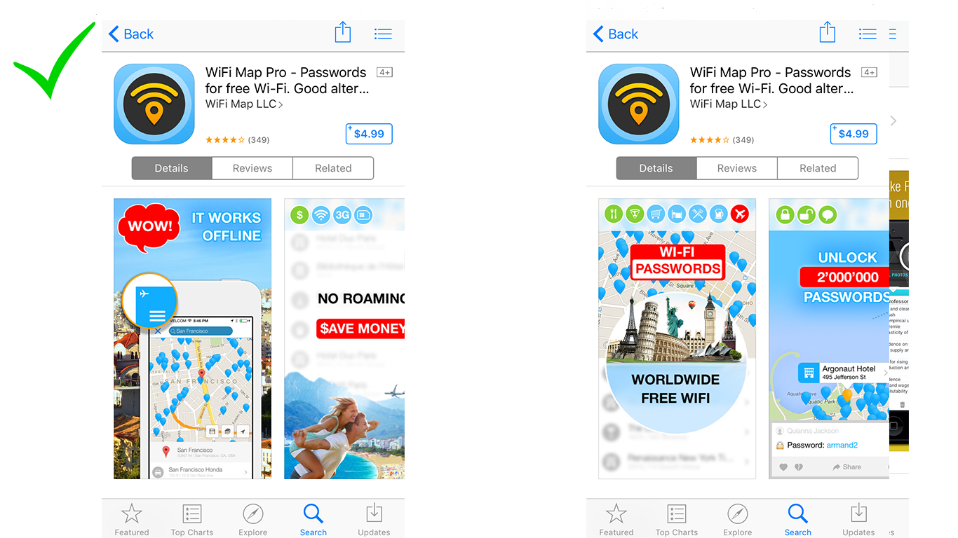
10. Experiment with badges and expressive interjections. Play up your screenshots by adding some short exclamatory text (e.g., Aha, lol, aw, etc.). The “Wow” badge on WiFi Map Pro in one of our tests increased engagement and conversion of the app store page.
Your app store screenshots may be the single most important factor in turning app store visitors into users. So make them pretty! Or better yet, make them irresistibly converting. Try some of these best practices in app store page design and let us know how it goes. Play and experiment with your app store visual creatives to see what’s working – trial and error is the way to go. What are your favorite screenshot designs? Share in comments.