SplitMetrics Lets You See How Your Apps Perform in New App Store Design
 Alexandra Lamachenka
  Alexandra Lamachenka
 With the news that Apple’s redesigned the App Store, we have started receiving questions about A/B experiments in a new design in SplitMetrics.
We can clearly see that app development companies are concerned about how the App Store redesign will influence their rankings and conversions.
There’s no wonder as the redesign not only impacts a number of characters in the title but switches the whole focus from the developers’ vision to the product side. For instance, each in-app purchase can be presented in a form of a card with a title, icon, description and a price. Will this feature influence conversions? Heck yes, it will!
Another example is three spots for video app previews. If app previews were a nice-to-have element that could in some cases increase a conversion rate (having said that, we have opposite examples), we predict that they will turn into a powerful conversion optimization tool. Since app previews will start their journey with big and medium players who can actually afford to create videos, small companies will have to follow the trend to be able to compete effectively.
Sylvain Gauchet, a founder of Apptamin, claims that the redesign makes app reviews more relevant and worth testing. And not only video previews – subtitles and promotional text are on the testing list as well.
The understanding of how all these elements will ultimately affect your apps’ performance is crucial. That’s why in SplitMetrics we launch A/B experiments in the new App Store design.

These experiments let you see how potential users interact with video previews and in-app purchases. You can also evaluate a conversion rate of the new name format – a short title and subtitle.
Well, the truth is A/B testing itself is the most fun part of the app store optimization process and most app developers tend to overlook two steps that come before creating alternatives and running experiments. These steps are research and analysis and development of the hypothesis.
You need to understand why you are going to run a test with the new design and what your final goal is:
Once you have a clear goal, you continue with a hypothesis. For example, if your goal is to develop a winning combination of a title and subtitle, you can compare a subtitle with a CTA and one that describes an app.
That’s when you are ready for having lots of fun launching a test with mobile A/B testing software.
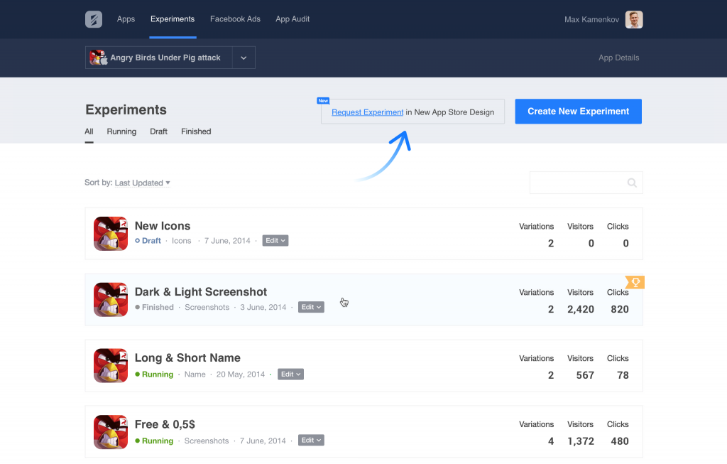
To launch an experiment, go to your SplitMetrics dashboard (sign up if you do not have an account yet) and open an “Experiments” tab. There you will see a “Request Experiment in New App Store Design” button. Click it to let us know you are interested.

On our side, we will open a feature for you and assist with launching a test – we want to make sure you get the maximum out of it.
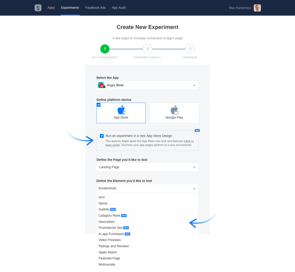
From this point, you are able to choose whether you want to set up an experiment for the new or old design. Just like in a regular experiment with SplitMetrics, you will be offered to choose an element you want to test: icon, title, subtitle, in-app purchases, etc.

Click “Next” when you finished. On the following steps, you can adjust an app landing page for a test by changing its elements.
On the last step, you will add variations. These could be subtitle alternatives, video sets, two types of promotional text – depending on an element you’ve decided to test.
The experiment is now ready and you can publish it. A testing link will be generated automatically so you can start sending traffic to your app A/B test right away.
