Why User Retention Metrics are Key and How to Improve Yours
 Alexandra Lamachenka
  Alexandra Lamachenka
 This is a guest post by Gabe Kwakyi, our friend who runs a blog at incipia.co.
The world of mobile apps is quite a lucrative one, filled with zero to riches stories (Flappy Bird) and multi-billion dollar acquisitions (King Digital). Yet making it to the top of the charts requires diligence in not only acquiring users, but also retaining them for the long-haul.
Unlike websites, users must decide to not only download an app, but also keep that app on their home screen and allow it to continue hogging their phone’s internal memory. When combined with the fact that the App and Play stores consider retention as one of their ranking algorithm factors, it’s clear that spending time improving your app’s user retention is of paramount importance.
In terms of how to optimize your app’s user retention, it’s important to know that retention is preceded by activation (see AARRR by Dave McClure). Activation is the stage after acquiring a user download, where the user launches your app and completes any required initial activities before fully accessing your app, or “enjoy[ing] their first ‘happy’ experience,” in Dave McClure’s words.
Figuring out how to better activate and retain users involves equal parts research (diagnosing data on the issues/opportunities) and optimization (making decisions based on those findings for incremental improvement). Start the research phase off by tracking how users interact with your key actions and workflows in order to create a picture of your app’s bottlenecks (where users close your app or abandon a key workflow) and strong points (what key actions or flows lead to the most desirable outcomes such as a purchase or the fewest undesirable outcomes such as churn). Determine what bottlenecks are the most pressing to fix or which strong points have the biggest opportunity to leverage and prioritize tweaking your app’s UX or UI accordingly.
As it relates to examples of optimizing for user retention, onboarding is the most common strategy for increasing activation and typically involves educating users on what they need to know or do in order to get to their first “happy experience.” There are two main types of onboarding:
Static onboarding involves making users swipe through a series of screens (3-5) with text and images. Static onboarding is easy to implement but also easy for users to skip.
Tooltip onboarding involves adding call-outs to actionable elements of an app’s UI and requiring users to interact with those elements to progress through the onboarding. Tooltip onboarding takes more effort to implement, but is less easily breezed through by users.
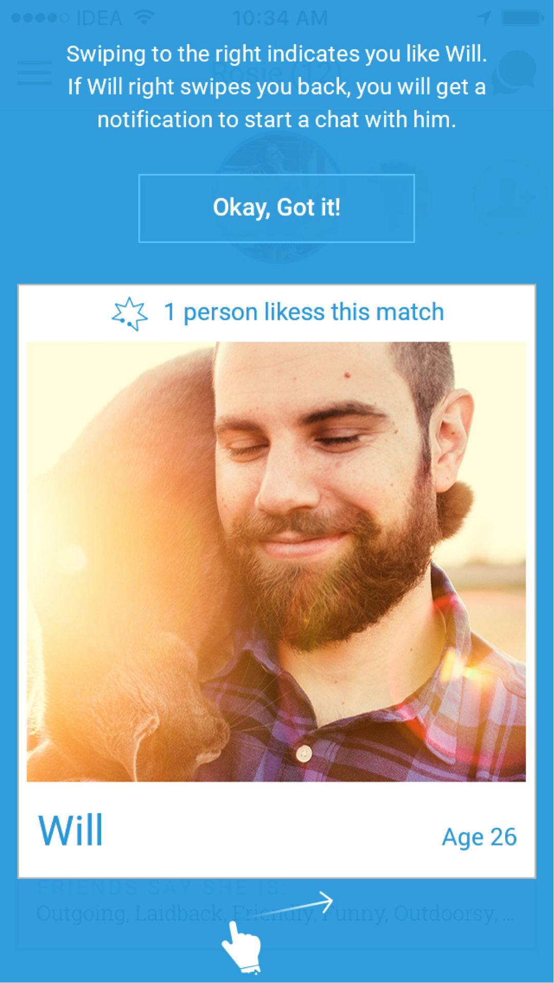
While these are the main methods of user onboarding, apps are innovating to find better ways to increase user participation in onboarding, such as SparkStarter – a dating app. Tony Kramer, CEO of SparkStarter explains:
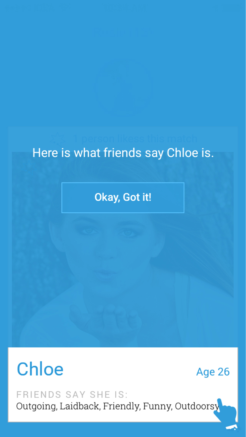
“We saw that too many people were just swiping through the tutorial without looking in order to get in and check out the app. So instead of trying to fight this behavior, our approach has changed to one-time notifications that periodically will appear to explain actions in the app. Some notifications happen before the action if it’s important for the user to understand. Some happen post action so the user understands what happens next. We’ve been testing and received great response so far. As one user put it, ‘it feels less like a tutorial instruction and more like tips on how to use the app more efficiently.’”


Here, SparkStarter shows a screen explaining the swipe-matching process, which appears after the user opens the matchmaking screen for the first time.
Here, SparkStarter shows a screen that highlights important details when the first friend endorsement card appears.
Other activation tactics include:
Once you have put some effort into ensuring that users are making it past the activation phase and have also gathered enough data on how users are actually interacting with your app, there are many ways to go about boosting the number of times users return to your app. One of the most effective methods is to create a roadmap detailing gradual improvements of your app’s user experience, such as adding features that users request, setting up integrations that make your app work with your users’ other services and fixing bugs.
Other popular retention strategies include:
Incipia is a mobile app development and marketing company based in Detroit, MI that helps companies manage the entire app lifecycle, from concept to launch and beyond. Visit incipia.co to learn more.
