Beginner’s Guide to Pre-Launch Mobile A/B Testing
 Gabriel Kuriata
 Pre-launch A/B testing for mobile apps is a method of validating an app idea and optimizing its potential performance before it’s released to the public, thereby increasing the probability of a successful launch and better performance.
Pre-launch A/B testing provides real data on what resonates with the target audience, helping developers make informed decisions about product features, marketing messages, and creative assets essential for app store optimization (ASO).
Typically, pre-launch A/B testing for mobile apps involves creating a simulated product page on the App Store or store listing on Google Play for a prospective app and driving traffic to it to see how a real audience reacts to various ideas introduced there.
How these tests are designed exactly, what metrics matter, depends significantly on the stage of app development.
In principle, pre-launch A/B testing follows the same framework as post-launch A/B testing for ASO, but there are enough unique aspects of it that a separate guide is needed to clarify it.
Pre-launch A/B testing scenarios vary depending on the stage of app development. These primarily impact how we approach designing our tests.
Pre-launch A/B testing can begin before development starts, allowing you to find the right creative direction or sample the market. The sequential A/B/n testing methodology is frequently utilized during this stage, as it allows to create a logical progression of experiments that build on each other.
At this stage, pre-launch A/B tests can be referred to as pretotyping.
Pretotyping is a quick, inexpensive method for validating a new product or service idea by simulating its core functionality with minimal resources. The goal is to determine if people will actually use or buy the product before you invest significant time and money into building it. During pretotyping, you want to make sure that you’re making the right app or game.
Pretotyping answers the question “Should we build this app?” It focuses on testing market demand and user interest. To understand pre-launch A/B tests at this stage better, let’s examine the case of MSQRD, a virtual augmented reality app acquired by Facebook.
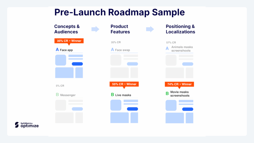
MSQRD team chose to focus on these features because of positive audience reaction to them during a round of A/B tests run with SplitMetrics, which turned out to be a tremendous success, ultimately going viral.
MSQRD continued to rely on pre-launch A/B testing to improve its product pages and store listings, optimizing videos and screenshots for enhanced user experience, further capitalizing on its success.
Pre-launch A/B testing may shed light on your further moves regarding app development, allowing you to identify specific features that should be highlighted on the App Store.
For example, from the initial pretotyping tests that pointed the MSQRD team in the right direction of augmented reality, continuous testing revealed more relevant audience preferences, like the fact that users were 55% more interested in live masks than in the face swap feature.
[tonestro screenshot with CPP and the default page]
Choosing the right feature to highlight is critical on any app store, whether on the default product page or store listing, or a custom one. Here’s the example of tonestro, which showcases music lessons as its default and primary feature, but selects to promote instrument tuning through custom product pages.
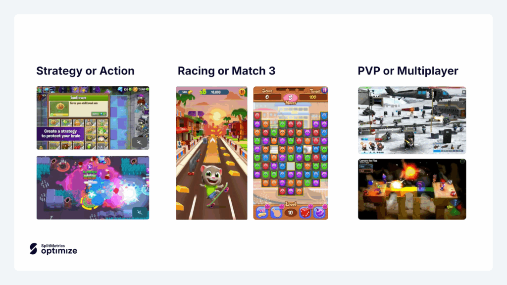
During the prototyping phase of pre-launch A/B testing, the focus can shift to refining the prototype based on audience feedback. Having already validated the app’s core idea during pretotyping, the goal now is to determine which features or themes to highlight and for which specific audience segments they are best suited.
Prototyping is the process of creating a preliminary, functional model or a sample of a product to test an idea or design. Prototypes are used to gather feedback, identify potential issues, and refine the design before committing to full-scale development.
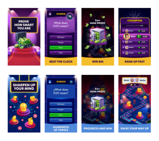
To better understand the role of pre-launch A/B tests at this stage, let’s examine experiments run by Etermax, an international technology company with a gaming division whose offering exceeded 800 million downloads.
The company was already actively developing a new trivia game, but wanted to probe their audiences to verify which style of play is the most appealing, a decision with significant impact on the further visual design process and product page and store listing optimization (ASO).
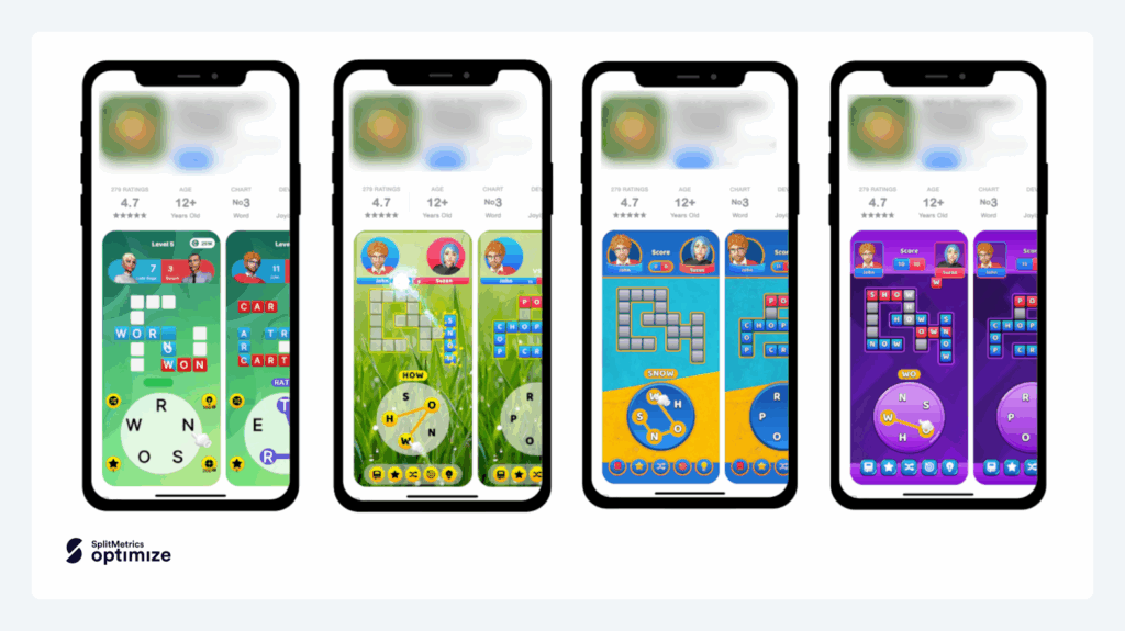
Pre-launch A/B testing, conducted right up to the release day, is crucial for securing a strong launch. An app’s debut significantly impacts its future performance, with high download velocity and conversion rates acting as key organic ranking factors on the App Store and Google Play, according to App Radar. A successful launch, marked by numerous downloads, ratings, and reviews, can establish a solid foundation for future user acquisition.
Now is the time formore granular tests, concerned with fine-tuning a product page or a store listing, equipping it with the best app icon, screenshots, or preview video. Here are some examples of the types of tests designed during the final stages of app development:
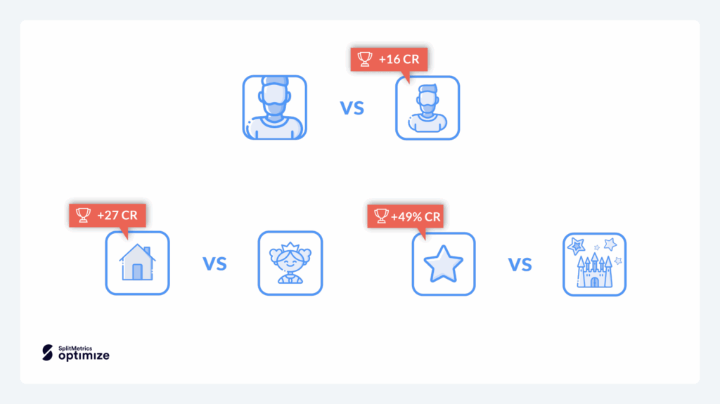
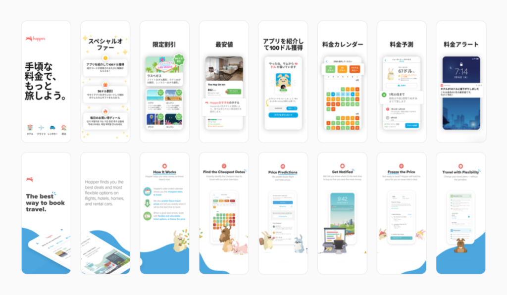
The pre-launch period is an ideal time to prepare your app for launch in various regions. The level of nuance required for a successful, effective and well performing localization makes pre-launch A/B testing a great tool for finding the right way of adjusting our default product page or store listing for the target market.
Mobile A/B testing in pre-launch may also aid in the decision-making process when determining the most effective app advertising channels.
It’s possible to qualify different ad channels like news, Facebook, cross promo, and various ad networks. Thus, you can allocate your marketing budget more effectively once your app is live.
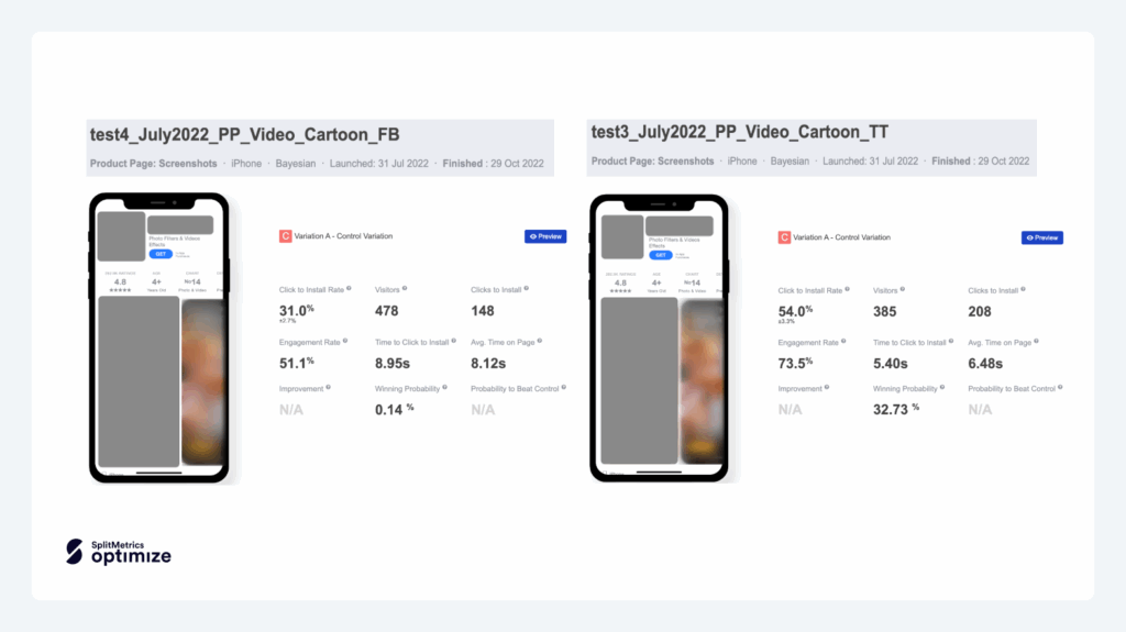
User acquisition channels have varying strengths and weaknesses, with TikTok being a great choice to reach young audiences or Apple Ads to acquire high-value customers, more likely to spend their money on subscriptions or in-app purchases.
Consequently, aligning you user acquisition channel mix with your app’s value proposition and messaging is critical. Investing in that research can secure a strong launch, ultimately resulting in bigger visibility.
The primary focus of A/B testing product pages or store listings for ASO on the App Store and Google Play is the conversion rate, as the goal is to find the best pefroming variant of creatives that will drive the most downloads. The full range of metrics available depends significantly on the way you choose to run pre-launch A/B tests. For example, SplitMetrics Optimize allows a full analysis of on-page user behavior, including potential sign-ups or other interactions signifying engagement. In general, the data points to look at while pre-release A/B testing should include:
The more data about your audience you aggregate, the better you’ll be able to optimize specific product page elements (icons, screenshots, names, etc) and localize your app.
Remember, your goal is to not only verify which direction is right for your app in terms of features or themes. Pre-launch A/B testing can serve as a reliable market probe, allowing you to confidently estimate whether there’s real demand for what you’re about to develop.
Pre-launch A/B testing follows the same framework as post-launch A/B tests, and the principles remain:
However, pre-launch A/B testing is different from testing a live app. Here’s advice critical to that type of testing in particular:
Pre-launch A/B tests and experiments are most frequently run with specialized platforms like SplitMetrics Optimize, to create tested product pages or store listing variations and provide comprehensive analytics necessary to interpret the results correctly.
While it’s possible to run pre-launch A/B tests independently, there are several considerations before committing to doing so. In general, when a specialized solution is used:
To maximize your app’s potential, especially during the crucial pre-launch phase, leveraging an advanced A/B testing platform is key. SplitMetrics Optimize offers comprehensive testing methodologies, powerful features, and expansive analytics designed for all types of A/B tests, proving especially beneficial for validating ideas and refining strategies before your app hits the market.
