ASO — 31 Jul 2020
Science-Backed Tips on App Store Creatives With People & Characters
 Anastasia Sidoryk
Anastasia Sidoryk
Anastasia Sidoryk

App stores are overloaded with visual information. With about 4.4 billion apps on the App Store and Google Play Store combined, users may look at icons and screenshots but they don’t consciously see each and every one of them. So winning user conscious attention is a vital prerequisite for conversions, downloads and, thus, subsequent revenue.
But what grabs the user’s conscious attention? And how to design noticeable visual assets that drive conversions? To get the answers, we referred to neuroscience.
This is the second article in a small series of articles covering science-backed tips for developing and optimizing app store screenshots and icons. Missed the first part? Read about what visual salience is and how it helps achieve a conversion uplift and make your app visible.
In this part of the series, we will explore the attention-capturing visual stimuli, which you may want to consider adding to your assets – people and characters.
Evolutionally, we are wired to scan the environment for social cues. By this means we increase our chances for survival – either by noticing a dangerous person or by spotting a mating partner. That radar is still there in our brain, ready to be triggered by outer stimuli.
To grab users’ conscious attention on app stores automatically, you may want to add “people” – faces, body parts or the entire body – as stimuli.
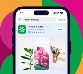
People in creatives can boost conversion for photo & video editors, fitness, ride-hailing, delivery and human resources apps as well as selfie and beautification apps. Additionally, by showing people who use your financial, business or healthcare app you can reduce the degree of risk associated with such spheres and build trust, so that users are more likely to download. As for gaming, consider placing characters on your visuals if you promote a hardcore game.
Our A/B tests show that in the above categories, creatives with people or characters show a 5-10% improvement when being tested against creatives with no people or characters.
Both real people’s characters’ faces may attract user conscious attention. Let’s see how you can apply this to app store creatives.
In order to survive, human beings had to identify the most dominant person in the hierarchy. They followed the eye gaze of the rest of the crowd, and that mechanism is still there in our brain.
When you optimize your visuals or design them from scratch, show people looking at your CTA or the most important app features.
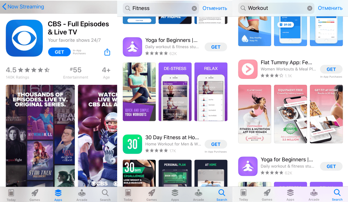
In the examples above, people’s eye gaze is directed towards the captions with the most prominent app features. Users will follow the eye gaze and pay conscious attention to your features.
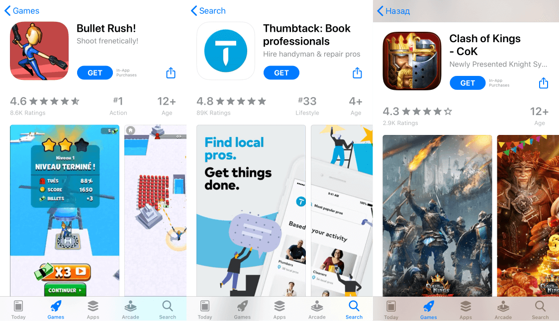
Another hack is to make the user look at and consciously notice your CTA (the “GET” button). Have a look at these screenshots:
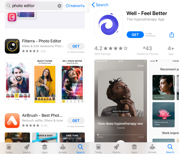
I bet you followed the eye gaze of the people looking upwards, which brought you to the “GET” button. Google Play Store and App Store product page visitors explore the screenshots in the same way, being prompted to download the app by the visual stimuli.
Evolution has programmed people to unconsciously scan the environment for threats. This neural mechanism has been saving our lives and is still in function. But in order to survive, we need to spot the threat quickly, so we’re wired to detect simple geometric patterns associated with that threat.
Think about an angry face. The underlying pattern of angry expression is a V shape. You will easily detect an angry face, whether it’s real or schematic.
Once it happens, your attention system gets triggered.
In mobile app marketing, you can benefit from this evolution mechanism by adding threatening stimuli to your icons and screenshots.
In opposition to casual games, where visuals with animals or gameplay-based creatives convert much better, angry-faced characters can work for hardcore games, especially in Strategy and Simulations.
If complimented by visually salient stimuli, icons with angry-faced characters can help your app stand out in search, which increases the likelihood of a user appearing on your product page.
This “life-threatening” stimulus can be surprisingly effective for non-gaming apps as well (like Health & Fitness):
But before opting for such an unconventional visual design, it makes sense to A/B test your icon or app store screenshots for their conversion potential.
The visuals will capture more attention when they contain faces as well as bodies. The human brain is wired to detect the bodies of real people and characters, and just like with faces, we identify the underlying geometric patterns.
The eyes are the first thing we pay attention to. If we don’t see them clearly, the second thing we are programmed to detect is head orientation:
Place people and characters with the head oriented towards your CTA or features. Or face them towards the next screenshot that you want the user to explore, which will improve the engagement and thus increase the likelihood of downloading.
You can go even further: try to manipulate the conscious attention of users by using the entire body orientation of people and characters in icons and screenshots:
In the examples above, all characters point at the “GET” button, which can potentially increase the likelihood of users downloading the apps.
If you need to, use the pointing to manipulate the users’ attention to make them look at your app store screenshots and CTAs in the order you need:

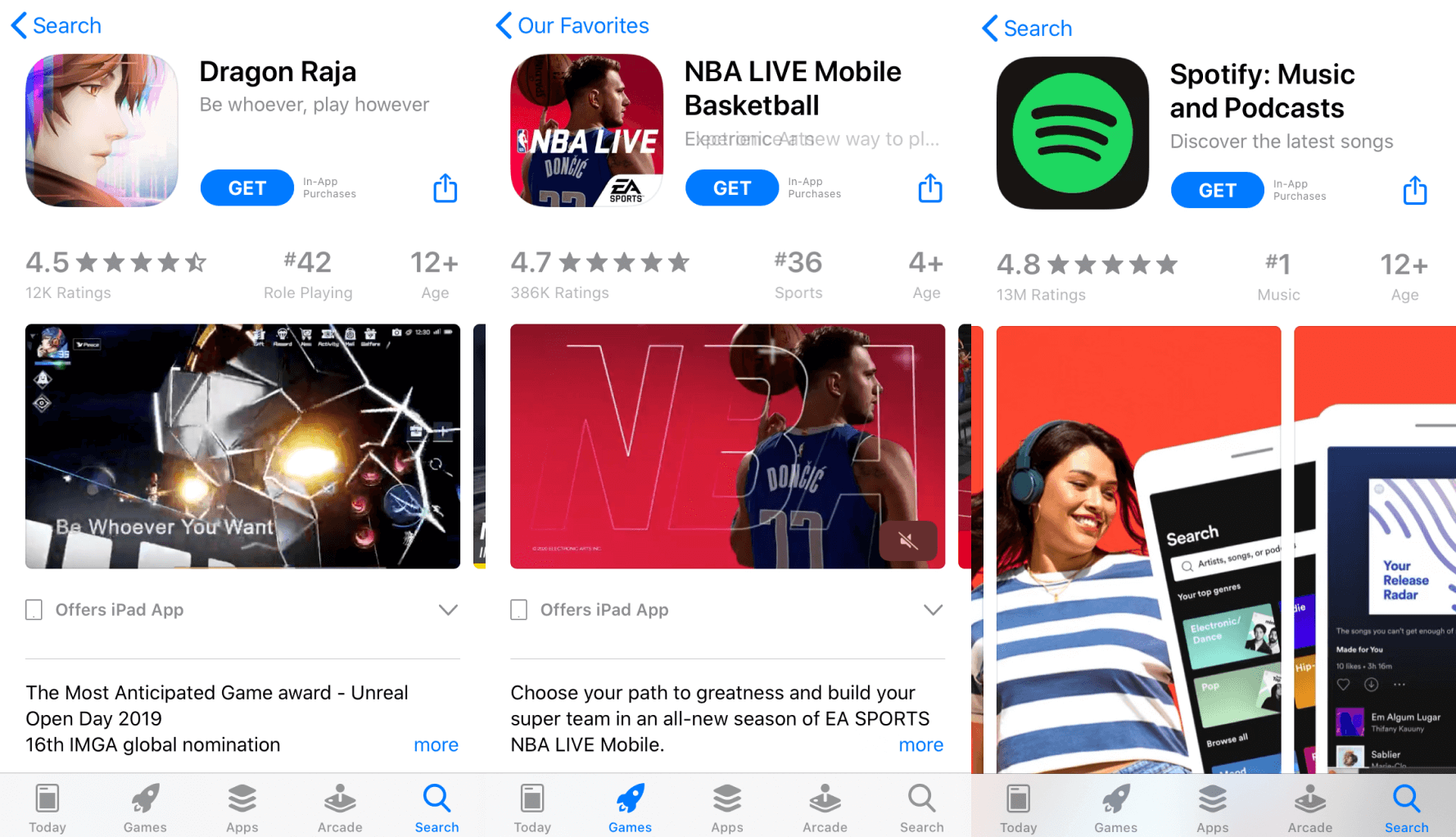
On the “Marvel” product page, advertisers want you to follow the eye gaze upwards (1) to look at the icon (2), where the Spider Man’s body orientation makes you look at the “GET” button.
The “VSCO” app marketers want you to explore their screenshots, so they direct your attention by the hand of a person in screenshot 1 (1), then look at screenshot 2 to follow the hands (2) that point at the “GET” button.
These techniques increase the likelihood of a higher conversion rate and installs. However, before introducing any changes to your Google Play Store or App Store creatives, consider running an A/B test. Understand the behavior of users backed by our analytics to make informed ASO decisions.
See how A/B experiments work on our platform. Request a demo tour of the SplitMetrics platform.