ASO — 14 Apr 2020
Visual Salience: Evidence-Based Tips to Developing App Store Creatives
 Lina Danilchik
Lina Danilchik
Lina Danilchik 
While the number of various apps and mobile games on both the App Store and Google Play continues to grow, the competition is getting tougher and users are spending less and less time on the app store product pages. This means they decide whether to download an app faster than ever before.
Against this backdrop, mobile publishers and ASO agencies are struggling to capture users’ attention in the app stores by running A/B testing experiments, comparing various visuals and figuring out what works best. This is often a trial and error process when hypotheses are formulated based on observations. But there is an easy fix for that: you can develop creatives for your app store product page building on stimuli that historically grab the attention of users.
Today we are going to talk about one of such stimuli that will help your mobile app or game stand out in the app stores and see uplift in conversions – it is visual salience.
This is the first in a small series of articles where we will provide you with evidence-based insights and recommendations for developing and optimizing icons & screenshots for your app store product page.
So, what is visual salience (or visual saliency)? This term means the distinct subjective perceptual quality which makes some items stand out from their neighbors and immediately grab our attention.
In simple terms, our attention is selective, and our brain notices objects that stand in sharp contrast to other items.
Attention of users in the app stores is also attracted to visually salient stimuli.
So, you can capture their attention immediately and influence their behaviour. How? Incorporate visually salient stimuli into your app’s visuals: icon and screenshots. That will enable you to:
Visual salience rests on three pillars: Color, Orientation and Size. Let’s start with color.
Color is probably the most salient pillar.
So, how can you leverage color in regard to your icons and screenshots?
Before uploading your app to the App Store or Google Play check out how icons of your competitors look like. Then develop several variations of the icon building on contrasting – salient – colors. Then A/B test all versions of icons on SplitMetrics and choose the one that works best.
Your icon will capture the attention of users and they will respond at the neural level: choose your app among others.
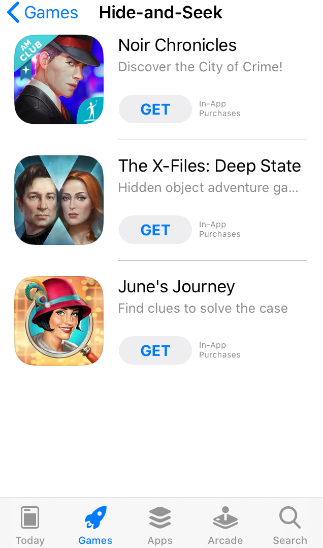
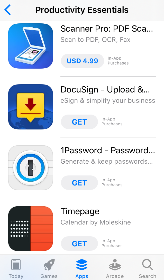
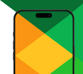
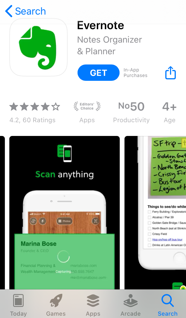
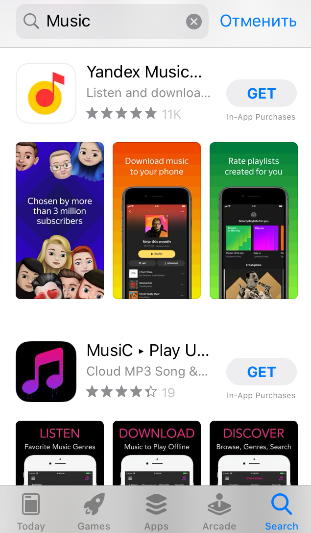
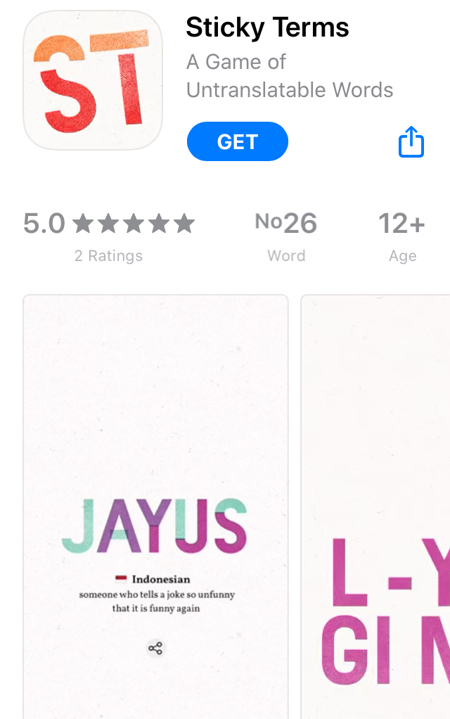
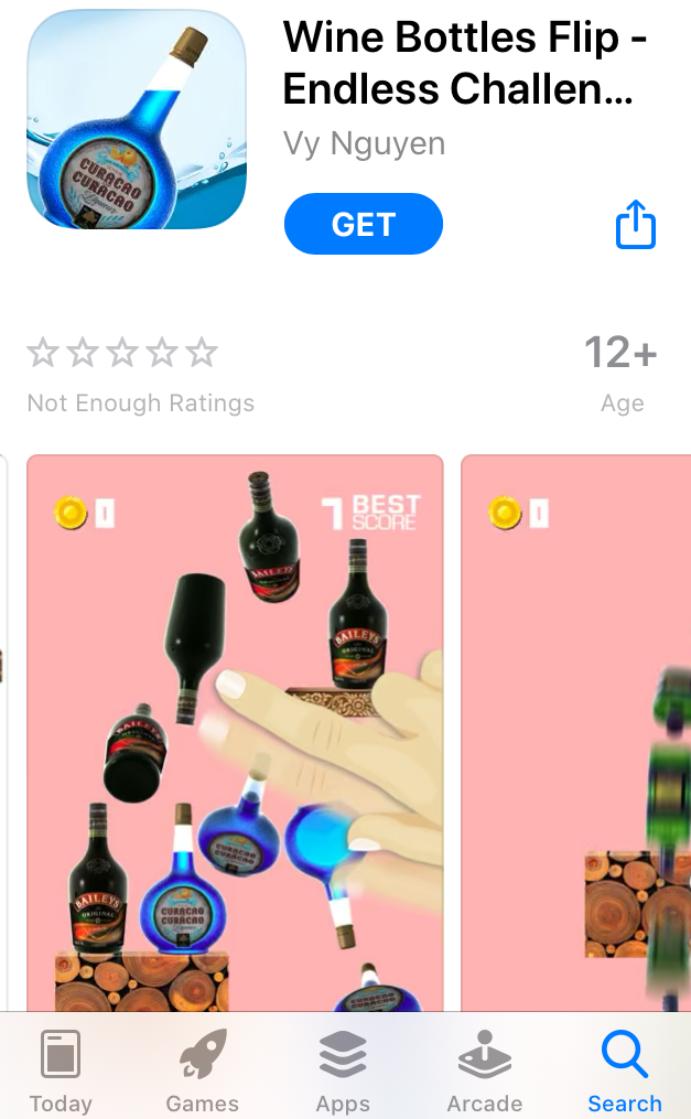
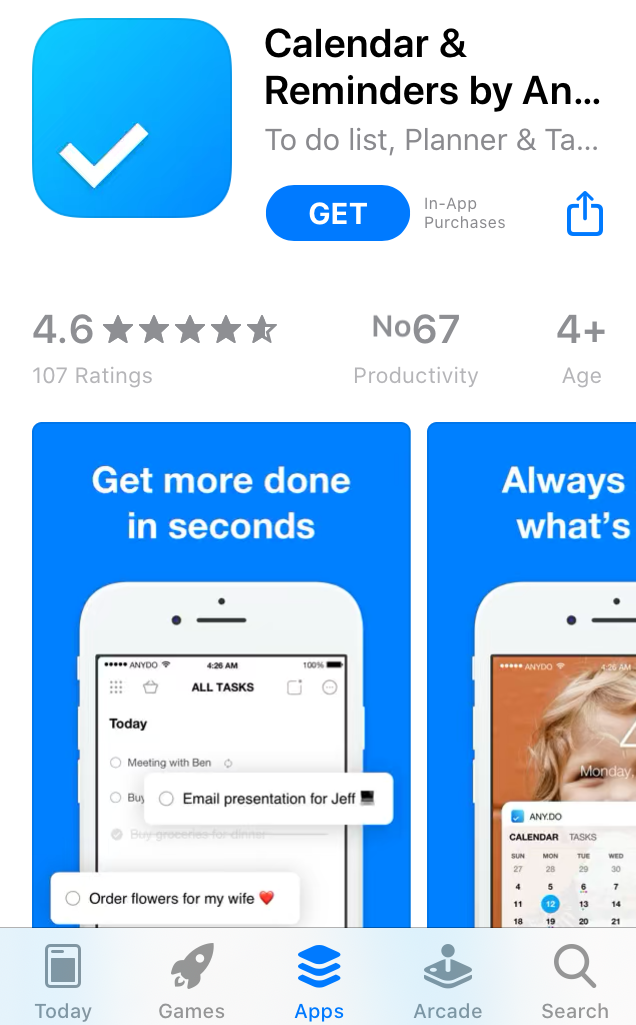
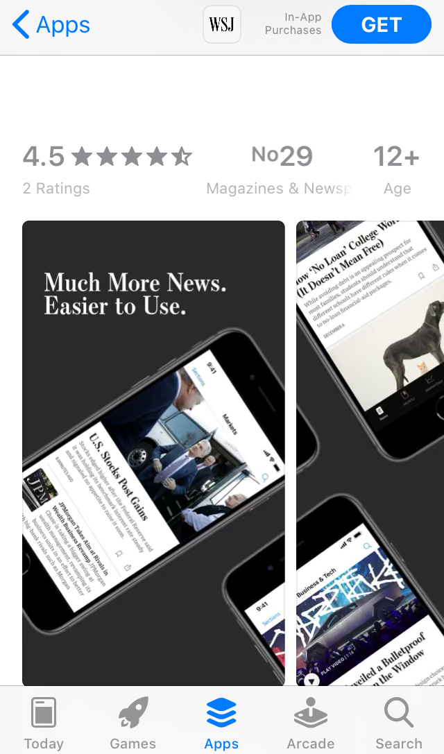
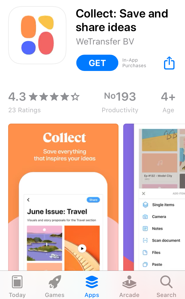
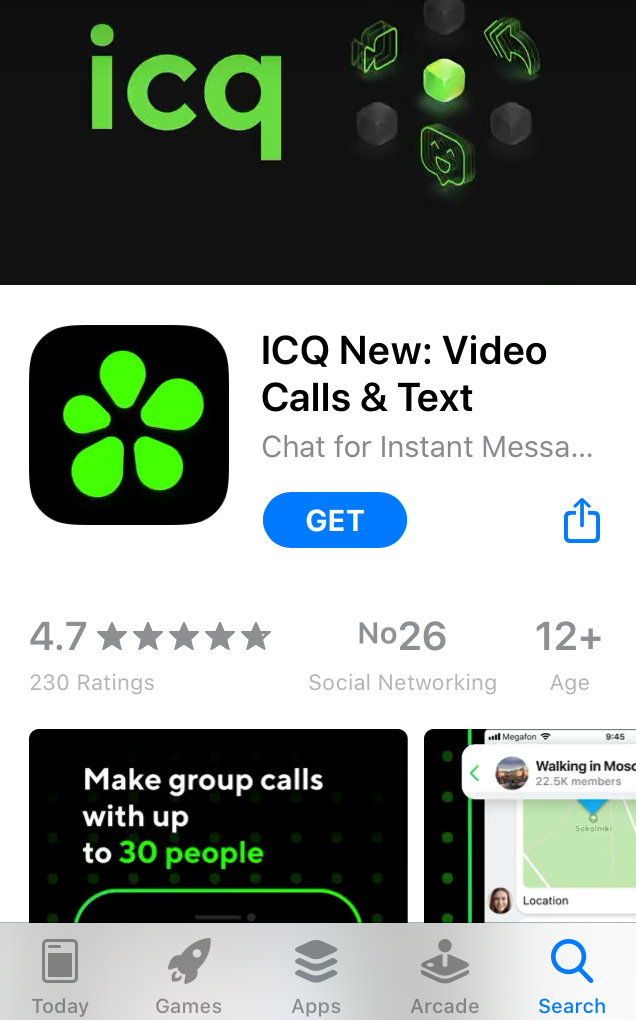
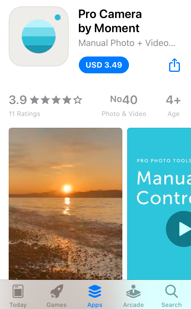
Icons with colors that differ from their “neighbors” instantly grab attention
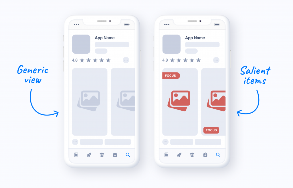
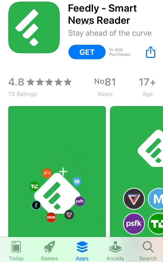
Apart from contrasting colors, you may increase the saliency of your visuals with the help of a salient item or area. This item or area will serve as a focus point that will pull attention of users towards your app.
The same works for icons:
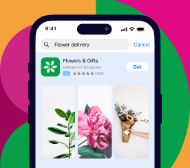
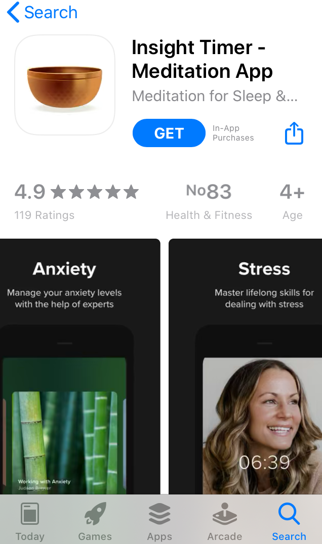
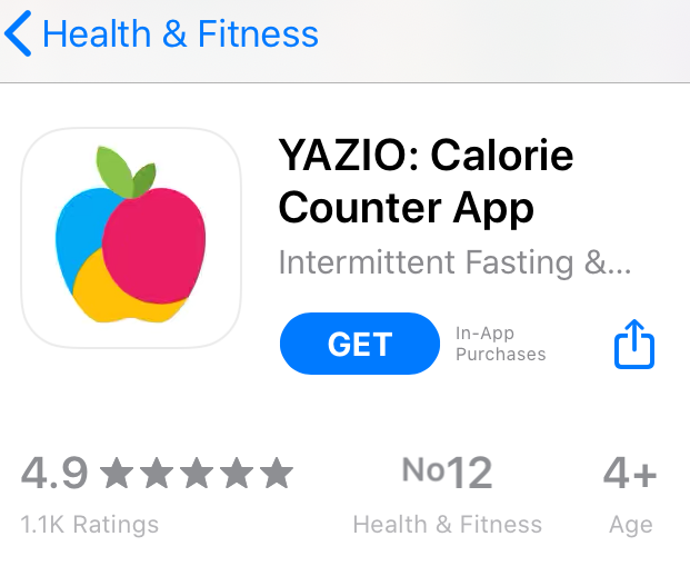
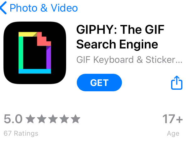
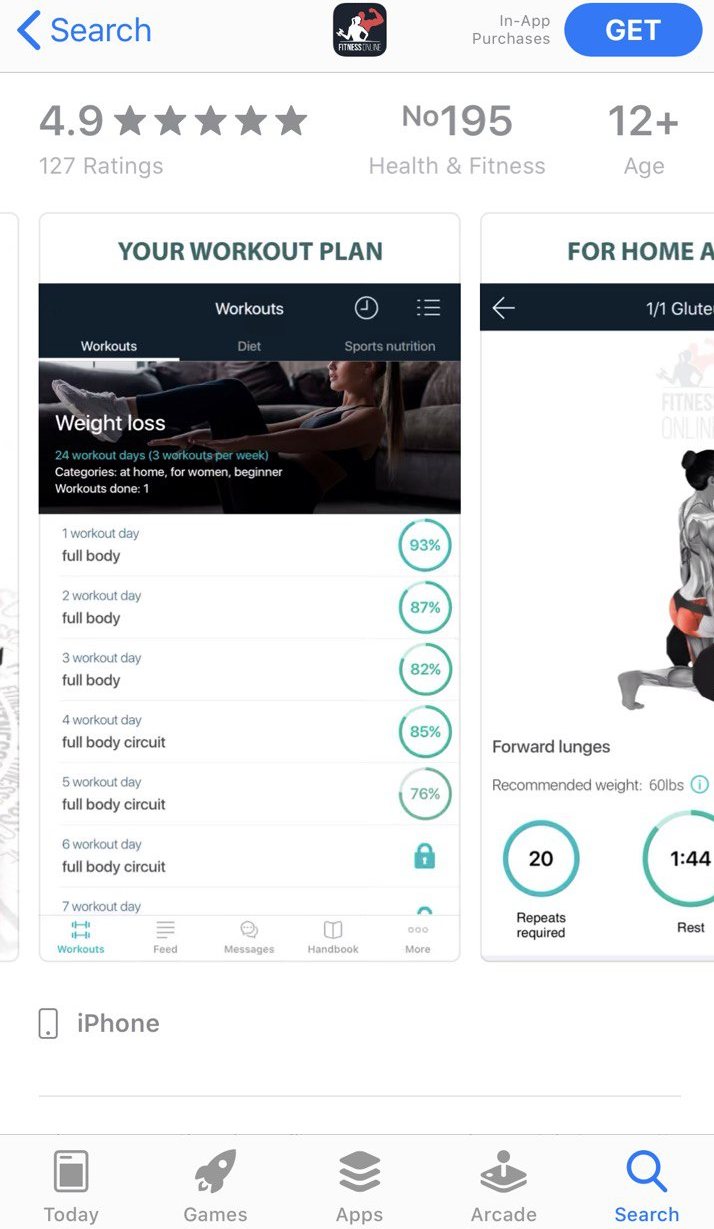
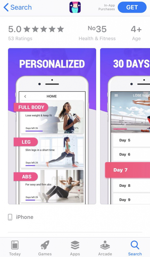
There is no need to make your icon equally vibrant. One colorful area is more than enough:
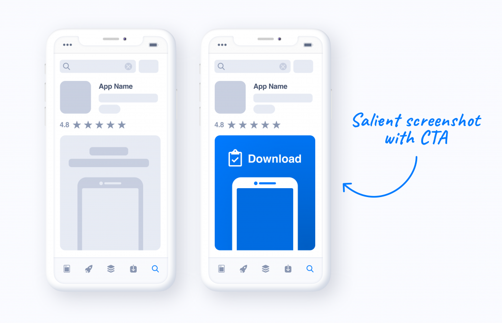
Since the longer people are looking at something, the more likely they will tap on this particular item, you need users in the app stores to focus on those areas of your app screenshots that bring you target actions: sign-ups, purchases or subscriptions.
That’s why you should add eye-catching elements with contrasting colors to such areas on screenshots. Those elements should also include calls to action urging to download an app, make an in-app purchase or take advantage of subscription.
You may also design screenshots that showcase the most important features of your app or features that are coming soon. Showcase them, make this area salient and make sure users would like to download your app with new features.
Just compare:
Screenshots on the right and screenshots on the left, do you feel the difference? The app on the right will definitely capture user attention, since its most important features are in focus, they are highlighted by color on the screenshots.
Another saliency pillar is orientation: our brain also notices objects that are arranged in an unusual way and counter to the alignment of their neighbours.
So, what can you do with orientation to make your icon and screenshots more salient?
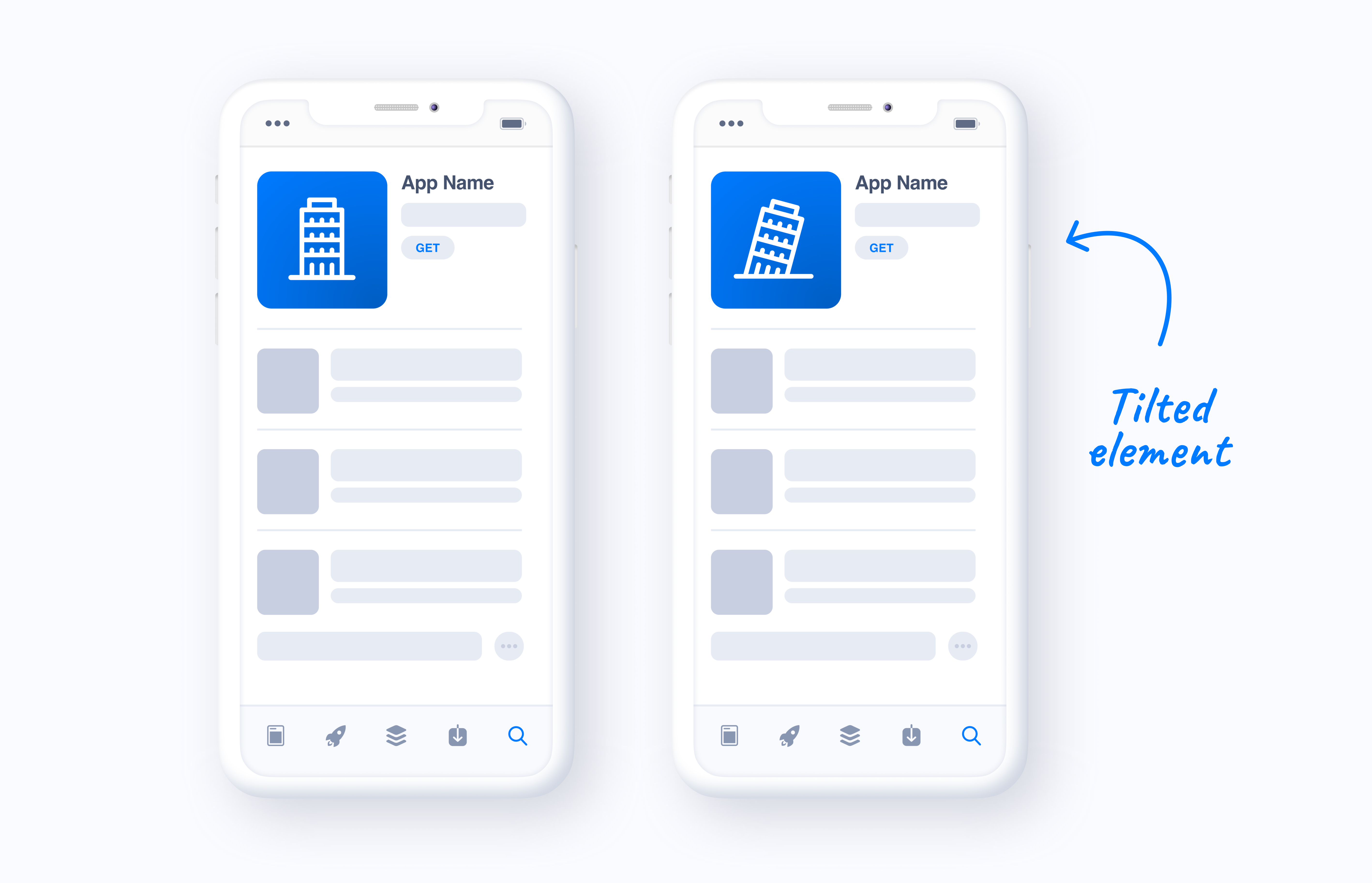
Icons with tilted items look non-trivial:
You may also experiment with the location of an item on your icon or screenshots:
Landscape screenshots tend to catch user attention on the search page, while portrait visuals show higher conversion rates on product pages. So you might want to run A/B testing experiments and find out whether you should add landscape screenshots to your app store product page.
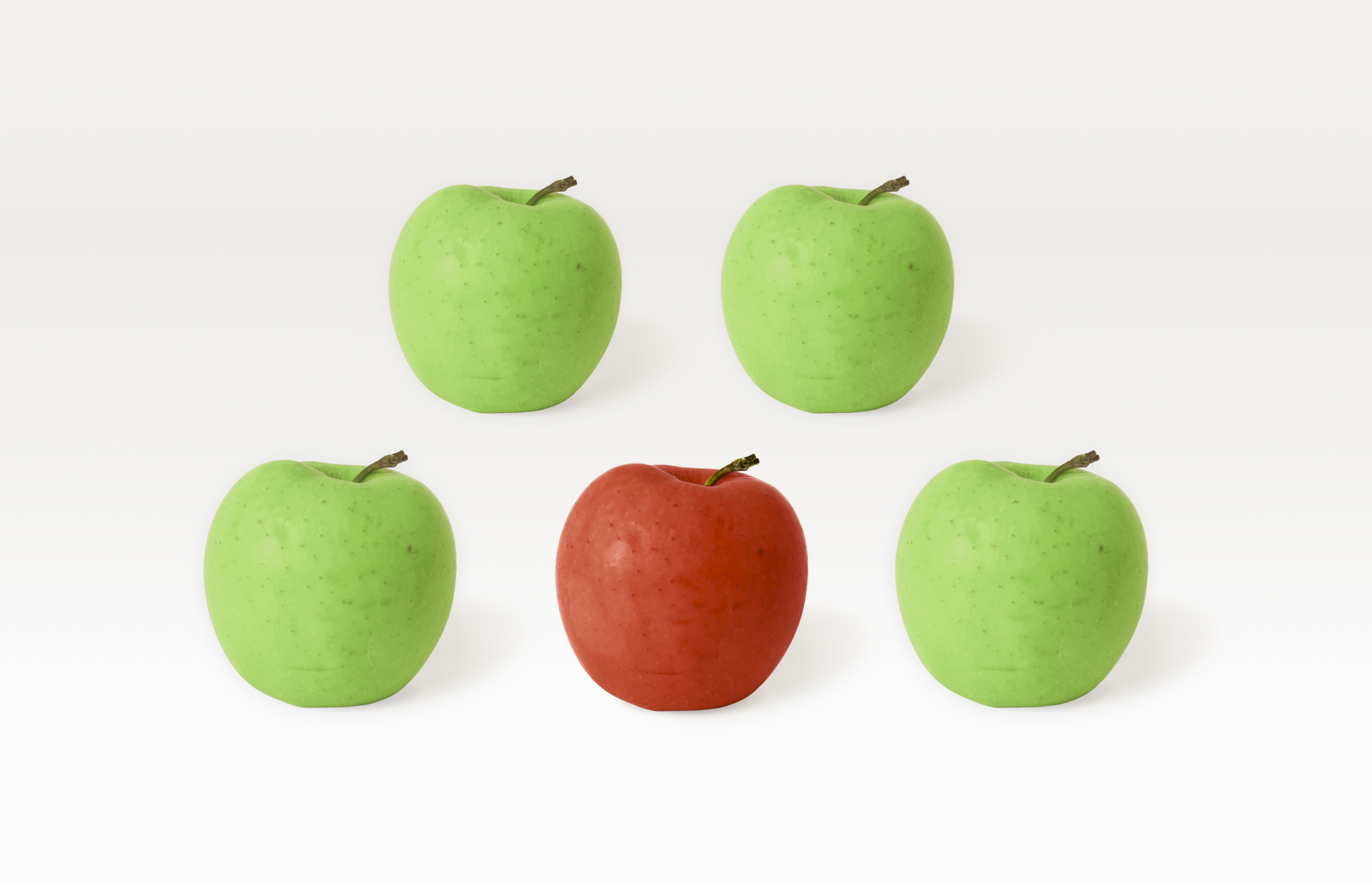
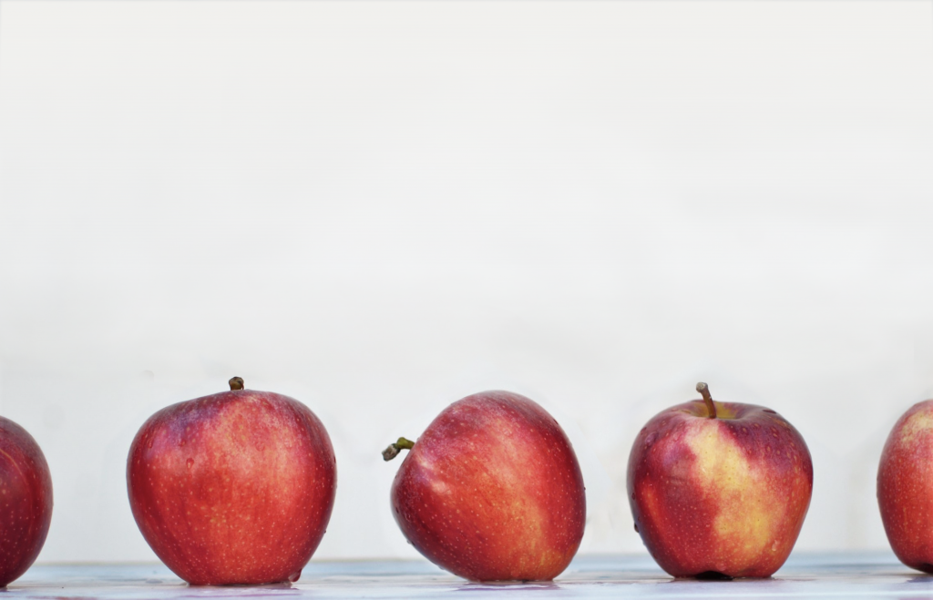
If you place an object of a different size among objects of the same size, you will definitely attract the attention of users, since size disparity is another salient stimuli.
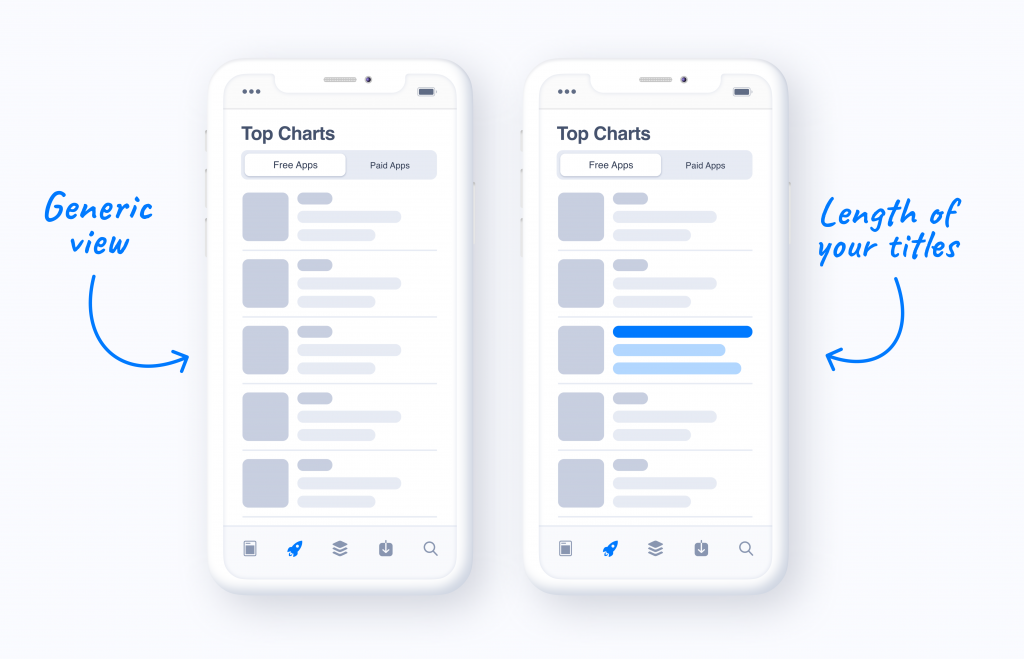
But the third pillar of visual salience can be applied to not only your app store creatives, but also to other product page elements, like, for example, titles and subtitles (short descriptions).
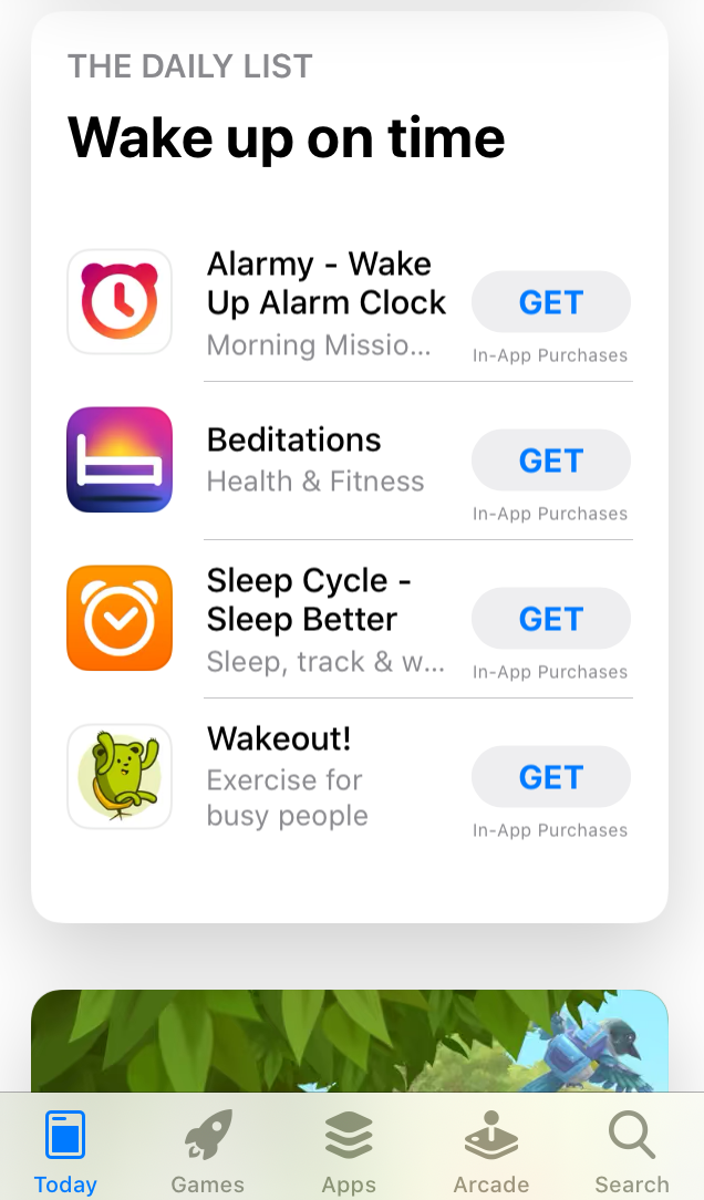
Most titles of competitors apps are short? Do exactly the opposite: add a long title. Include the brand name and short app description to the title – our findings show that such titles bring higher conversion rates.
By applying all these principles you will be able to make your app visible on the App Store & Google Play, and increase the number of downloads. However, before making any changes, don’t forget to first run A/B testing experiments on SplitMetrics and compare the performance of current and new visuals.