7 App Store Optimization Tips and Tricks for Early 2020
 Lina Danilchik
  Lina Danilchik
 With mobile riding the waves, mobile apps are often the first to introduce the latest technologies. But what about platforms where mobile apps are placed? App stores are rapidly evolving as well. For the success of your app, you need to keep abreast of all Google Play and Apple’s App Store innovations, test new concepts and adapt to changes. To make your life a little bit easier, we have drawn together updates, insights and tips for app store optimization that are worthy of your attention right now and will remain relevant in early 2020.
Splitmetrics A/B testing experiments show that the combination of brand name and app description in titles on the App Store and Google Play increases the conversion rate. What’s interesting about it, even heavyweights like Google take advantage of this feature. Change your titles and see if it works for your app. If you don’t want to shoot from the hip, first experiment with explanatory notes in title using A/B testing. In general, A/B testing is a good way to push the envelope and try out new things for your app store page.
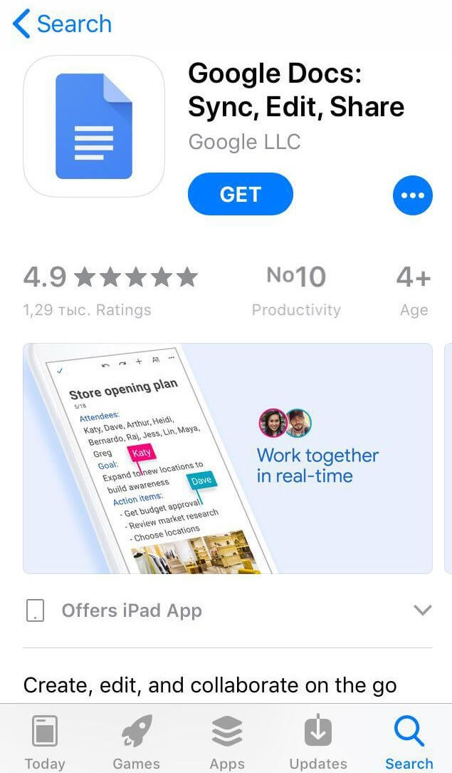
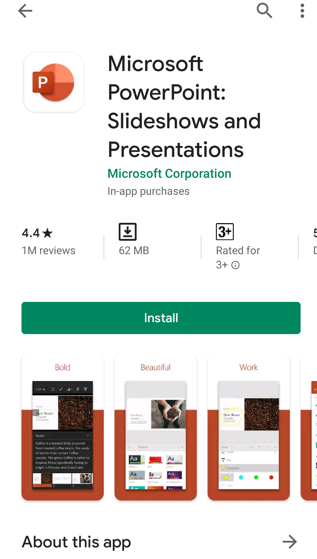
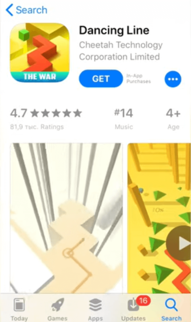
Horizontal screenshots and videos convert better in the App Store search results, while vertical creatives perform better on product pages.
So, what can you do in such a situation?
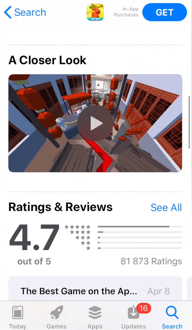
Try adding two videos: in a landscape and portrait mode. Then in search results your app will be illustrated by a horizontal app preview. On your product page the horizontal video will be moved to A Closer Look section, while your portrait screenshots will be joined by the portrait video.
Thus, your app store product page elements will be optimized for both organic and paid search. Follow this pattern and check out what results your landscape and portrait screenshots show in the app store search and on your product page.
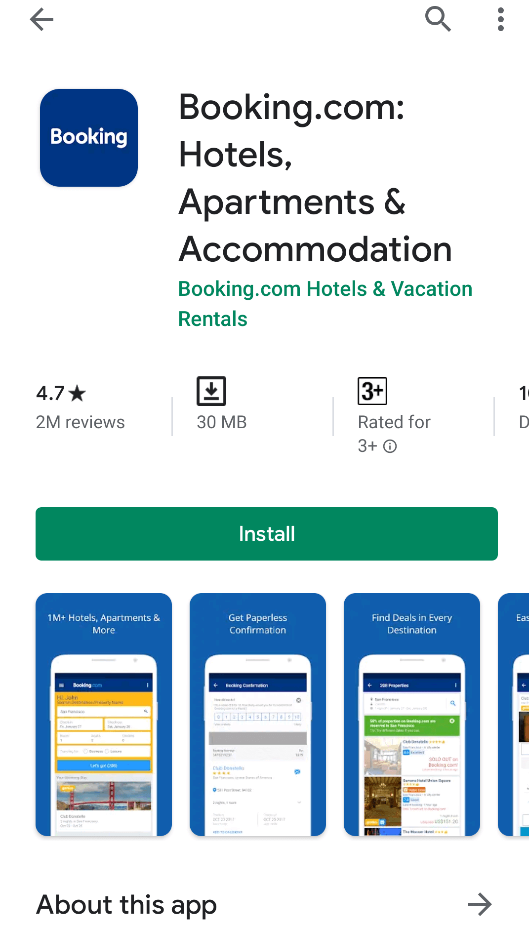
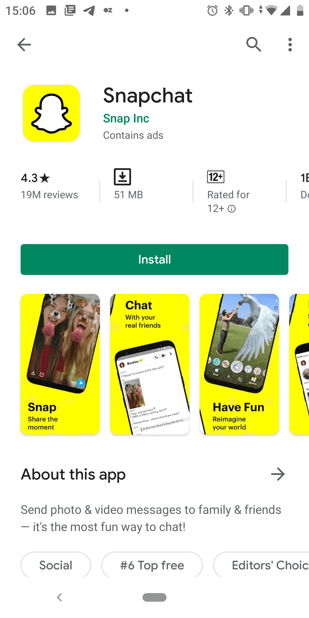
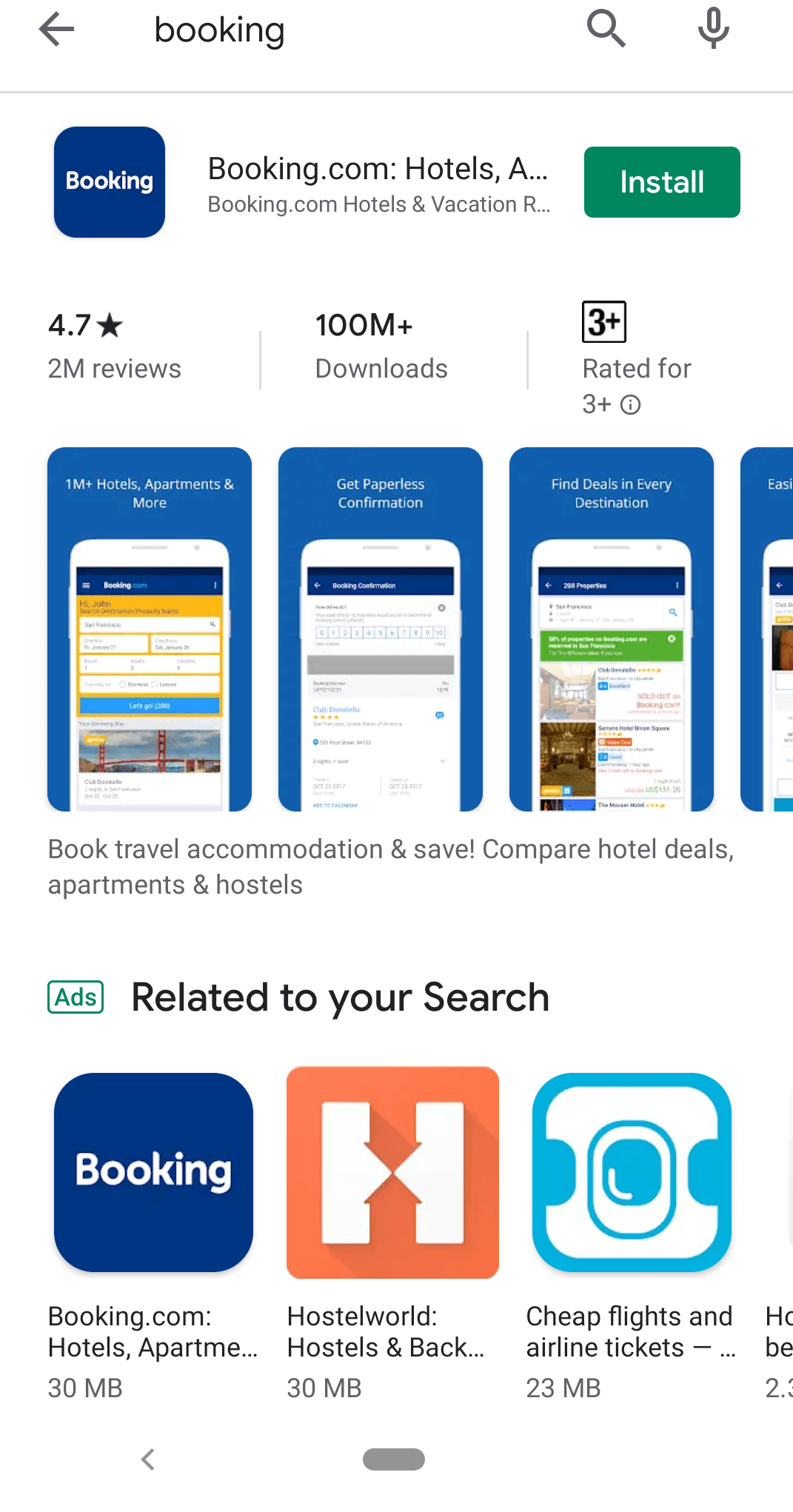
New Google Play Store has been released recently with multiple innovations. Pay your attention to portrait screenshots: they look smaller now, which can have a negative impact on the conversion rates, especially for small screens. Consider creating a panoramic screenshot or opt for landscape screenshots. You might find it helpful to adhere to the principles of design: contrast, emphasis, balance, movement, rhythm, pattern and unity/variety when working on your creatives. Also note that the text in the small print might become unreadable, so increase font size if necessary. And one more thing, be careful with screenshots in a split mode, since the distance between them has increased.
Starting from September 2019, Google Play is kicking off autoplay for app listing videos. What does it mean for you?
Google urges mobile publishers to disable ads in their store listing videos to “keep the video eligible to be shown on Google Play.” Autoplaying videos are intended to make mobile publishers’ content easily discoverable for users.
So, make sure to disable ads in your store listing video by November 1, 2019.
It also makes sense to check if the first seconds of your Google Play video are optimized for high conversion, since according to SplitMetrics, only 20% of users watch a video for longer than 7 seconds.
Have you ever thought that you probably don’t need any videos on your app store product page?
Moreover, videos might have a negative impact on your app’s conversion rate.
Although Apple enables publishers to upload 3 videos, 15-30 seconds each, total time on page is 12 seconds on average. That’s why app previews often lose to descriptions and screenshots that users quickly scan through. Furthermore, SplitMetrics findings show that two and more videos decrease the conversion rate.
So, you might want to test the theory that your app can perform better on the app stores if you remove all videos. Here is when A/B testing again will prove useful.
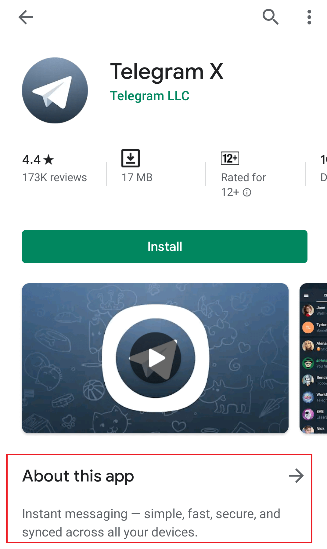
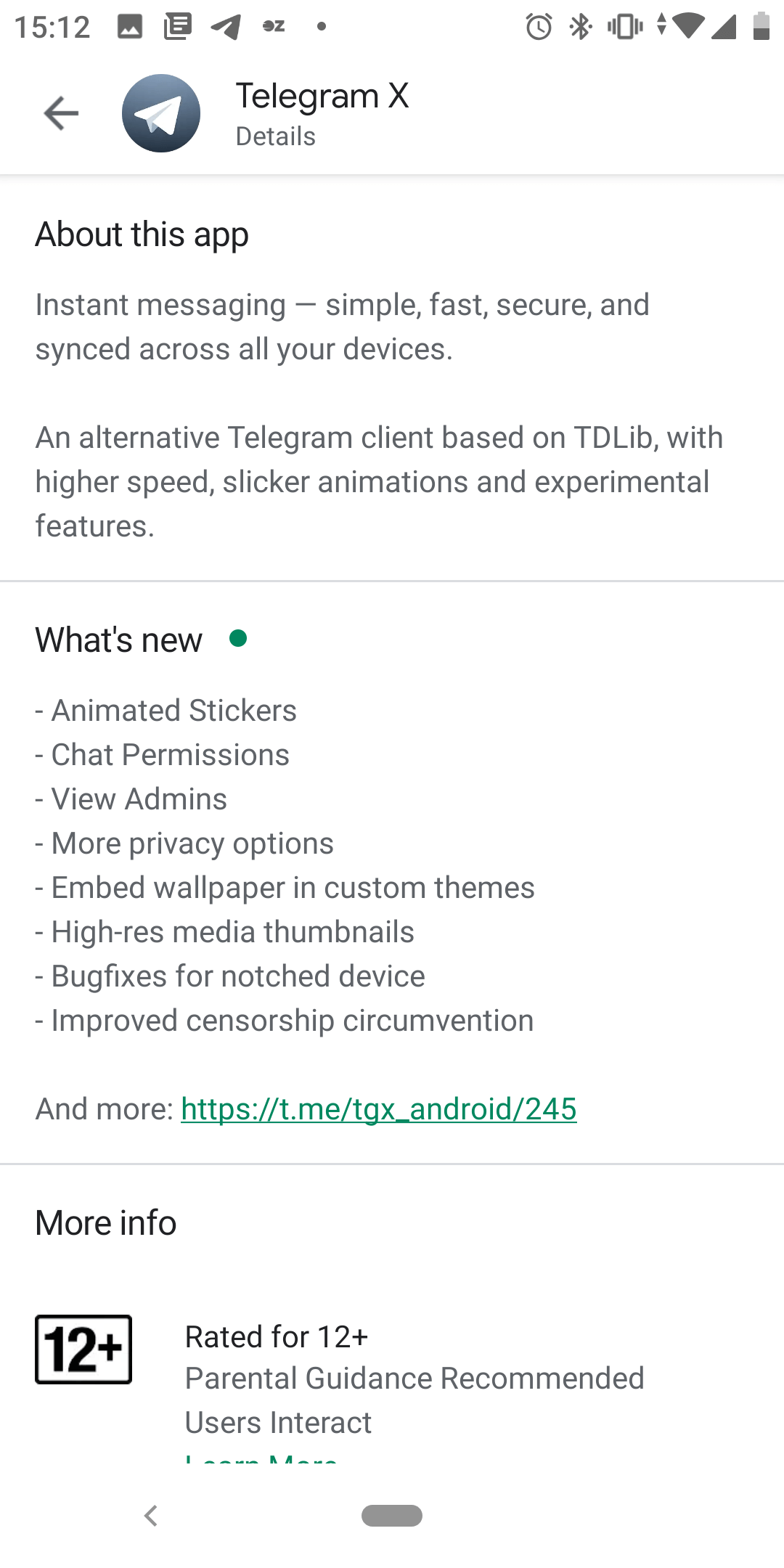
In the updated Google Play Store users will no longer see your app’s long description unless they tap the “About this app” button above the short description. That’s why the short description on Google Play will be of major importance, since it will affect the first impression. Remember that more than half of users decide whether to install a game or not based only on their first impression. Experiment with your short description on Google Play – maybe it should sound like a catchy jingle? – to optimize the conversion rate.
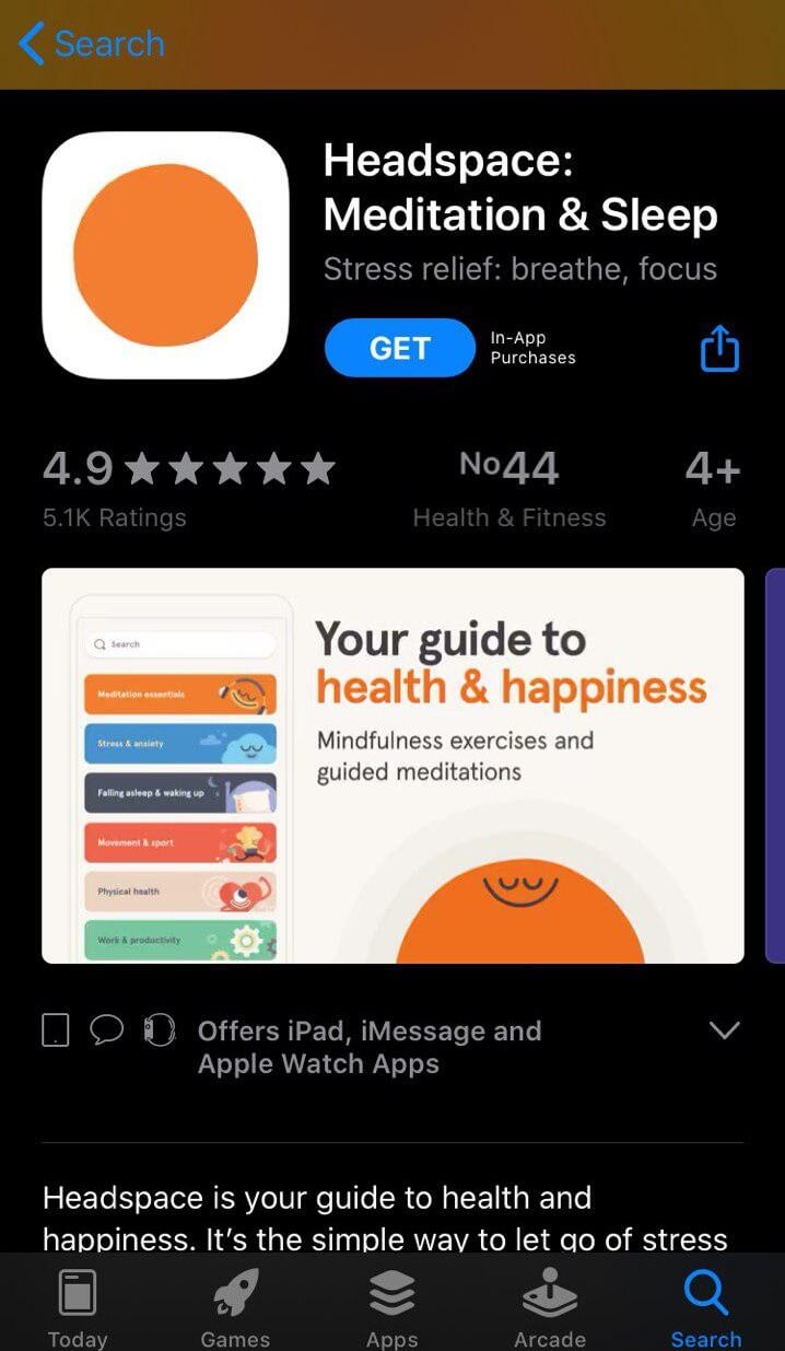
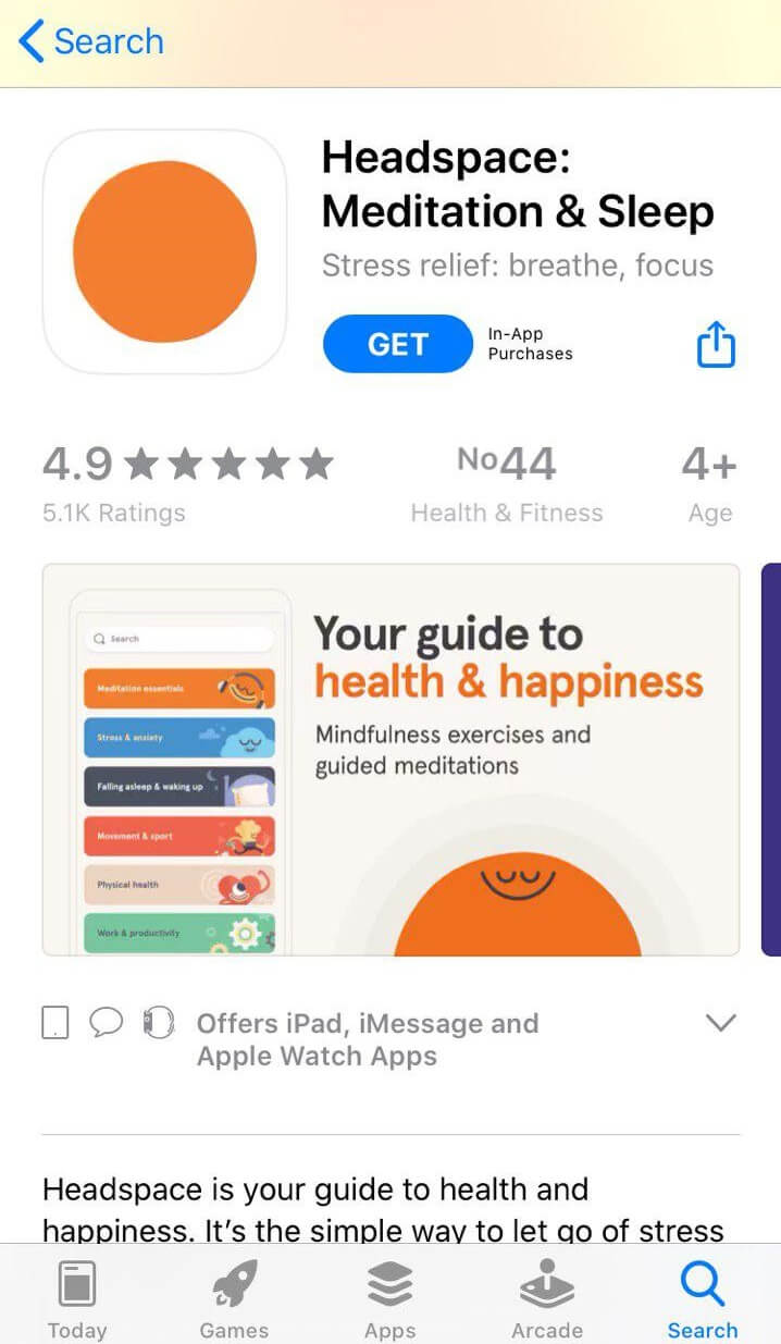
News about the introduction of dark mode to both Android and iOS devices caused quite a stir in the mobile community. The Play Store has most recently rolled out a dark theme, so that now apps on Android 10 with icons and screenshots adapted to the new dark grey environment defeat those that have been caught off guard. New iOS has also arrived with Dark Mode, so if you have an app on the App Store, you need to hurry up and make your creatives pop on the black background.
Keep in mind that some users will turn on the dark mode, while others won’t – so, your icon and screenshots should look good in both modes.
