Best Christmas App Icons
 Gabriel Kuriata
 Seasonality matters. For many apps keeping an eye on the calendar can have a tremendous impact on their KPIs. From TTR (tap-through-rate), through CR (conversion rate) to engagement.
Christmas is big. It’s global and powerful enough to dominate the latter part of the year soon after pumpkins, ghosts and skeletons are put back in the closet.
Icons are the first of app’s assets to be noticed and to make an impact on users. Having that distinct Christmas aesthetic can increase it significantly.
Symbolism and color associations matter for all apps who wish a piece of that gingerbread cake. Here’s example of e-commerce apps doing just that:
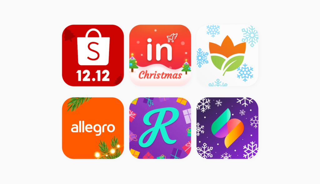
Christmas is big for apps for kids, games, casinos and shopping. But many more can introduce meaningful updates to join the club. When done right, choosing the best Christmas app icons can have great results, as evidenced by one of our tests:
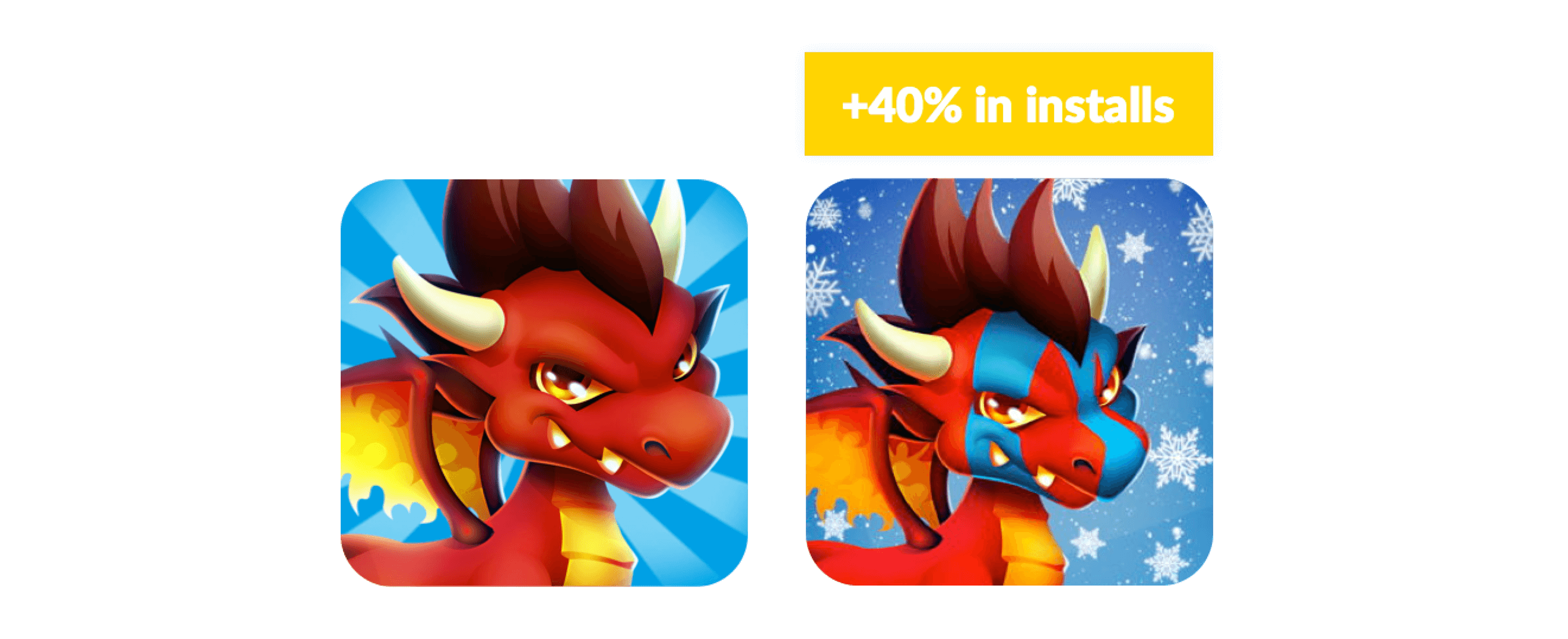
What are the best Christmas app icons? It depends on whether you’re having a seasonal update or creating something new and special (like a variant of your game, a branded calendar or a similar app).
There are two things that matter here: color palette and symbols. In this article, we’ll try to analyze what are the most frequently used ones on the App Store and Google Play and what types of Christmas app icons might work best for:
If you’re updating your app, a new icon is the simplest and most immediate message to users that you have something new. Whether on any given app store or already installed on devices, you can count on increased interactions.
Our tests run with our App Store Optimization and A/B testing tool SplitMetrics Optimize have shown that having the right icon impacts a product page’s conversion rate (even though naturally, the biggest uplift is observed in case of cohesive updates).
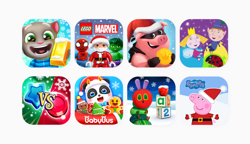
Go full Santa…or just use accessories. Even a little bit of snow might do the trick. You want to preserve key elements of your apps icon, only adding some immediately visible elements associated with Christmas.
Updated apps usually keep a rich color palette and mostly focus on adding a few elements associated with Christmas. The most frequently used symbol is Santa, followed by Christmas trees and gifts.
Red is the most important color and encountered in close to 100% of cases, followed by green. Blue (associated perhaps with Christmas night) and white are there, but given that these may be in the default color scheme of icons anyway, they occupy a third and a fourth place.
Want to introduce similar changes to your app’s images – not just icons? We encourage you to read our comprehensive ASO guide:
You want to get noticed and you want to stand out. But at the same time it would be risky to stray away from expectations of users. Icons for games or apps for kids have their own unique aesthetic, with more detail and action on them than on an average, flat and symbolic icon from a more “serious” category. Seasonal apps rely on color association heavily and simple symbolism. This is why they might be a fun source of inspiration for many publishers planning their own Christmas app icons.
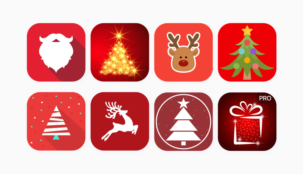
Red is the color of Christmas, present in any other template to some degree. It’s so popular that it frequently is utilized as the only Christmas-associated color on an icon, with the exception of a shape – be it just a logo, an outline of a Christmas tree or Santa Claus.
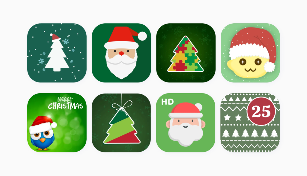
Always coupled with red, green Christmas app icons are also popular. Red and green are “the two” colors of Christmas, despite off-line popularity of gold, silver, blue and white.
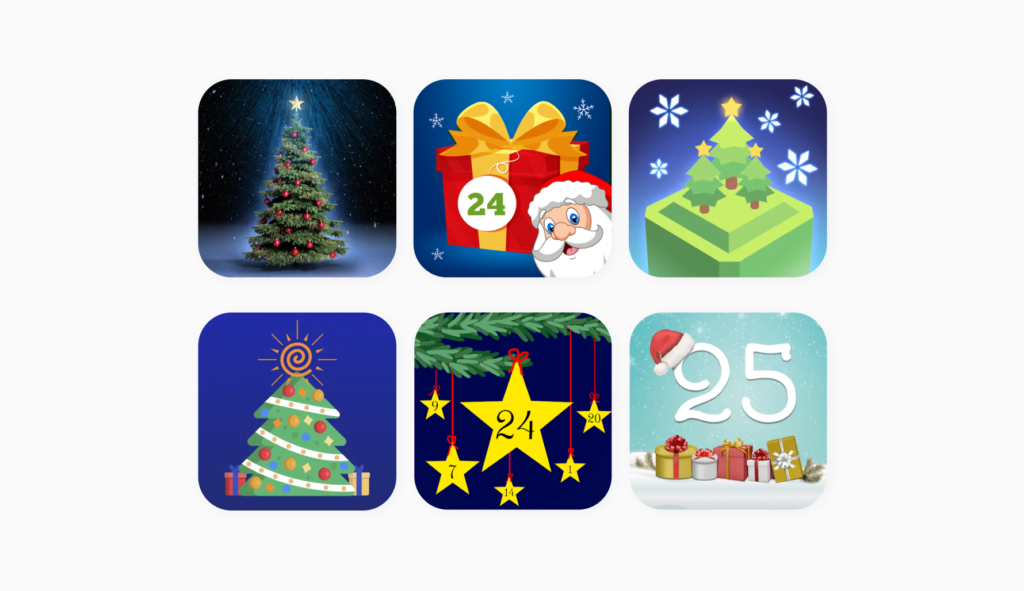
Though not as popular as red and green, there are some apps with a dominant blue coloring. This is subtle, but notice the presence of gold & silver (also traditionally associated with Christmas) on them.
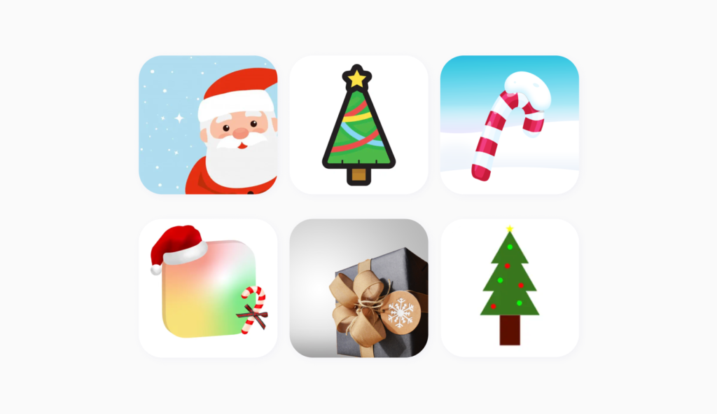
Even though snow and snowflakes are a popular element of festive modifications to app imagery on all app stores, they aren’t popular in themselves as publishers prefer to choose more contrasting palettes instead.
Red Christmas app icons are the best icons. Or are they?
There are many more ways to trigger the right feelings & stand out at the same time (just take a look at shopping icons earlier in the article). You can have a meaningful icon, reflecting the intention and functionality of your app and communicate its Christmas spirit clearly and visibly, despite your brand’s original color palette.
There’s only one way to tell if your Christmas masterpiece (your icon) works… you have to start preparing earlier and try it. Tests can sometimes bring surprises. Those surprises may be key to increasing your TTR and CR and standing out from the crowd.
