Health & Fitness in 2021: Top Apps & Creative Trends
 Lina Danilchik
Lina Danilchik
Lina Danilchik

This mobile app category, unlike some others, has seen an upswing since the beginning of the coronavirus pandemic. People across the globe faced the need to take care of their mental and physical health while staying at home, in new circumstances, when familiar things, such as going to the gym, yoga classes or even regular walks became unavailable. This is when apps for mental and physical health, mindfulness, stress relief, workout and fitness become especially popular.
Now we can see that this trend continues. According to The Global Health and Fitness Market Report by Prophecy Market Insights, the health and fitness market accounted for $4 million in 2020 and is estimated to rocket to $18.7 million by 2030. Compound annual growth rate is expected to approximate 17%.
The competition in this market is also growing, while app store visuals play a crucial role in winning that competition. We identified top creative trends based on the insights SplitMetrics Agency gained after streamlining ASO for multiple clients in this category, and examined them through the prism of some of the top apps in the Health & Fitness category on the App Store.
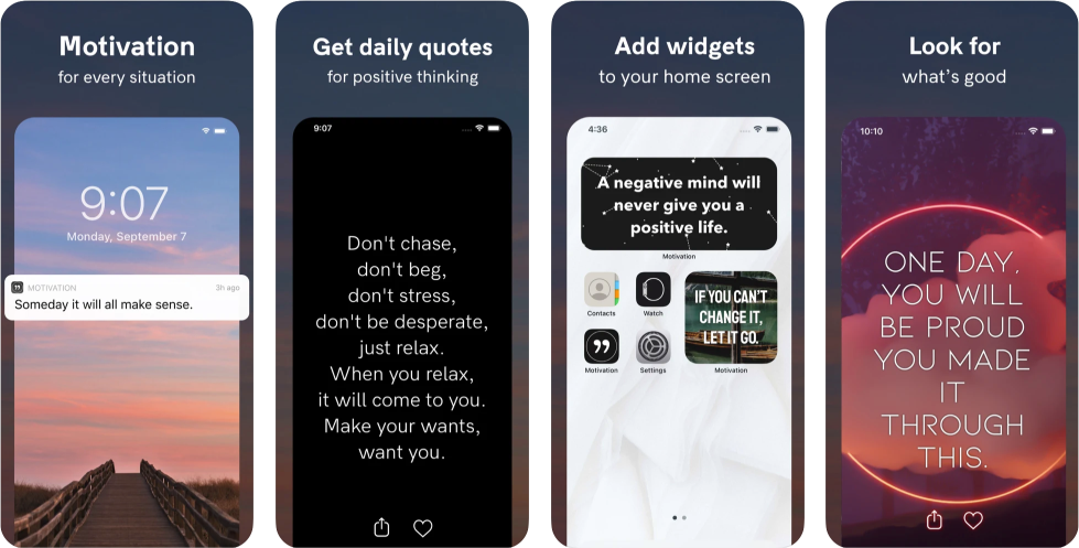
Icon
App icon has a higher impact on the conversion rates in the category and search results rather than on the app product page (where screenshots and video will play a more decisive role). Here are the trends related to the icons of health & fitness apps.
Placing elements on icons that clearly reflect the app’s idea helps to improve the conversion rate.
According to SplitMetrics Agency, the icon that displays the main app’s functionality may increase the conversion rate in Search, since it corresponds with the app’s idea and helps users associate an app with something they are looking for – meditation or workouts – at once. In fact, this approach to developing icons is evidence-based: it’s related to processing fluency – an ease with which users process information. They see an icon, immediately understand what the app is about – and install it.
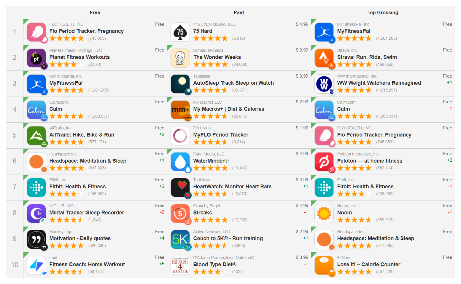
Let’s take a look at some apps from the App Store top 10 free in the Health & Fitness category.
The icons speak for themselves:
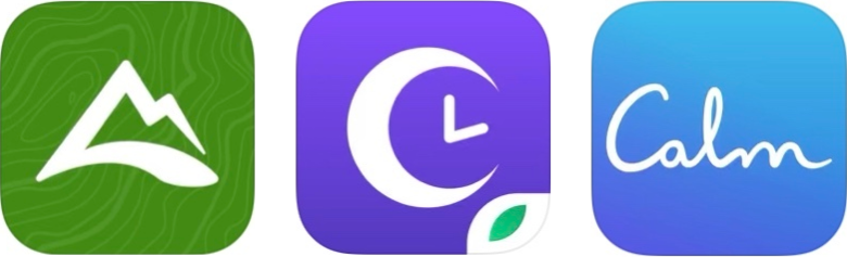
Just looking by at them, you may understand where the icon of each app is, which one illustrates AllTrails: Hike, Bike & Run, which icon belongs to MintalTracker: Sleep Recorder and which one is designed to help you keep Calm.
Health and fitness apps on the App Store use vibrant contrasting colors to attract user attention.
Icon colors in the Health and Fitness category tend to include all the colors of the rainbow. For example, 12% of the apps analyzed by SplitMetrics Agency, use blue as a primary color, while 10% use black and 10% – pink color.
What connects almost all health & fitness apps is that most of them use bright and/or contrasting colors for their icons to draw user attention.
Tip: read about Visual Salience and find out how using vivid colors for app store visuals might help to attract new users.
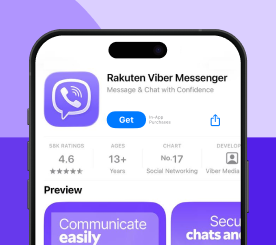
Video preview is one of the first things users see, and it has a high impact on the conversion rates. Video previews show apps in use, so users watch them to make a final choice – whether to download an app or not. Therefore, the first 3-6 seconds of the video are of the most important (if you do not hook the visitors and do not get your point across in the first seconds, you risk losing their attention).
Most of the top-grossing apps from the health and fitness category don’t use videos. That’s why a well-crafted video for your health & fitness app might help differentiate it from your competitors. Here are a few tips:
Headspace: Meditation & Sleep – an app that is in the TOP-7 free apps in the Health and Fitness category on the App Store, is a good example to look at.
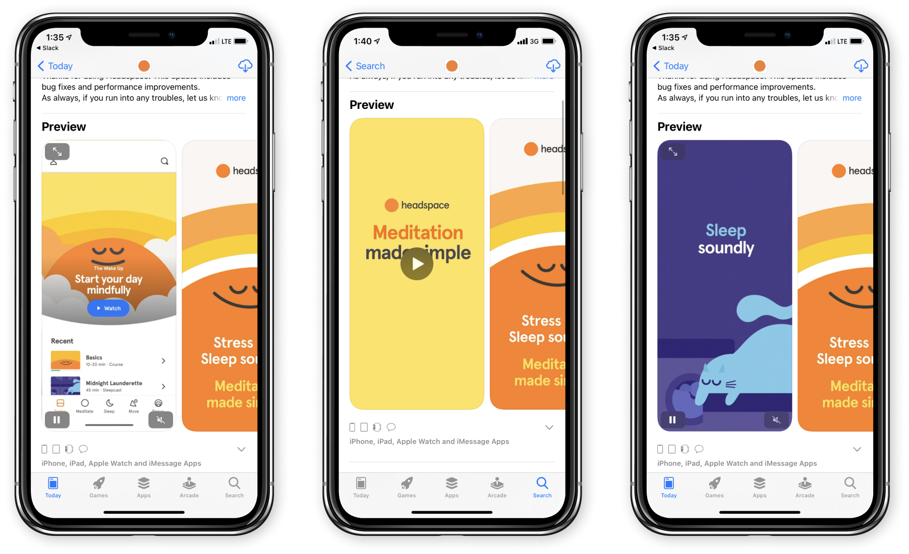
However, the most important thing to keep in mind is that adding a video might also drop the conversion rate. So before making any changes to your health or fitness app’s product page, first run out-of-store A/B testing experiments with SplitMetrics.
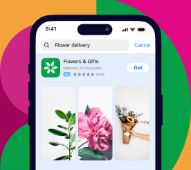
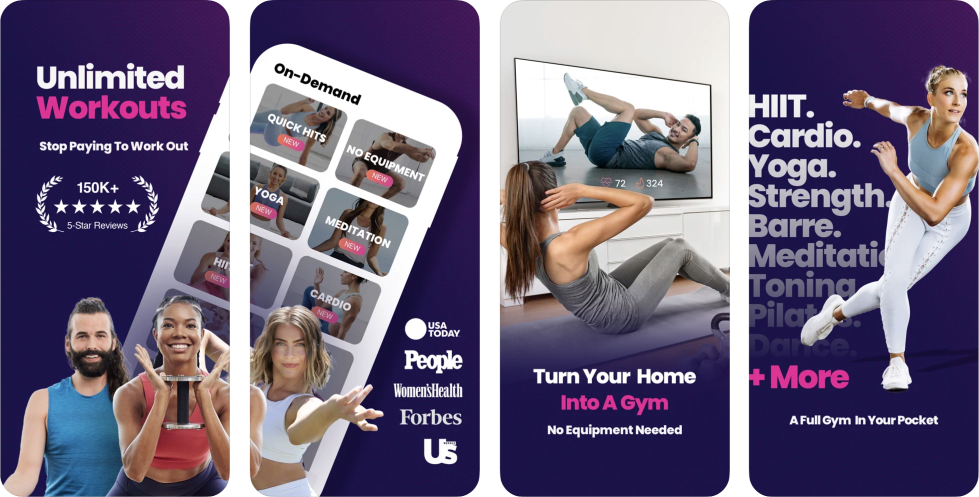
Screenshots
Screenshots are probably the most impactful element on the app store page. The majority of installs are made after viewing the 1st screenshot.
How do the apps in the health and fitness category enhance their screenshots to encourage users to download?
SplitMetrics Agency recommends to place your value proposition on the first, second or third screenshot to help users see them in search results at once. Your value proposition should communicate the benefits that users get after installing your fitness app. The messaging should be simple and easily understandable.
And now let’s take a look at how the leading apps, which are among top 3 in the US App Store, take advantage of this insight.
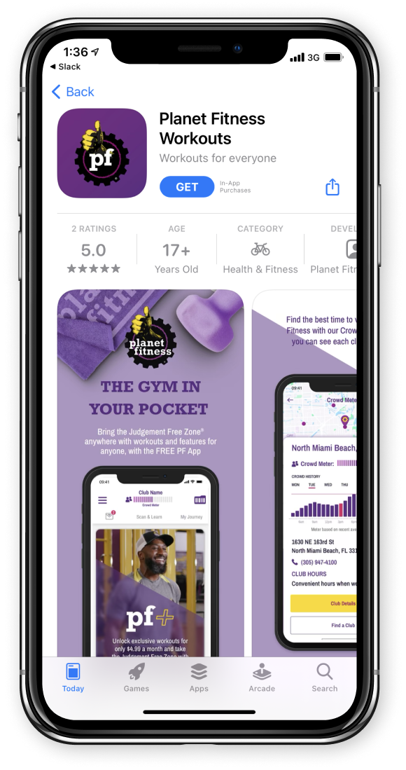
The first thing you see at the product page of Planet Fitness Workouts is the primary purpose of this app. “THE GYM IN YOUR POCKET” says the first screenshot – and this motto makes the app comprehensive for users who see it for the first time in their life.
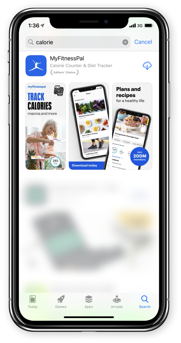
Seeing the MyFitnessPal app in search results, you won’t question its purpose. If a user is looking for an app to track calories and probably for some recipes – they won’t look no more.
Personalized workouts basically drive users’ attention. Placing the possibility of drawing up a training program depending on age on the first screenshot can expand the app’s target audience.
Tip: Speaking of personalization, SplitMetrics A/B testing experiments show that placing people / persons who meditate or do exercises on the first screenshots, prompts users to scroll through the whole screenshot gallery and eventually install the app. People who are not in the middle of doing something also perform better on screenshots than objects, according to SplitMetrics mobile out-of-store testing experiments.
SplitMetrics Agency also proves that apart from displaying key features on the first screenshot, the best practice for the health & fitness category is also to place people to catch users’ attention straight away.
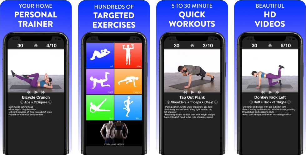
Tip: Lead your users to the get button. The eyes are the first thing we pay attention to. If we don’t see them clearly, the second thing we are programmed to detect is head or body orientation. Facing the character towards any item, you motivate the user to explore it. Applying this technique, SplitMetrics Agency clients usually observe improvement in the engagement and install rate. Try to place a person with the head/eye gaze/ part of the body-oriented towards your CTA or features, or a GET button.
Read more about this data-driven technique here: https://splitmetrics.com/blog/evidence-based-tips-for-cro-screenshots/
Social proof messages are one of the strongest influential methods that can be used in marketing to increase conversion. The idea is to show that your app is useful, helping many people, or is appreciated by influencers. Design your social proof in a familiar style for the target audience of your health & fitness app.