ASO & Design Guide to Japan: Localization & Seasonality
 Gabriel Kuriata
Gabriel Kuriata
Gabriel Kuriata

Japan is a beautiful country. Home to many natural and man-made wonders, rooted firmly in its rich history and tradition but full of high-end technology.
For mobile app developers, Japan is a lucrative, much-desired market. Its average revenue generated by a user (ARPU) is ostensibly higher than in the United States. According to Statista, ARPU in the United States is projected to reach $11.79 in 2027, compared to $13.72 in Japan, a value that has not historically been its highest. Japan has a high share of iOS devices (over 67%, according to Statista) and a colossal mobile gaming market worth approximately $14bn in 2023, according to Sensor Tower.
A developed market with a powerful iOS share (64.82% according to Statcounter), a reasonably accessible one with an average TTR of 8.75%, CVR of 58.29%, CPT at $0.70 and CPA at $1.20 (compared to TTR of 9.98%, CVR of 65.85%, CPT at $1.97 and CPA at $3.00 in the USA in 2023, all according to our data for 2023, collected for the latest SplitMetrics’ Apple Ads Search Results Benchmarks Report). According to Global Data, Japan also enjoys a high ARPU, ranking 3rd globally in 2021, with the mobile gaming segment responsible for this high position.
Success in Japan requires a powerful ASO-driven growth strategy due to cultural differences and unique customer preferences. Even though in 2024, Japan and the West are culturally closer than ever (especially among younger generations), a different language, alphabet, and cultural norms can inhibit many developers from building a meaningful and noticeable presence there on the App Store or Google Play.
ASO & design are fundamental to building a true connection with a foreign audience. From localization through seasonal promotions and in-app events that captivate and engage users with relevant imagery, ASO specialists and designers have a lot of work before their colleagues launch their first paid user acquisition campaigns.
While fostering adequate cultural sensitivity might be challenging without professional support, we hope this article will point many app and mobile game developers (especially their design teams and ASO specialists) in the right direction and encourage them to explore this market more effectively.
International expansion and scaling require a genuine understanding of the target audience. Many values, goals, and aesthetic preferences are shared across all markets. Minimum Viable Localization (MVL) is grounded in that fact, allowing app developers to reach outside familiar territory on a budget.
Minimum Viable Localization (MVL) for a mobile app involves adapting essential elements such as language, currency, imagery, and cultural references to target specific international markets while minimizing costs and development time. It ensures basic usability and understanding for users in target regions.
MVL should be good enough in terms of ROAS, ROI, and other key benchmarks, such as tap-through rate (TTR), conversion rate (CR), cost per tap (CPT), and cost per acquisition (CPA).
However, this article will show you how to go beyond that. So, how can we localize our app’s product page on the App Store to reflect what Japanese users are looking for?
An image is worth a thousand words. Plenty of research and articles are available on marketing in Japan, but we figured it’s best to show the Japanese mobile app and game market as it is and see how well it reflects theory.
On the one hand, we wanted to see how much effort Western (or global) apps put into localization and seasonality. On the other hand, we wanted to show how native apps fare in this field. To do this, we browsed the App Store itself, relying heavily on our Market Intelligence features:
To better understand the capabilities of CPP Intelligence in SplitMetrics Acquire, we recommend setting up a demo and just trying it out. App Radar also has a free trial that can be used to check out all its market intelligence features!
All analysis contained in this article is based on publicly available information: live product pages, custom product pages and events. First, let’s discuss key insights into the minds of Japanese consumers that will greatly influence design & ASO tips collected in this article.
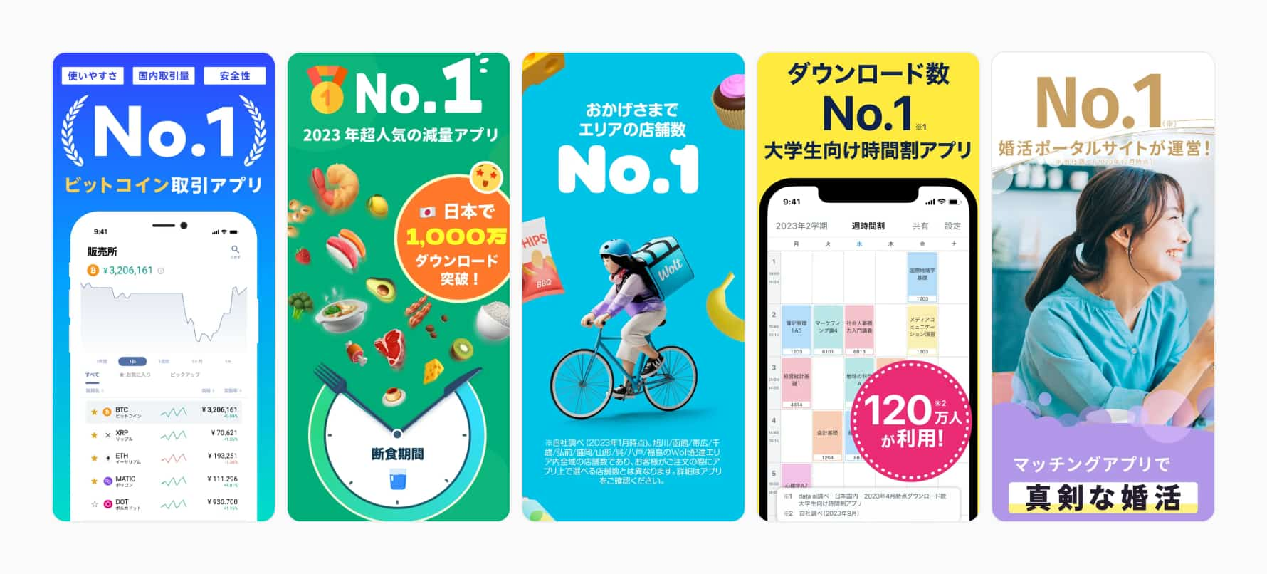
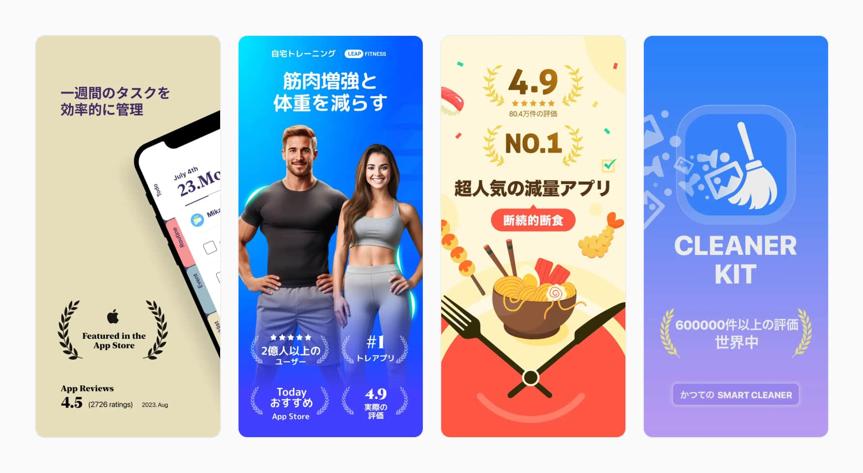
Uncertainty avoidance is one of the most impactful traits of Japanese culture. According to data from the Cultural Factor Group, a cultural analytics and strategy advisory with a global reach, Japan scores exceptionally high in this dimension, with 92 points out of 100, signifying a tremendous preference for predictability (country scores are sourced from various scientific journals, aggregated and analyzed by the company).
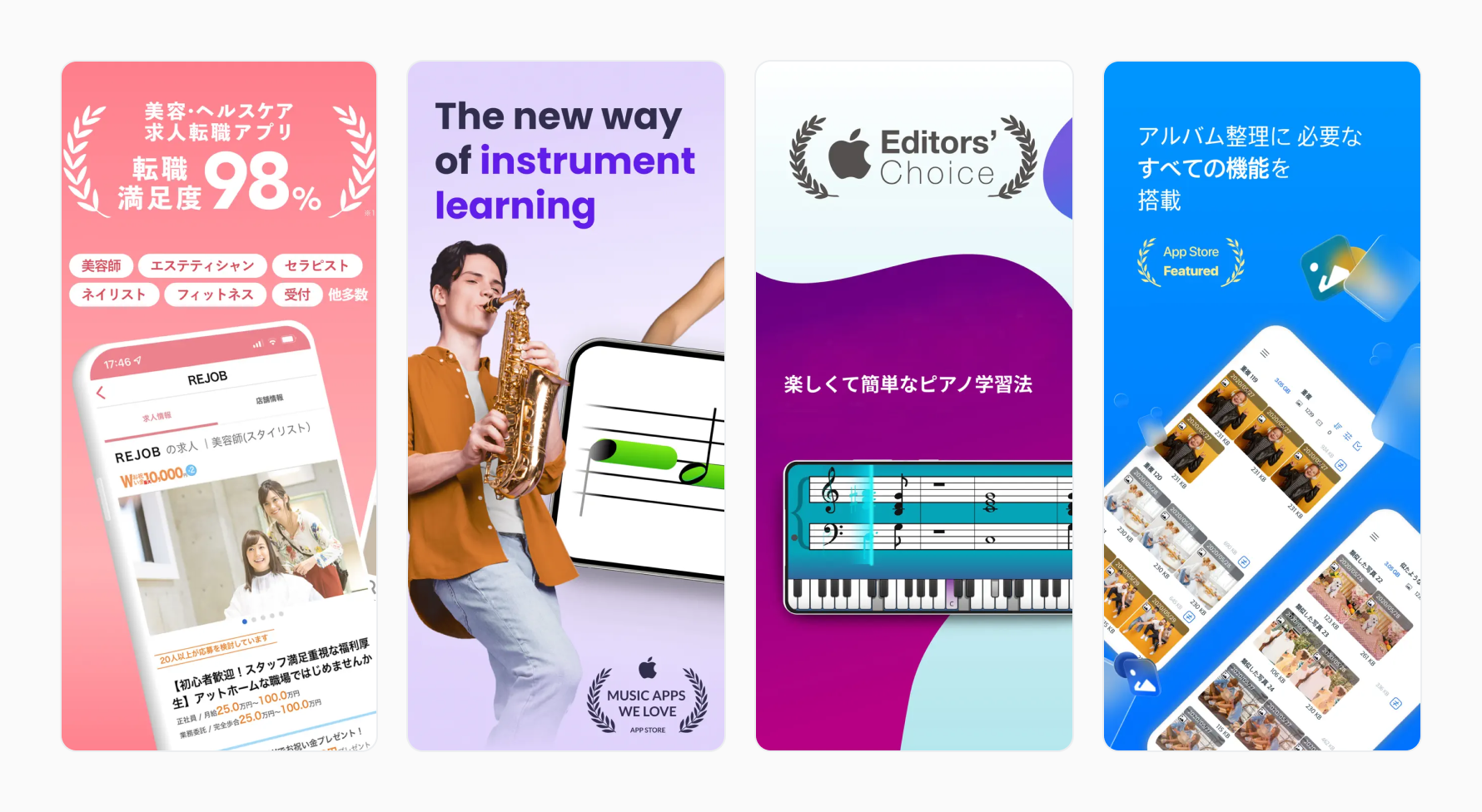
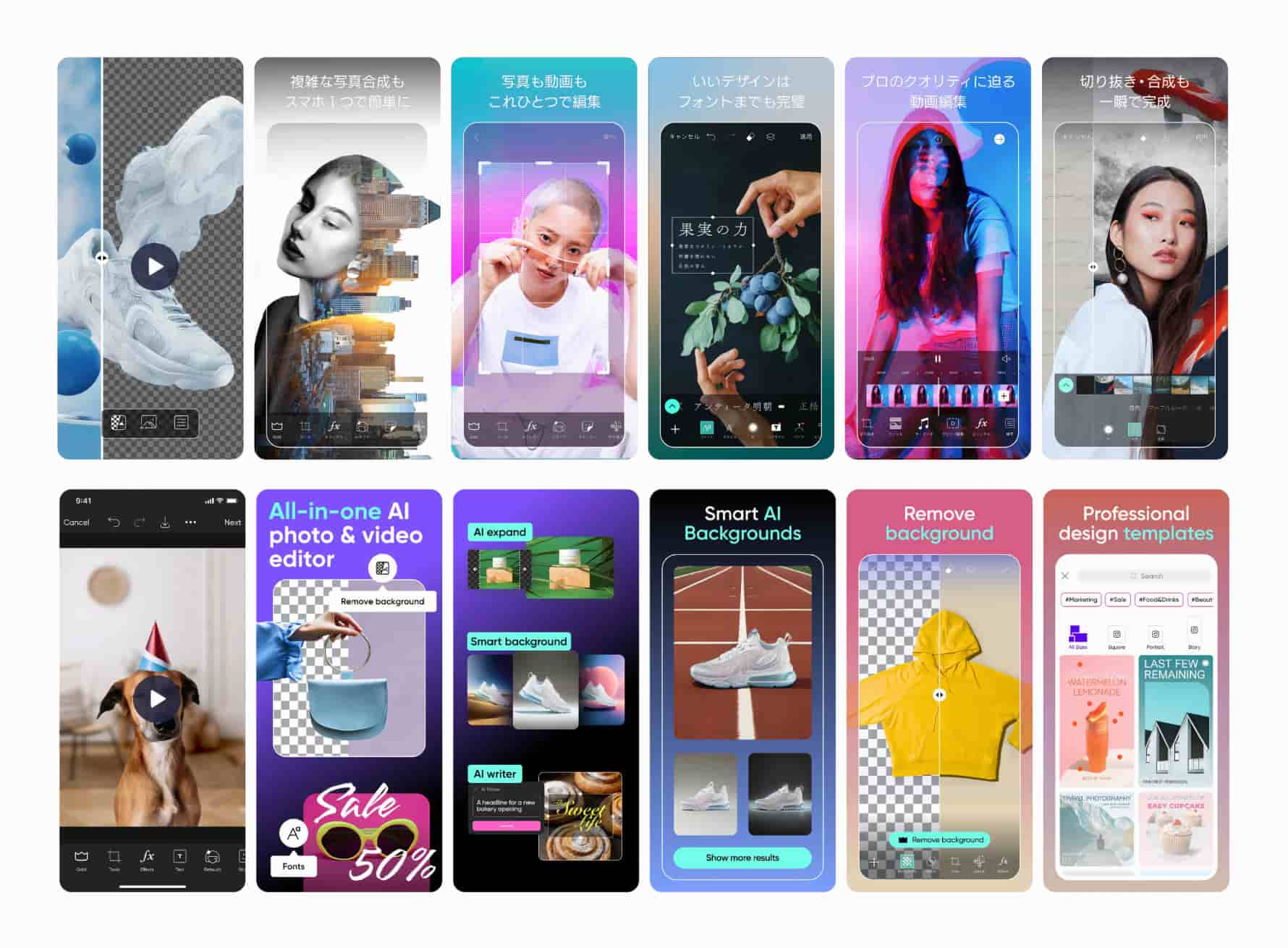
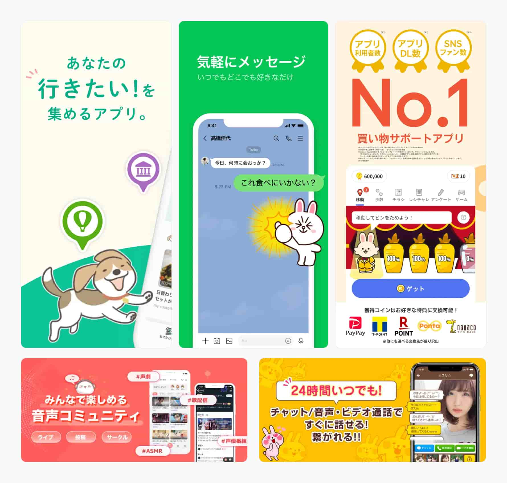
The impact of this trait reverberates throughout several design principles that many apps present in Japan adhere to. Notice the prominence of “No. 1” badges on the first and most crucial screenshot on an app’s product page. This design element is visible across all mobile app and game categories.
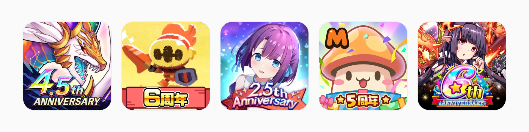
Additionally, notice how eager mobile games are to display their time on the market. It’s a parameter especially vital to those with long lifecycles. Celebrating anniversaries showcases a healthy ecosystem with steady updates and a satisfied player base.
Risk aversion is inherently tied to the need to make informed decisions. Those call for more facts, insights, and proof that your app can deliver what it promises.
The source of this trend goes beyond the need for certainty, motivated by high pragmatism and the quest for the best solution (not merely good enough), but is deeply rooted in the aesthetics of the language itself.
The written language itself is space-efficient and compact. While Western design is object-related and placing a single message or feature front and center is the most common practice, East Asian viewers are generally able and willing to process more information holistically. Design Theory, a fun Youtube channel focusing on the principles of creativity and design, has a great YouTube video on this topic, which helps to explain why images on Japanese product pages look the way they do:
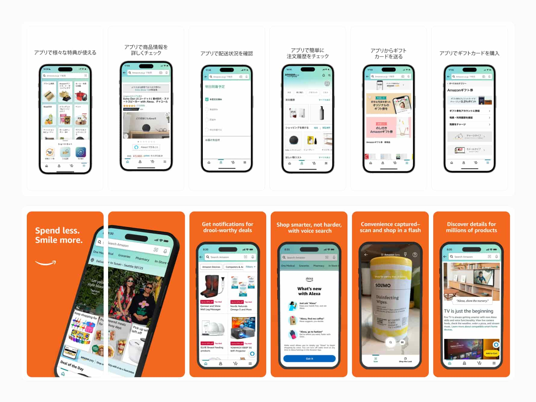
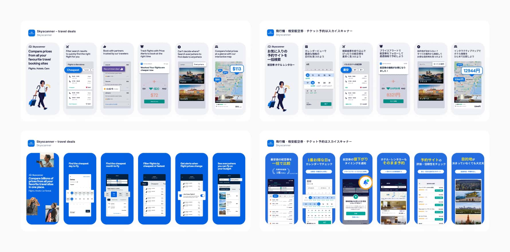
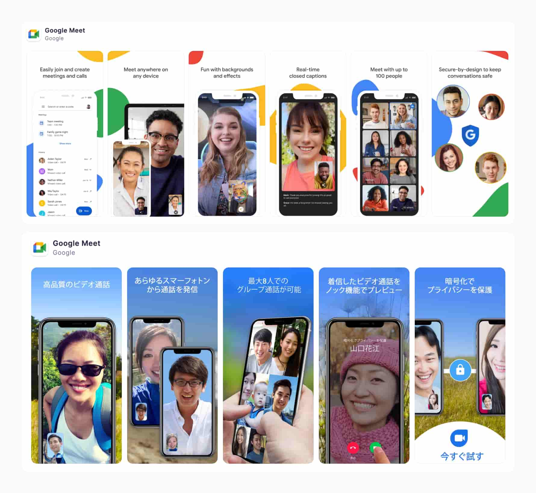
A quick comparison of screenshots from American and Japanese app product pages shows that although there is a difference in information density, it’s not as pronounced as with traditional online ads. Many mobile apps and games are global and strive for a relatively consistent look while maintaining a cohesive brand identity and reducing costs.
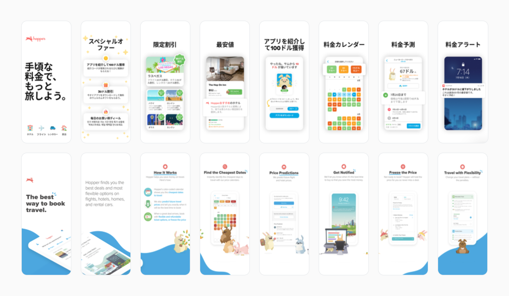
It seems more likely to encounter such differences in Shopping, Lifestyle, Travel, and Financial apps – wherever more information is needed to process all the special offers, discounts, or benefits available.
While it’s common for Western and Japanese apps to embrace a clean aesthetic that focuses on a single message, apps in Japan aren’t shy about using space more efficiently, delivering key details on promotions, special offers, customer reviews, etc.
App ratings tremendously impact an app’s product page conversion rate, with three-digit differences between 3.0 and 4.0 ranges not uncommon. A long-term, pragmatic approach to review management may be especially important in the Japanese market.
Such an approach is advisable in all markets, but pay extra attention to courtesy in Japan. Tokhimo, an HR & recruitment company, has an excellent article about this subject: Omotenashi: How Japanese Treat Their Customer with Extra Care.
Reviews and ratings aren’t under your direct control but should be within the scope of work (or at least concern) of the ASO team. Allocate time and resources to communicate with your audience and study what they say about your app.
Reply to all reviews (positive, negative, and updated ones), showing that you care and understand that even criticism can be a growth point for your app. According to data released by App Radar, developers who reply to users’ reviews have increased their star rating by 0.7 points. If you’re going from 3.5 to 4.2, this will mean a three-digit CVR uplift. App Radar’s AI-driven review management features will tremendously help you accomplish this task.
Comparison of American app product pages and those targeting Japanese customers reveal examples of different color utilization. In general, color associations are very similar in both markets, but we’d like to highlight two of them:
Our own research with SplitMetrics Acquire and CPP Intelligence confirmed research published by academics from Tokyo, Berkeley, and Wisconsin-Madison:
“Reliable differences were present in preferences for brightness/saturation levels, however. In particular, Japanese observers had a greater relative preference for light colors, rating light colors higher than Americans did and rating dark colors lower than Americans did. Japanese observers also liked desaturated (muted) colors less than American observers for warm colors (chartreuse, yellow, orange, red, and purple) but not for cool colors (green, cyan, and blue). Males in both cultures tended to prefer saturated colors more than females, whereas females in both cultures tended to prefer desaturated colors more than males.”
Familiarity is crucial for engaging users and fostering a sense of connection. Incorporating recognizable Japanese elements like Torii Gates, Sakura flowers, Mount Fuji, traditional temples, and Koi fish can evoke a cultural resonance and appeal to Japanese users. These symbols enhance the visual appeal of screenshots and icons and create a welcoming atmosphere, instilling trust and credibility. By integrating such elements, app developers can create a more immersive and memorable user experience, increasing the likelihood of user engagement and retention.
Fashion & food preferences also play a key role here, which applies to the world of many causal mobile games and apps from categories such as Travel, Food, Lifestyle, and even Photo & Video.
Despite the differences, creeping globalization impacts Japan too. Many apps that originate from the West do well enough by merely changing calls to action on their screenshots, with the power of their brand obviously being a factor (and probably a hefty marketing budget).
This has two effects: many growing apps emulating their minimal localization efforts, and Japanese users becoming more accustomed to Western aesthetics.
Sometimes, it’s difficult to pinpoint why an app has a different set of imagery for its Japanese product page. In other cases, changes are more subtle or technical, showcasing a history of possible A/B testing that considered more factors affecting the conversion rate, like demographics, which can be slightly between two markets and different marketplaces.
There’s only one logical conclusion to these considerations: be ready to explore your options with A/B testing, which will be cheaper than wasting precious work hours of your designers on a page that fails to convert by an order of magnitude.
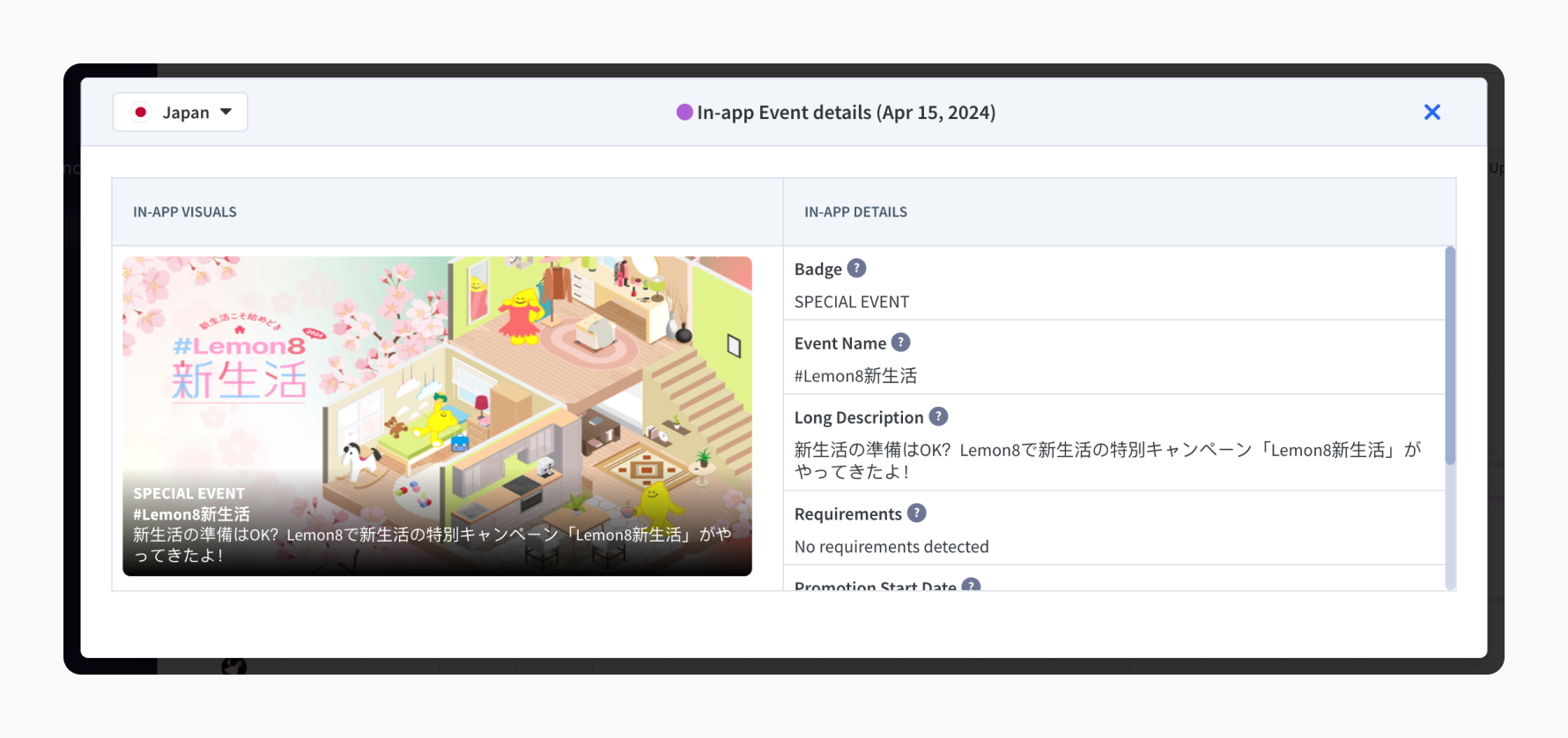
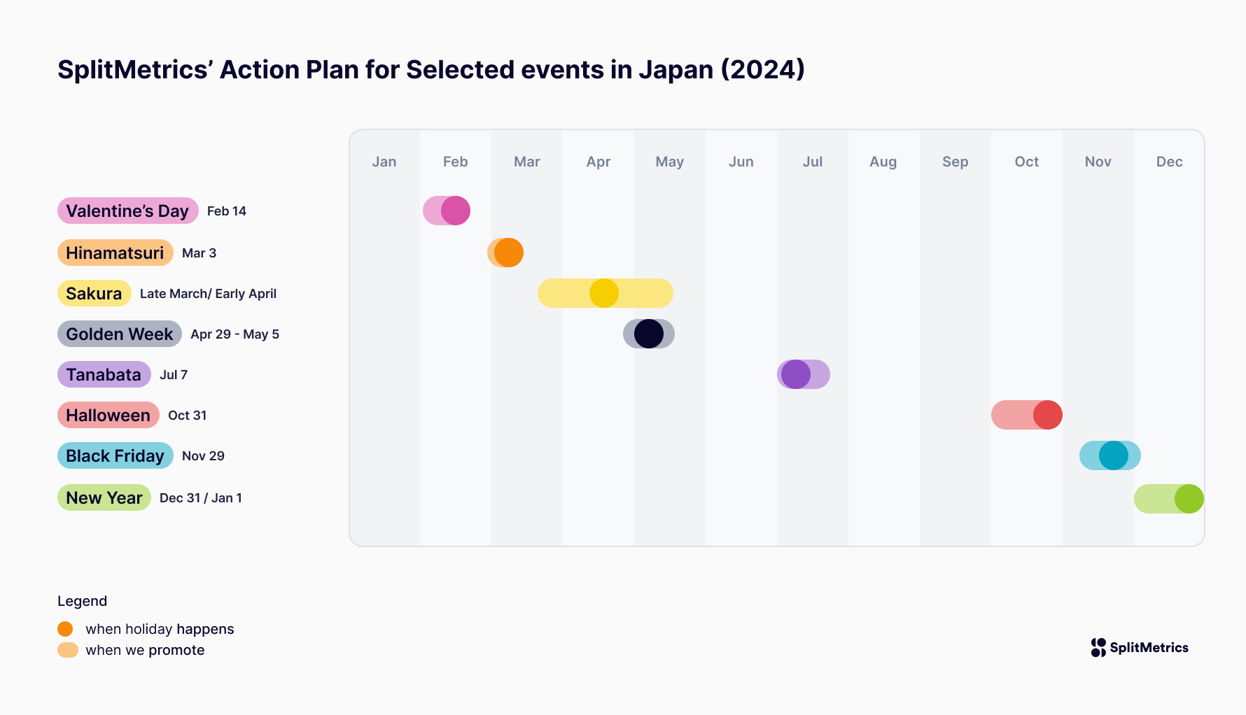
Each market has unique holidays and festive periods, allowing app developers to connect better with their audiences. Japan offers many such opportunities. Japanese App Store is teeming with in-app events. Mobile games are especially likely to release time-sensitive updates, referring to important festivals or seasons of the year, but frequently celebrating in-game lore, characters, or their ever-evolving stories.
The list below includes selected holidays or festive periods that Western-based app developers may want to explore while launching their apps in Japan or running seasonal campaigns for them.
We’ve included those holidays that can be considered easy & safe to celebrate and most importantly – have a wide appeal. They are heavily ingrained in popular culture without difficult undertones or meanings. Therefore, they don’t require high cultural sensitivity and considerable preparation to employ in an inoffensive and appropriate manner.
Event duration: Late March, April… and beyond. Sometimes forever ;)
Promotional activity: Late March, April, sometimes even May
Most relevant for app categories: All
Japanese cherry blossom season, known as the “Sakura” season, is a highly anticipated time in Japan, marking the blooming of cherry blossoms (sakura) across the country.
Observing the multitude of in-app events, re-designs, or just designs, it’s safe to say that this is probably the most important celebration you can have on both the App Store and Google Play, hands down. Judging by the screenshots, icons, or in-app event imagery, the Japanese simply love cherry blossoms, and it’s probably impossible to overdose on them.
We highly recommend running A/B tests of holiday designs before any updates. SplitMetrics Optimize offers testing methods for meaningful results in short time frames.
Key design elements: Incorporate cherry blossom motifs, such as sakura flowers, cherry blossom branches, and petals, into your app’s design elements.
Recommended color palette: Opt for soft pastel hues inspired by cherry blossoms, including shades of pink, white, and light green. These colors reflect the delicate beauty of Sakura and create a tranquil, serene ambiance in your app’s visuals.

In theory, the Cherry Blossom Season lasts for spring, but we’ve noticed that many apps and games incorporate the pink Sakura flower into their design throughout the year. Pink Sakura flowers are used as an indispensable accessory for feminine characters in mobile RPG games and as a decoration for health, fitness, travel, and fashion apps.
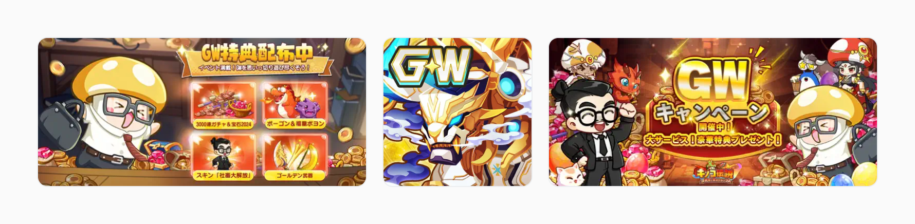
Event duration: April 29th – May 5th
Promotional activity: April 29th – May5th (12th in practice)
Most relevant for app categories: All
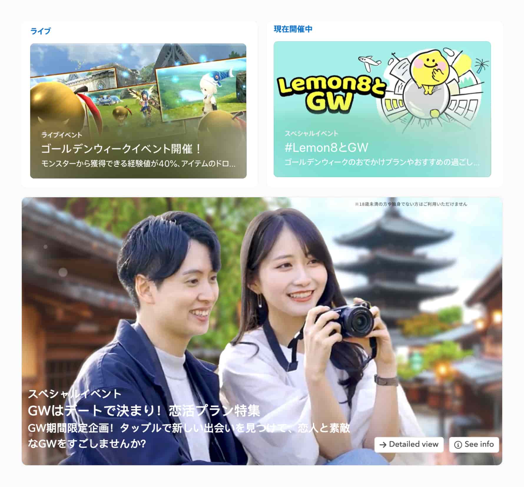
Golden Week is a series of public holidays in Japan that usually occurs from late April to early May. It includes Showa Day (April 29th), Constitution Memorial Day (May 3rd), Greenery Day (May 4th), and Children’s Day (May 5th).
Golden Week is a popular time for travel, shopping, and leisure activities, as many people take advantage of the consecutive holidays for vacations and outings.
Key design elements: Although many iconic symbols are associated with the Golden Week, most mobile app developers use the Roman letters “GW,” it’s difficult to discern a cohesive visual way to celebrate these days in mobile apps.
Recommended color palette: There is no dominant color save for golden elements. However, even those weren’t used consistently in analyzed apps. The message, or just the abbreviation “GW,” is the key player in this holiday.
There are many factors influencing the final design decision on the extent of holiday-related redesign (like brand identity and unique visual style); incorporating gold hues (both muted and vibrant) into the creative’s color palette is effective in terms of attainable conversion rates.
Event date: July 7th
Promotional activity: Late June to middle of July, with exceptions.
Most relevant for app categories: Games
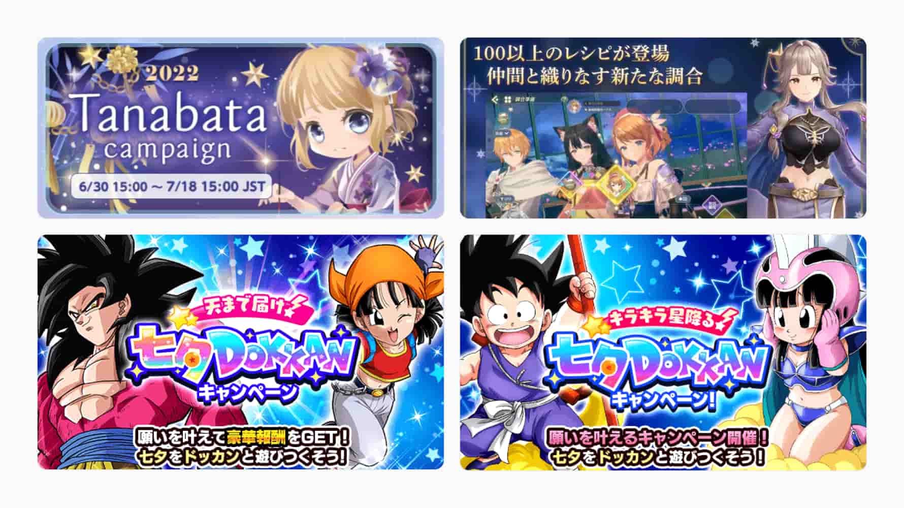
Tanabata, also known as the Star Festival, is a traditional Japanese celebration on July 7th. It commemorates the meeting of Orihime and Hikoboshi deities, represented by the stars Vega and Altair, who are allowed to meet only once a year on this day. Tanabata festivals feature colorful decorations of paper strips (tanzaku) hung on bamboo branches, symbolizing wishes and aspirations.
Key design elements: Incorporate luminous effects, constellation patterns, the Moon, and the night sky to evoke the magical ambiance of Tanabata.
We’ve found that traditional Tanabata decorations, such as bamboo branches, tanzaku paper strips, and star motifs, aren’t widely incorporated. Most developers chose night and star motifs to create a romantic atmosphere. Additional elements from other summer festivals may also be incorporated: fireworks or lanterns.
Tanabata enjoys a similar position to the Cherry Blossom, with night skies, crescent moons, and stars incorporated into mobile games throughout the year to create an atmosphere of magic and romance.
Recommended color palette: Consider incorporating hues reminiscent of the night sky, such as deep blues and purples, to evoke the magical ambiance of Tanabata and complement the star motifs in your app’s design elements
Mobile games take full advantage of Japan’s incredible diversity of festive events. In their pursuit of monetization opportunities, developers are eager to explore celebrations held worldwide.
In-app events positively impact retention, engagement, and opportunities for keyword indexing. They can be prominently showcased in curated sections on the App Store and Google Play in the Games and Apps tabs, where the advantages of seasonal relevance truly come to light.
Additionally, apps operating on a global scale bring more events and customs to Japan, which have become a mainstay there. Here are some recommendations worth exploring:
In Japan, seasonal sales are launched at the intersections of the changing seasons. They are important events for the entire fashion industry, clearly visible among mobile apps from the Lifestyle and Shopping categories.
While all can be considered important, Winter sales are the most prominent, traditionally starting a few days into a new year. However, we’ve seen mobile apps utilizing winter sales or bargains communication on their product pages in December or November.
Explore the natural beauty of the seasons
There’s a lesson to be learned from examining the influence of seasonal aesthetics on design. Sakura’s everlasting presence in apps from all categories and summer night starlit skies in many mobile games showcase the cultural importance of nature and admiration of it in all its forms.
Each of the seasons has its own unique beauty and atmosphere. Savouring them is visible in day-to-day life, with Sakura and Autumn leaves sightseeing being a thing (for more about the custom of Momijigari, read the article Autumn Colors: A Guide to Visiting Japan in Fall)
Exploring making the beauty of each season visible on your app’s product page may help captivate your users. This can especially benefit Photo, Lifestyle, Health & Fitness, Travel, Shopping apps, and Games. Whether you give your app’s product page a complete makeover, create custom product pages leading to specific seasonal keywords (winter jogging, summer workout etc.), or include them permanently (perhaps changing their order) is up to you… or best, A/B tests.
Event date: February 14th
Most relevant for app categories: Games, Lifestyle, Shopping
Valentine’s Day in Japan has its own special twist, as women have to express their affection for men, typically by giving them chocolates. Additionally, there is a reciprocal holiday called “White Day” on March 14th. Men are expected to return the gesture by giving gifts, often candies or cookies, to the women who gave them chocolates on Valentine’s Day. From the perspective of mobile app marketers, employing this holiday is very similar to what’s practiced in the USA or Europe – by adding hearts or more intense pink color hues to existing imagery.
Event date: March 3rd
Most relevant for app categories: Games for children
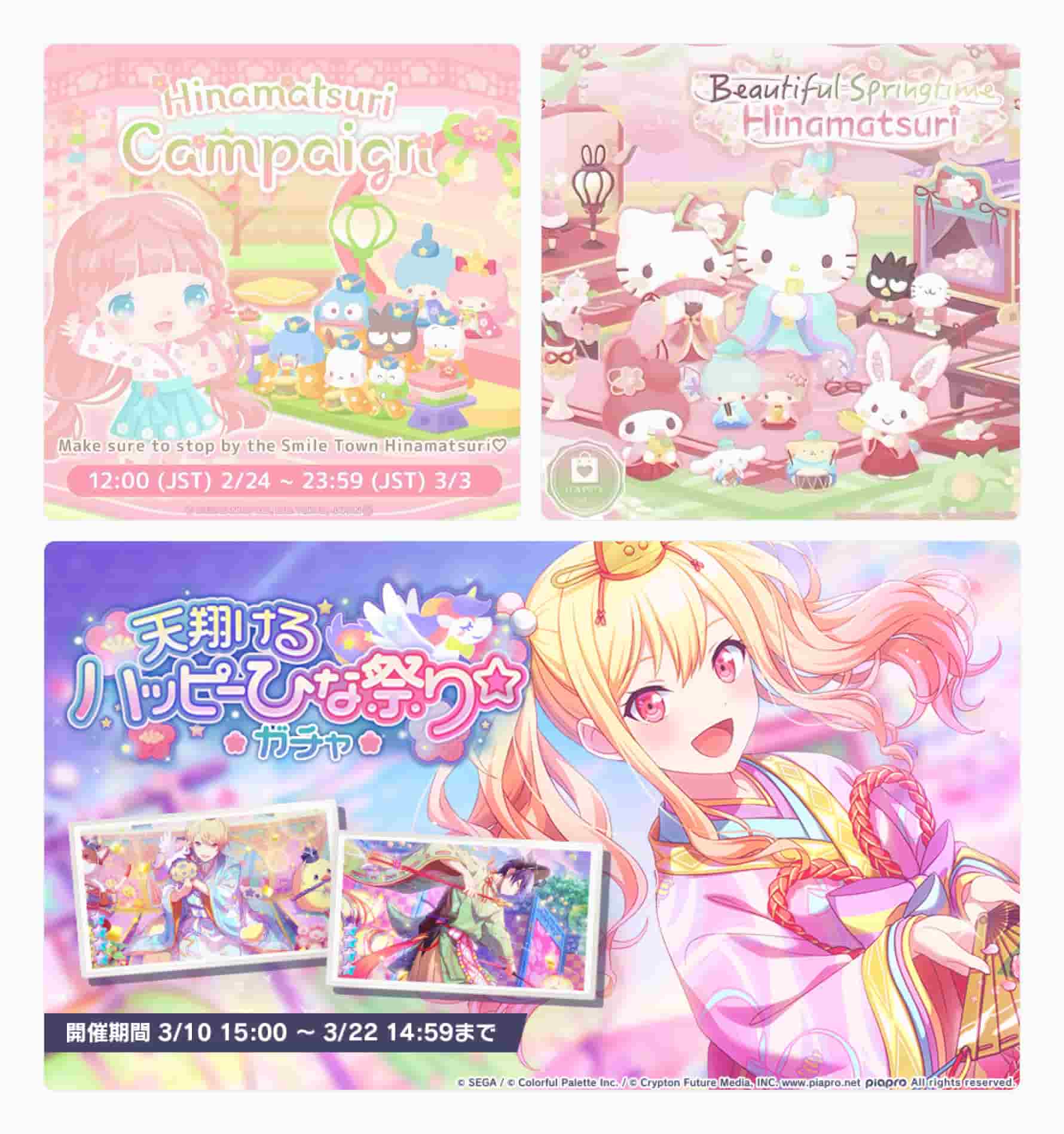
Hinamatsuri, also known as Doll’s Day or Girls’ Day, is a traditional Japanese festival celebrated on March 3rd. It’s a day to pray for the health and happiness of young girls in the family. In the mobile games sphere, the focus is on traditional clothing and all-around sweetness (and pinkness 😉). Unsurprisingly, the holiday is mostly celebrated by games and apps targeted at children. The examples above are from popular children’s games: Hello Sweet Days, Animal Crossing, and Hatsune Miku COLORFUL STAGE! by SEGA.
Event date: Oct 31
Most relevant for app categories: Games
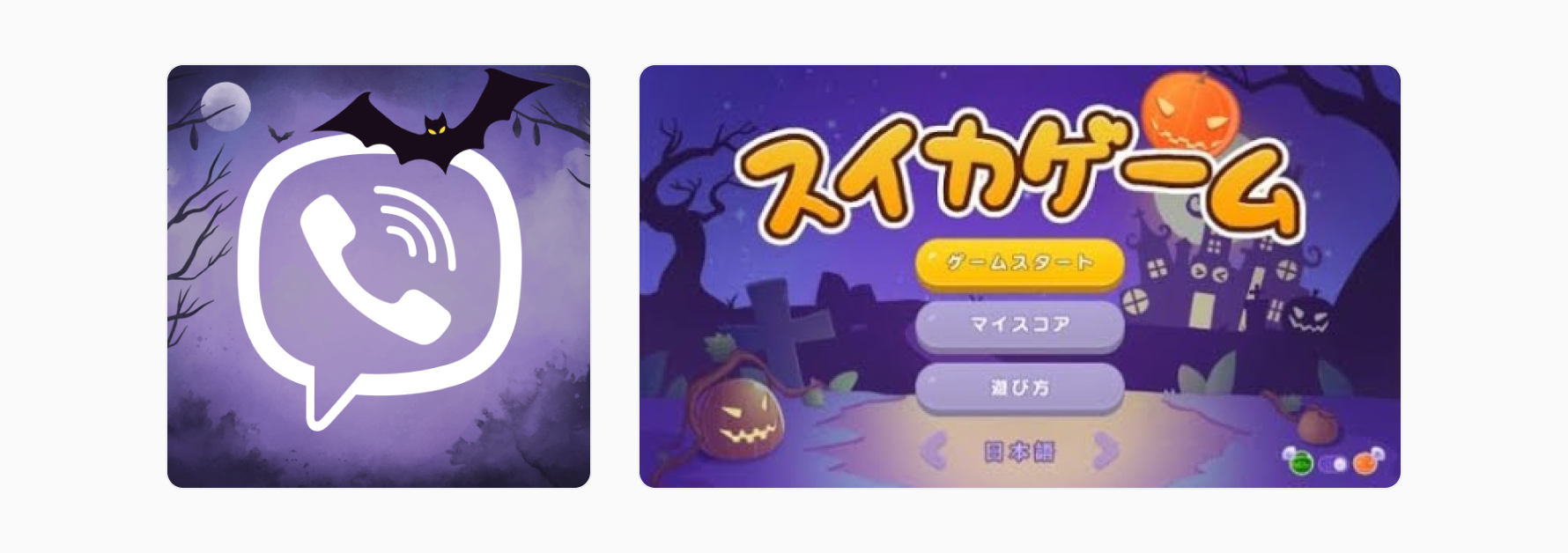
Halloween is increasingly observed in Japan, particularly among younger generations and in urban areas. While not traditionally a Japanese holiday, Halloween has gained popularity in recent years as a fun and festive occasion for costume parties, themed events, and trick-or-treating.
Event date: Nov 29
Most relevant for app categories: Shopping, Lifestyle
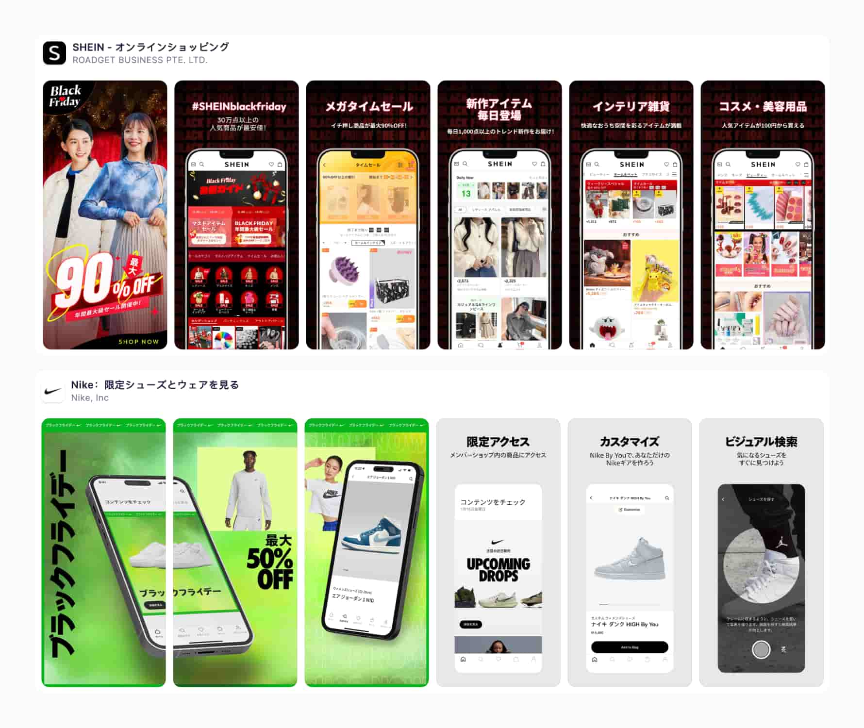
Black Friday originated in the USA. Celebrated (or rather practiced) after Thanksgiving, it comes after a longer holiday weekend. It arrived in Japan not long ago, and it seems like it found its place close to Japan’s traditional winter bargains. Western brands propagate Black Friday, but some Eastern Asian brands also pick it up in their app marketing activities.
We know this list is not comprehensive, but it gives enough options for most apps to explore in their localization efforts & seasonal campaigns.
ASO plays a fundamental role in localizing an app, as it’s responsible for its presentation. The scope of work includes these five tasks:
Let’s see how we can use all the insights from this article to succeed at them.
Take a closer look at all the images we’ve collected for this article. Have you noticed anything peculiar about app titles and subtitles?

Japan has three writing systems, each serving a different purpose:
As Duolingo puts it on its blog, “hiragana and katakana both represent sounds, while kanji represent meanings”. Technically, you may write the same word in the three scripts and convey your thoughts fairly well. Search Google images for ネコ or ねこ, and you’ll get cats. However, picking the right one in marketing communication matters, as some choices may feel odd, out of place, or outdated. The choice between hiragana, katakana, or a combination depends on context. Using the wrong one can lead to confusion, even if an alternative is technically possible.
In practice, all three scripts are used in the App Store in Japan. English words can be in there, too (notice all the “No. 1” weren’t translated), and not only for foreign apps but native ones, too.
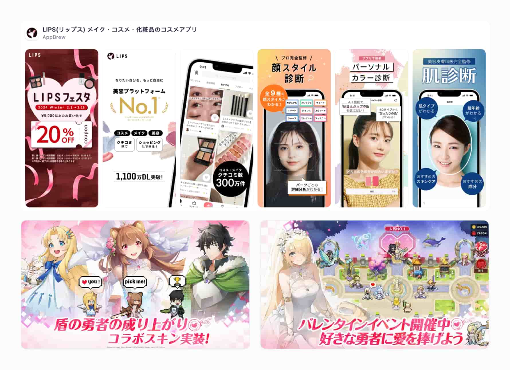
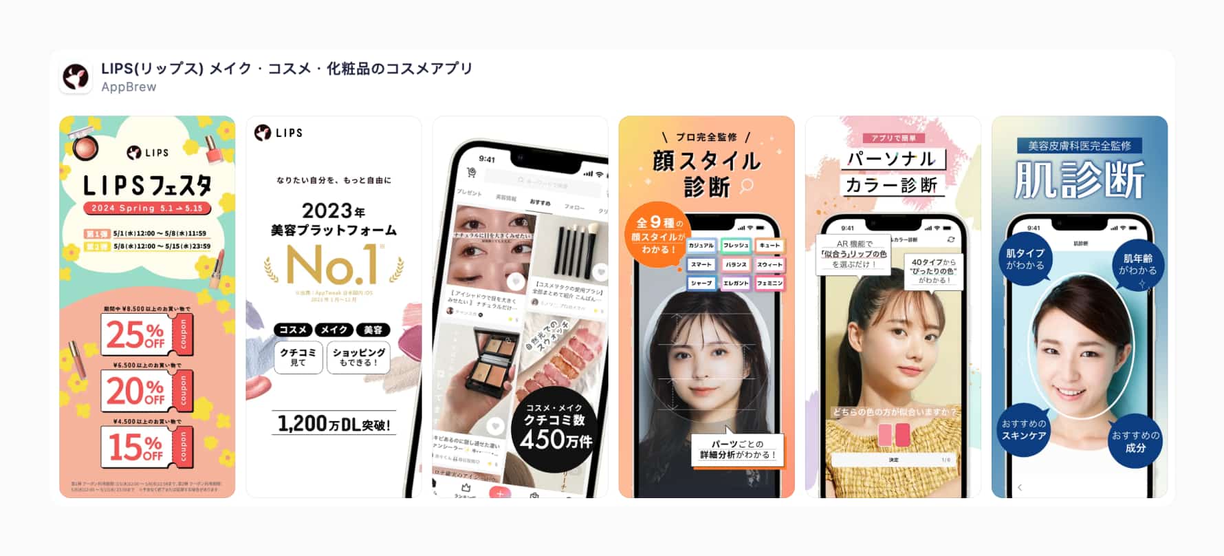
Let’s dissect the example above. The app has the title: “LIPS(リップス) メイク・コスメ・化粧品のコスメアプリ” and subtitle “顔診断やパーソナルカラー診断、肌診断でメイク、コスメの参考に”. Let’s look at the title alone.
The text “(リップス)” represents the word “Lips” written in katakana, which is one of the Japanese scripts used for writing foreign words and phonetic sounds.
The rest of the text, “メイク・コスメ・化粧品のコスメアプリ”, is written in a mix of kanji, hiragana, and katakana:
Overall, the app combines different Japanese writing systems and English words to convey the title: “Lips: Makeup, Cosmetics, and Beauty Products App.” Translating into English, the title and subtitle are as follows:
There’s one important advice we’d give you for translations: if you’re using AI, give it more context for your translation. Specify target audience, tone, and feel. You will get different results depending on your specifications.
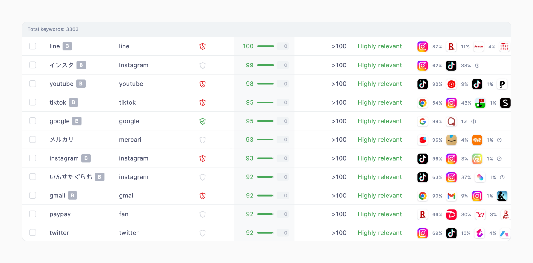
We ran a small experiment with Chat GPT and Nike and got the following translations:
After providing more context and exploring options, the AI admitted that the official version, “Nike:限定シューズとウェアを見る” is the best, as the no. 1 might seem too formal and no. 2 might not be precise enough for sports apparel. “Nike” is in the title because of the high prominence of this branded keyword.
AI helped us with these translations greatly (and understand the entire issue better), but we can only advise you to seek professional assistance regarding translations.
Title, subtitle, and keyword fields are crucial to organic rankings in the App Store. How do you select keywords for them, considering three writing systems and sticking to the principles and best practices relating to them?
Despite the complexity of Japanese alphabets described above, the answer to that question is very simple: the choice of keywords for your keyword field, title, and subtitle should always be driven by their performance metrics and relevance to the functionality of your app and brand. Treat words in different scripts as separate keywords for all intents and purposes.
While digging into keywords related to various custom product pages, we discovered that it’s more likely to be faced with a dilemma whether to translate your brand’s name from English (or any other language, for that matter) or not. Take a look at the keyword list below:
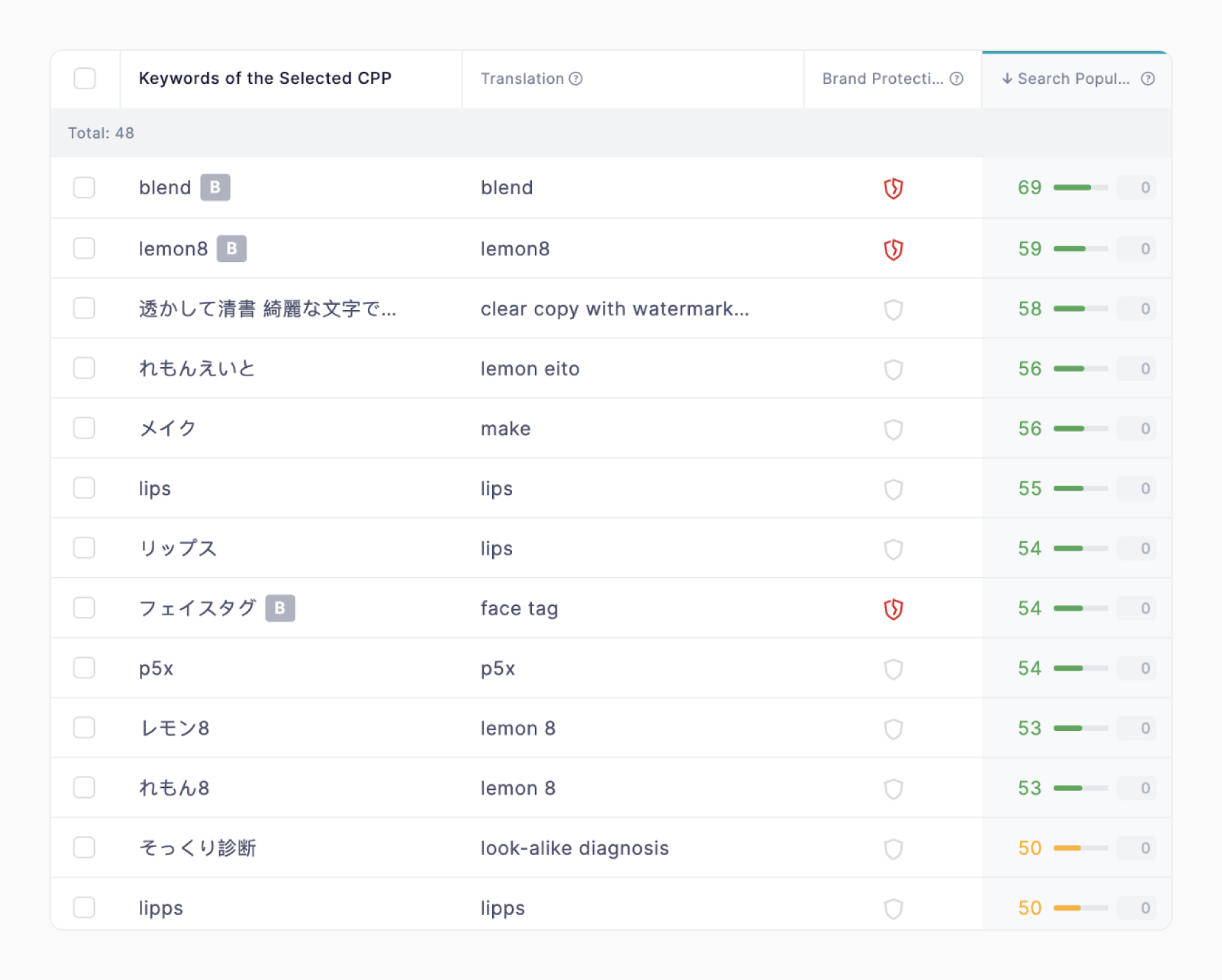
Lemon8 and LIPS are among the most popular apps in Japan. Their names include English words because the App Store users are using them. This goes beyond brand names, with many examples of mixing languages: “rpgゲーム”, “rpg 無 料 人 気” and so on.
Again, the solution here is not to overthink things. Keyword expansion is easy with SplitMetrics Acquire, as the platform provides translations and, most importantly, detailed metrics to help you evaluate each keyword. Properly set automation rules will purge any underperformers the second they’re spotted.
Learn how iSharing Automated Apple Ads with SplitMetrics Acquire to manage it in 17 Asian markets. Read the full case study
When in Rome, do as the Romans do. We hope our article sheds some light on what it actually means. Still, we know that what we can offer in a blog post will trigger that Dunning-Kruger effect for some (when you know enough about a subject that you’re aware you don’t know enough, having escaped the sweet bliss of ignorance, but not being a confident expert yet).
ASO is all about practicality, so instead of drowning in specialist literature (although that will be a fascinating endeavor in itself), we highly recommend building your ASO strategy for Japan on two pillars:
The reason is very simple: the multitude and diversity of factors ultimately influencing conversion rates for an app go way beyond local customs and generalized preferences. Brand power, demographics, time of the year, and direct competition which is visible in the search results and as recommendations on product pages. This article can give you a basic overview of what might work, but what will work calls for more targeted research.
Check out our comprehensive guides to ASO competitive research and A/B testing framework:
ASO Competitive Research & Analysis: a Step-by-Step Guide
SplitMetrics A/B Testing & Validation Framework to Win on the App Store
Here’s how the Market Intelligence features of SplitMetrics Acquire will help you with that precisely targeted competitive research:
In addition, remember that our Keyword Discovery tool enables you to expand keywords in three manners: by analyzing your app, evaluating your competitors, or extrapolating your direct input (offering more suggestions by keyword). Learn more about keyword expansion in this comprehensive guide: Apple Ads Keywords in 2024: Basics, Expansion & Best Practices.
Additionally, App Radar has some fantastic features for market and category research, as well as benchmarking:
Localizations: this tool lets you easily preview product pages for different markets. Gain a comprehensive understanding of how your competitors approach localizations.
App Timeline: lets you monitor metadata updates and in-app events of selected competitors, giving you insights into their holiday re-designs and other optimizations.
Metadata Benchmarks: benchmark your app against a category, comparing your metadata parameters against top apps.
Kaizen is a Japanese business philosophy that focuses on continuous improvement. The term “kaizen” translates to “change for the better” or “continuous improvement.” It involves making small, incremental changes to processes, products, or services to improve efficiency, quality, and effectiveness over time.
It’s probably the best advice we can give you for exploring the Japanese market and implementing all the insights collected in this article. Don’t base your design choices on assumptions. Don’t treat any elements shown here as “must haves”, but rather as things to try out if a basic 1:1 copy doesn’t bring sufficient return on investment.
So many factors can impact the final design of an app’s product page that you shouldn’t focus on the cultural aspect of international expansion. Different demographics and competition can play a role here.
A/B testing will be your most important tool in determining the actual preferences of your target audience. We can’t overstate the importance of following a solid framework and planning not a single test but rather an entire series of them. For example:
Run pre-launch A/B tests for your app to secure a successful international debut with SplitMetrics Optimize.
Embracing local holidays will probably be a culmination of your international expansion efforts. Promotional activities extend before and after any holiday. Give yourself a month to prepare before any scheduled marketing efforts occur. The infographic below shows when promotional activities are run for each holiday.
Each market has unique holidays and offers many seasonal opportunities to marketers willing to reach out to them. Check out our two articles about holiday design & ASO tips for the USA:
The Ultimate Seasonality Guide for User Acquisition on the App Store
The Ultimate Seasonality Guide for User Acquisition on the App Store #2
Three writing systems, more festivities than any app can handle. Unique design preferences. It may seem overwhelming, but small steps make it possible. We hope this article inspired you to explore the wonderful market of Japan and think of all the ways you could win over the hearts of new users there.