ASO — 5 Aug 2025
iOS App Icon Sizes, Requirements and Guidelines (With Apple WWDC 2025 Updates)
 Maryna Dorash
Maryna Dorash
Maryna Dorash

The app icon on iOS is a critical visual element for app store optimization (ASO) because it directly influences your app’s visibility, user appeal, and conversion rate. It is one of the top three visual assets that has the most significant impact on whether a user decides to download your app.
In this comprehensive 2025 guide, you’ll learn:
If you create or manage app icons for a living, this article is your one-stop resource for staying ahead in a competitive App Store world.
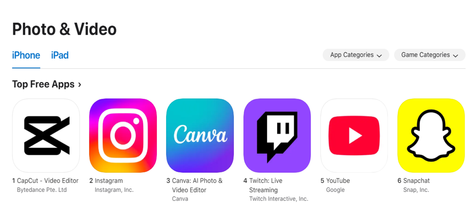
Your iOS app icon is often the very first — and sometimes the only visual element users encounter in App Store search results and top charts. This makes the app icon a primary driver for attracting attention within the busy App Store environment.
Your iOS app icon serves as the first visual touchpoint for potential users, with App Store impressions counted each time it is seen. Its role is essential for discoverability, representing the very beginning of the user acquisition funnel on the platform impacting your Apple app store optimization.
A strong app icon is also vital for creating an excellent first impression and differentiating your application from competitors. A unique and memorable design helps your app stand out and capture user interest immediately after being discovered.

Below are the latest technical guidelines, requirements, and important icon sizes for iOS app icons, drawn directly from Apple’s current official sources and developer documentation
Apple requires a 1024×1024 px app icon. The system then scales this master image to all required sizes via Xcode or the asset catalog.
The essential icon sizes used by different devices and contexts are listed below.
| Platform / Context | Icon Size (px) | Usage Example |
|---|---|---|
| App Store / Submission | 1024×1024 | App Store, iTunes Connect |
| iPhone Home Screen | 180×180 | iPhone Pro, Retina |
| iPhone Spotlight | 120×120 | Search, results |
| iPad Pro Home Screen | 167×167 | iPad Pro |
| iPad Retina Home Screen | 152×152 | iPad, iPad mini |
| iPad Spotlight | 80×80, 120×120 | @2x, @3x |
| iPad Settings | 58×58, 87×87 | @2x, @3x |
| Notifications (iOS/iPadOS) | 40×40, 60×60 | @2x, @3x |
| Apple Watch Home | 172×172 | watchOS |
There are a couple of more important points to highlight:
General guidelines include:
Apple has brought a couple of big changes relevant to app icon design in 2025.
Optimizing your app icon can significantly boost your conversion rate, with studies showing an average uplift of 22.8% (SplitMetrics ASO Benchmark Report). This means you can drive more downloads simply by updating your icon – without redesigning your screenshots or product description.
If your app title does not include your brand name, consider featuring it or your logo in the icon to reinforce trust and grow brand recognition. This is a key ASO strategy for building trust, especially when users are not yet familiar with your brand.
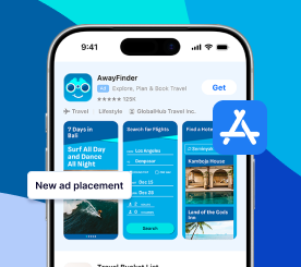
An app’s icon also appears on all promoted In-App Purchases (IAPs), which increases its visibility across the App Store. This placement reinforces brand presence and highlights the need for a clear and legible icon design that performs well at various sizes.
When designing IAP promotional art, remember that the app icon will always be placed in the bottom-left corner. It is crucial to ensure that no important imagery in your IAP creative is obscured by this automatic overlay.
To make your app icon stand out in the App Store, start with a strategy rooted in your category’s visual language, but don’t be afraid to break the mold. Avoid copying competitor icons too closely, as this can make your app prevent from standing out.
A high-quality app icon design created by a graphic designer is central to ASO. Follow these key principles for an effective icon.
A simple icon design ensures the icon is recognizable even at the smallest size. Avoid clutter and focus on a single element that captures the essence of your app.
Color is a powerful tool in making an icon pop. Choose colors that align with your brand and contrast well against the App Store background and other apps.
For example, when designing a logo, incorporate a unique shape or symbol that can become synonymous with your app. This shorthand visual can make your app instantly recognizable.
Ensure that the icon reflects the design and color scheme of the app itself. This consistency reinforces your app’s brand and improves user experience.
Design several icon options and test them with your target audience. Use feedback to refine your design until you find the most effective icon.
The best app icon designs effectively leverage your brand by using its most recognizable symbols, elements, and colors. This practice helps build instant recognition and reinforces your brand identity directly within App Store search results and browse sections.
For apps without massive brand recognition, including the app name or wordmark in the icon is a reliable ASO tactic. This strategy helps build user trust and connects the visual asset directly to your brand, improving recall and conversion.
Your app icon should include graphic elements or illustrations that simply and intuitively explain its value proposition. These visual identifiers help users quickly understand what your app does, which can improve click-through and conversion rates from search listings.
A clear and simple design ensures that your icon is easily recognizable and memorable by users browsing the app marketplace. Focus on a single element that represents your app or game effectively, avoiding clutter that can dilute the icon’s impact.
Your app icon should follow the same guidelines and convey your brand image. Include the color schemes, typography, and overall brand style. Consistency with your brand helps to build recognition and trust with users.
The key takeaway is that at first sight, the user should know it is yours and recognize your brand in the app icon design.
While using your logo in the icon can work for well-established brands, there are better approaches for all apps. Sometimes, a more abstract or illustrative design can better convey the app’s purpose and appeal to users.
Adding a subtle border can help your icon stand out against different backgrounds and ensure it remains visible on any device screen.
Since users can choose between a clear and a dark background, you need to make sure that the icon stands out on every background.
Choose a background color or design that complements the icon’s main element and enhances its visibility and attractiveness. A very dark icon could go unnoticed on a dark background, so you could go for bright colors adapted to both backgrounds.
Avoid overly busy or detailed backgrounds that can make the icon look cluttered.
Research the common color schemes used in your app’s industry or niche. While it’s important to stand out, you also want to ensure that your icon’s colors align with user expectations for your type of app.
Go for the ones that best represent the essence and functions of your app.
This tip is a must for every ASO strategy. A/B testing allows you to compare different icon designs to see which performs better in user engagement and downloads.
Use the insights gained from testing to make data-driven decisions when refining your icon.
Consider updating your icon to reflect seasonal events or holidays. This can make your app feel more dynamic and engaged with current events.
Analyze your competitors’ icons and look for ways to differentiate your icon design. Try to use a different color scheme, design style, or visual element that sets your app apart.
Avoid cramming too much detail into your icon. A simpler design is often more effective and easier for users to recognize and remember.
Aim for a design that users can easily associate with your app’s function or content. A recognizable icon can significantly improve your app’s visibility and appeal.
The iOS app icon is generally less impactful for search impressions compared to its Google Play app icon counterpart. This is especially true for apps that acquire most of their impressions through the App Store’s Browse tabs rather than direct search queries.
A key limitation is that the app icon cannot be changed for Custom Product Pages. The icon remains the same as the one on your default page, meaning you cannot tailor it for specific marketing campaigns using this feature.
You can still update your default iOS app icon for seasonal events or promotions through a standard app update. This ASO strategy helps your app stand out and remain relevant, as seen with apps adding festive themes during holidays.
Cultural nuances can also influence your app icon design and optimization. For example, in markets like Japan, it is common to add overlaid text to icons to announce special events or promotions, a practice that can boost local engagement.
With iOS’s Product Page Optimization, your app icon can be A/B tested to measure its impact on conversion rates. This feature allows developers to experiment with different designs and find the most effective version for their target audience.
For app icon A/B tests, making bold changes is highly encouraged. Drastic variations are easier for users to spot and are more likely to produce statistically significant results and substantial gains in your conversion rate.
The app icon is one of the most frequently updated visual assets in ASO. Recent industry studies suggest that 42% of top applications updated their icons at least three times in a single year to maintain relevance and appeal.
Your app’s category often dictates the frequency of icon updates, with Shopping and Dating apps changing their icons most often. Games also tend to update their icons more frequently than non-gaming apps, with roughly four more changes per year on average.
Regular icon updates help keep your app looking fresh, support ongoing ASO experiments, and can be timely relevant for holidays or special events – all factors that can improve your app’s click-through and conversion rates.
The easiest way to create an app icon is to use app icon makers. These tools offer a range of templates, design elements, and customization options to create professional-looking icons without the need for advanced graphic design skills.
Here’s a short list of popular app icon-maker tools you should check out.
Canva is a user-friendly graphic design tool that offers a variety of templates for app icons. It allows easy customization of colors, fonts, and images to create an icon that aligns with your app’s branding.
Adobe Spark provides a simple interface for designing app icons. It features a selection of pre-designed templates and design elements and allows users to upload images for a more personalized touch.
Iconion is a dedicated app icon maker offering various icon styles and customization options. Users can select from various shapes, backgrounds, and effects to create a unique icon for their app.
AppIconMaker allows app marketers to generate app icons of all required sizes for iOS and Android platforms – for free. It supports drag-and-drop functionality for easy uploading and customization of images.
MakeAppIcon simplifies the process of creating app icons by automatically resizing uploaded images to meet the specifications of different platforms. It also previews how the icon will look on various devices.
The app icon is a key component of your app’s presence on the iOS platform. It serves as the first point of interaction with potential users. It plays a significant role in the app’s branding, perception, and download rates.
Follow the best practices for app icon design and leverage the right tools to create icons that stand out in the crowded App Store and drive more downloads.
Remember, a great app icon is not just about aesthetics; it’s about making a strong first impression, conveying your app’s essence, and enticing users to engage with your content