ASO — 11 Aug 2025
App Store Screenshot Sizes, Guidelines and Requirements for iOS Apps (2025 update)
 Gabriel Kuriata
Gabriel Kuriata
Gabriel Kuriata

App screenshots are visual previews on the Apple’s App Store that showcase an iOS app’s interface, key features, and core design elements. These images provide a quick insight into an app’s functionality, appeal and play a significant role in a potential user’s decision-making process before they download.
High-quality app screenshots directly impact your iOS app’s conversion rate by appearing in App Store search results next to your app name and subtitle. When potential users visit your product page, the screenshots should tell a compelling visual story that convinces them to download the app.
App screenshots are also crucial for driving more downloads because they create a user’s first impression. These visual previews are a massive component of App Store listing optimization, helping potential users quickly decide if your app meets their needs and is worth installing on their device.

Your iOS app screenshots must strictly follow all of Apple’s App Store guidelines and specific size requirements to be approved for the App Store. Beyond the technical rules, the screenshots must also be well-designed to visually communicate your app’s value and attract downloads.
Apple’s guidelines for app screenshots are direct, focusing on what content can be shown, how many images can be uploaded, and the specific technical requirements for file format and resolution. Following these rules is mandatory for listing an app on the App Store.
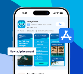
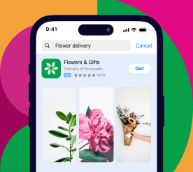
Your app screenshots must contain only the actual screens from your app’s user interface, as stated in Apple’s guidelines. You are not allowed to use images or videos that show people holding a device, like an iPhone, or any other imagery that is not a direct capture of the app in use.
You can upload up to 10 app screenshots per localization in App Store Connect (max file size is 10MB). It is highly advisable to use all 10 available slots whenever it makes sense, as every additional screenshot is another opportunity to show users why they should download your app.
The required file format for app screenshots is a flattened JPEG or a PNG file in the RGB color space, and must not contain transparency.
Each app screenshot must also fit one of the mandatory screen resolutions that the Apple App Store defines. Your images must meet these precise dimensions to be accepted during the upload process in App Store Connect.
The main Apple requirements are a 6.9-inch iPhone screenshot and a 13-inch iPad screenshot. These two sizes are now the mandatory base submissions for new and updated apps.
Apple provides specific pixel-size specifications for app screenshots across iPhone, iPad, Mac, Apple TV, and Apple Watch. For 2025, two primary screenshot sizes have become the default and mandatory submission requirement in App Store Connect, defining the required dimensions for both portrait and landscape orientations.
For iPad screenshots, the 13-inch size is now the default requirement. The 12.9-inch dimension is considered a legacy format and is now only necessary for apps that specifically target older iPad Pro models.
Apple automatically scales your app screenshots to fit smaller device displays. The system uses your mandatory 6.9-inch iPhone and 13-inch iPad submissions as the source images, resizing them as needed to populate the App Store listings on older or smaller hardware models.
Your app preview video resolution must match the required screenshot resolution for that device. This means a video for an iPhone must match the 6.9-inch dimensions, and an iPad video must match the 13-inch dimensions. If you do not submit a preview for a specific device, it will also be scaled down from these required sizes.
Below is the table detailing the “Screenshot source” and “App preview source” information. These official resources show which device listings use your default screenshots and videos and which alternative sizes can be used for specific device models or localizations.
| Device Size | Device | Portrait Screenshot Size | Landscape Screenshot Size | Requirement | Screenshot source |
| 6.9″ Display | iPhone 16 Pro Max Phone 16 Plus iPhone 15 Pro Max iPhone 15 Plus iPhone 14 Pro Max | 1290 x 2796 pixels 1320 x 2868 pixels | 2796 x 1290 pixels 2868 x 1320 pixels | Required if app runs on iPhone and screenshots for 6.5″ display aren’t provided | Upload screenshots for 6.7″ or 6.9″ display |
| 6.5″ Display | iPhone 14 Plus iPhone 13 Pro Max iPhone 12 Pro Max iPhone 11 Pro Max iPhone 11iPhone XS Max iPhone XR | 1284 x 2778 pixels 1242 x 2688 pixels | 2778 x 1284 pixels 2688 x 1242 pixels | Required if app runs on iPhone and screenshots for 6.9″ display aren’t provided | Default: Scaled screenshots for 6.9″ display Alternative: Upload screenshots for 6.5″ display |
| 6.3″ Display | iPhone 16 Pro iPhone 16iPhone 15 Pro iPhone 15 iPhone 14 Pro | 1179 x 2556 pixels 1206 x 2622 pixels | 2556 x 1179 pixels 2622 x 1206 pixels | Not required | Default: Scaled screenshots for 6.5″ display Alternative: Upload screenshots for 6.1″ or 6.3″ display |
| 5.8″ Display | iPhone 14 iPhone 13 Pro iPhone 13 iPhone 13 mini iPhone 12 Pro iPhone 12 iPhone 12 mini iPhone 11 Pro iPhone XS iPhone X | 1170 x 2532 pixels 1125 x 2436 pixels 1080 x 2340 pixels | 2532 x 1170 pixels 2436 x 1125 pixels 2340 x 1080 pixels | Not required | Default: Scaled screenshots for 6.5″ display Alternative: Upload screenshots for 5.8″ display |
| 5.5″ Display | iPhone 8 Plus iPhone 7 Plus iPhone 6S Plus iPhone 6 Plus | 1242 x 2208 pixels | 2208 x 1242 pixels | Not required | Default: Scaled screenshots for 5.8″ display Alternative: Upload screenshots for 5.5″ display |
| 4.7″ Display | iPhone SE (3rd generation, 2nd generation) iPhone 8 iPhone 7 iPhone 6S iPhone 6 | 750 x 1334 pixels | 1334 x 750 pixels | Not required | Default: Scaled screenshots for 5.5″ display Alternative: Upload screenshots for 4.7″ display |
| 4″ Display | iPhone SE (1st generation) iPhone 5S iPhone 5C iPhone 5 | 640 x 1096 pixels 640 x 1136 pixels | 1136 x 600 pixels 1136 x 640 pixels | Not required | Default: Scaled screenshots for 4.7″ display Alternative: Upload screenshots for 4″ display |
| 3.5″ Display | iPhone 4S iPhone 4 | 640 x 920 pixels 640 x 960 pixels | 960 x 600 pixels 960 x 640 pixels | Not required | Default: Scaled screenshots for 4″ display Alternative: Upload screenshots for 3.5″ display |
| Device Size | Device | Portrait Screenshot Size | Landscape Screenshot Size | Requirement | Screenshot source |
| 13″ Display (primary required size) | iPad Pro (M4) iPad Pro (6th generation, 5th generation, 4th generation, 3rd generation, 1st generation) iPad Air (M2) | 2064 x 2752 pixels or 2048 x 2732 pixels | 2752 x 2064 pixels 2732 x 2048 pixels | Required if app runs on iPad | Upload screenshots for 12.9″ or 13″ display |
| 12.9″ Display | iPad Pro (2nd generation) | 2048 x 2732 pixels | 2732 x 2048 pixels | Default: Scaled screenshots for 13″ display Alternative: Upload screenshots for 12.9″ iPad Pro (2nd generation) display | |
| 11″ Display | iPad Pro (M4) iPad Pro (4th generation, 3rd generation, 2nd generation, 1st generation) iPad Air (M2) iPad Air (5th generation, 4th generation) iPad (10th generation) iPad mini (A17 Pro) iPad mini (6th generation) | 1488 x 2266 pixels 1668 x 2420 pixels 1668 x 2388 pixels 1640 x 2360 pixels | 2266 x 1488 pixels 2420 x 1668 pixels 2388 x 1668 pixels 2360 x 1640 pixels | Default: Scaled screenshots for 13″ display Alternative: Upload screenshots for 8.3″ or 11″ display | |
| 10.5″ Display | iPad Pro iPad Air (3rd generation) iPad (9th generation, 8th generation, 7th generation) | 1668 x 2224 pixels | 2224 x 1668 pixels | Default: Scaled screenshots for 11″ display Alternative: Upload screenshots for 10.5″ display | |
| 9.7″ Display | iPad Pro iPad Air iPad Air 2 iPad iPad 2 iPad (6th generation, 5th generation, 4th generation, 3rd generation) iPad mini (5th generation) iPad mini 4 iPad mini 3 iPad mini 2 | 1536 x 2008 pixels (portrait without status bar) 1536 x 2048 pixels (portrait with status bar) 768 x 1004 pixels (portrait without status bar) 768 x 1024 pixels (portrait with status bar) | 2048 x 1496 pixels (landscape without status bar) 2048 x 1536 pixels (landscape with status bar) 1024 x 748 pixels (landscape without status bar) 1024 x 768 pixels (landscape with status bar) | Default: Scaled screenshots for 10.5″ display Alternative: Upload screenshots for 9.7″ display |
| Device | Screenshot Size | Requirement | Screenshot source |
| Mac | One of the following, with a 16:10 aspect ratio. 1280 x 800 pixels 1440 x 900 pixels 2560 x 1600 pixels 2880 x 1800 pixels | Required for Mac apps | Upload Mac screenshots in one of the listed sizes |
| Apple TV | 1920 x 1080 pixels 3840 x 2160 pixels | Required for Apple TV apps | Upload an Apple TV screenshot in one of the listed sizes |
| Apple Watch (Series 10, Series 9, Series 8, Series 7, Series 6, Series 5, Series 4, Series 3, SE, Ultra 2, Ultra) | 396 x 484 pixels (Series 7, 8, 9) 368 x 448 pixels (Series 6, Series 5, Series 4, and SE) 312 x 390 pixels (Series 3) 410 × 502 px (Ultra 2, Ultra) 416 × 502 px (Series 10) | Required for Apple Watch apps | Upload Apple Watch screenshot in one of the listed sizes. You must use the same screenshot size for Apple Watch consistently across all localizations for the app |

You can upload a maximum of three app preview videos per localization, in either portrait or landscape orientation. A key guideline to remember is that each portrait video you add will take the place of one of your available app screenshot slots in the gallery.
When you use a portrait app preview video, it occupies the first position in your media gallery. For instance, if you submit one portrait video and three screenshots, your App Store page will display the video first, followed by the first two screenshots in the second and third positions.
If your app preview video is in landscape mode, the App Store search results will show only that video in the media preview area. This format gives your landscape video exclusive prominence when a user first discovers your app via the search function, hiding the static screenshots.
The general iOS video guidelines for an app preview video mandate several key technical specifications for your files to be accepted in App Store Connect.
The primary technical requirements include:
.mov, .m4v, or .mp4.An app preview video must consist only of actual footage captured from within the app itself. Apple’s content guidelines strictly forbid using promotional content, marketing text, or any copyrighted material that is not a direct part of the app’s user experience.
Because app preview videos autoplay on the App Store (often without sound), the content should be visually engaging from the very first frame. Use the video to immediately highlight the most compelling and unique elements of your application to capture user interest.
Apple has slightly updated the video requirements as well – you can find the full list of app preview video specifications on the Apple’s official App Store Connect Help page.
For effective app store optimization (ASO), your app screenshots must appealingly present your core features and value proposition. Potential users need to quickly understand how your app works and what benefit it provides just by looking at these images on your product page.
The first step in screenshot design is choosing an orientation, as both vertical and horizontal layouts have unique benefits. Your decision should be based on which format best showcases your app’s key features and user interface to potential downloaders.
Using vertical app screenshots allows you to display a broader range of content without requiring users to scroll horizontally. This layout can be more effective for apps with multiple key features, as more of them can be made visible at a single glance.
You can also improve your visual appearance by combining horizontal and vertical screenshots. For example, a compelling horizontal video could be used in search results, while more detailed vertical screenshots are used on the actual product listing.
Your first few app screenshots are the most critical, as users typically decide whether to download within 7 seconds of visiting a product page. These initial images must have a high-quality design that immediately captures attention and makes users curious to learn more.
Create a compelling narrative for your app screenshots by using a storytelling technique like A.I.D.A. (Attention, Interest, Desire, Action). Structuring your screenshots to follow this copywriting framework can create a more engaging experience that makes users more likely to download.
For mobile games, app screenshots should include actual gameplay previews to have a positive impact on your conversion rate. Users want to see what the game experience is like and understand its progression, so showing real gameplay is essential.
Enhance your app screenshots by including short, descriptive headlines on each image. These text overlays should describe the functionality being shown and highlight important keywords, which is a key ASO tactic for quickly communicating your app’s value.
To optimize your screenshots impact, you must monitor your conversion rates after uploading new app screenshots. Use app analytics tools to track how changes to your visual assets impact downloads in your target countries and validate your design choices with data.
The best way to identify which app screenshots perform best is through A/B testing. Use Apple’s native Product Page Optimization feature to test different visual approaches against each other and find the most efficient options to effectively boost your conversion rate.
For paid user acquisition campaigns, use Apple’s Custom Product Pages feature. This allows you to create unique App Store landing pages with tailored screenshots that match the specific user intent of your ad creative and lead to higher conversions.
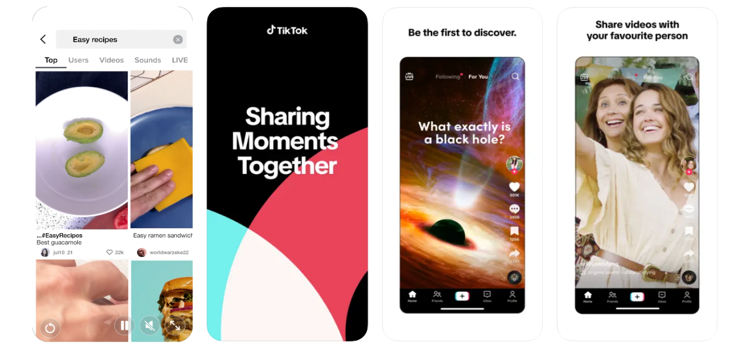
Top-performing apps use a variety of App Store screenshot strategies to tell their brand story and attract user downloads. When analyzing examples from successful companies like TikTok and Uber, app marketers gain insights into different ASO tactics for communicating an app’s value proposition to potential users.
TikTok’s screenshot strategy emphasizes its key video features and core purpose by using strong, concise messages. The visuals and text work together to quickly communicate the ap
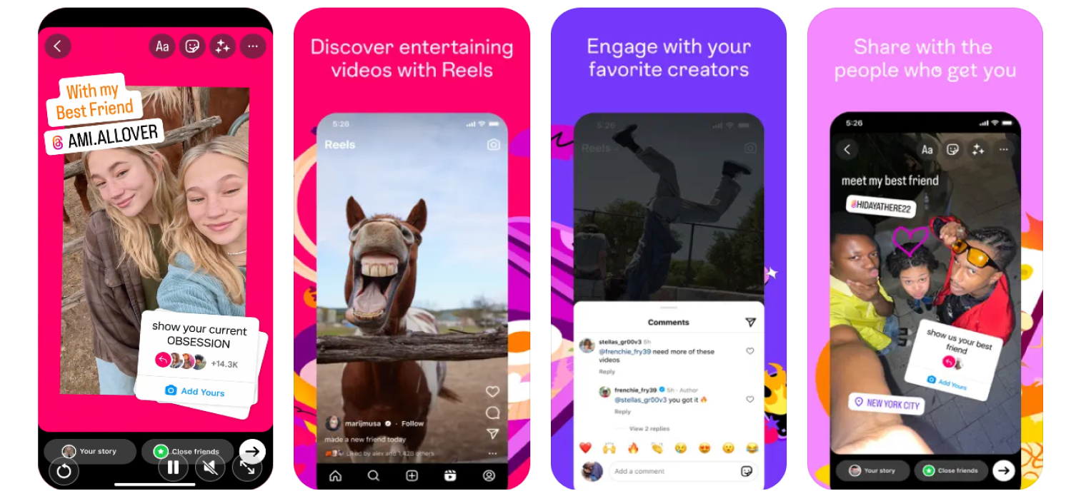
Instagram’s app screenshots focus on showcasing specific in-app features and the social aspects of the platform. As a powerful, well-known brand, its ASO strategy can rely on direct feature presentation rather than elaborate storytelling to convince users to download the app./
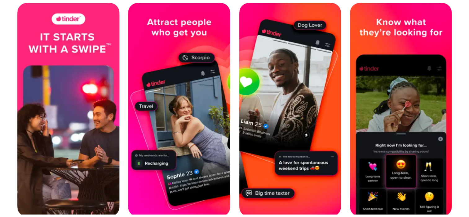
Tinder’s screenshot approach combines previews of in-app features with a guided tour format. This strategy is designed to effectively communicate how easy it is for a new user to set up a profile and begin using the app’s core matching and messaging functionalities.
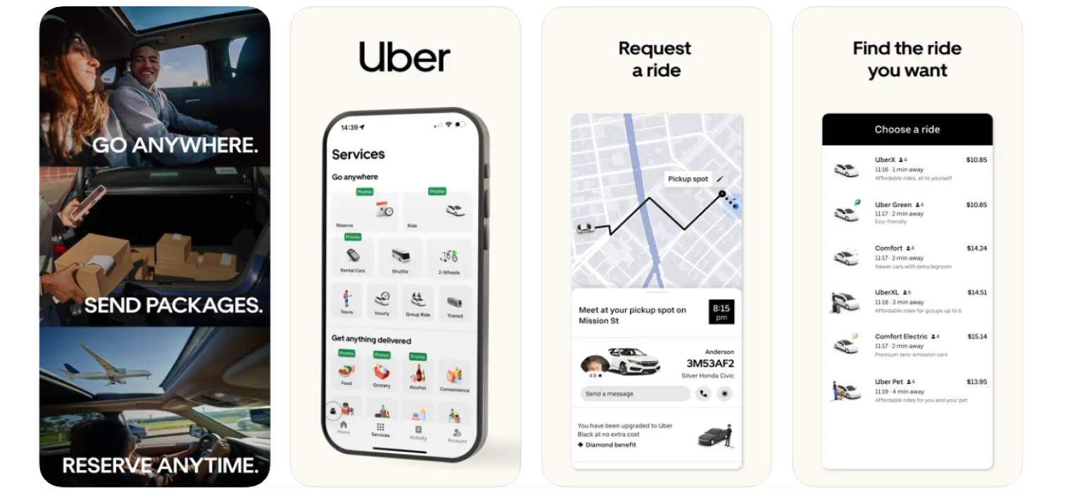
Uber uses a simple and clear app screenshot design featuring a dark background, contrasting white fonts, and uncluttered visuals. This minimalist ASO strategy allows the company to explain the main app concept of booking a ride quickly and efficiently to its potential users.
The best practice for iOS app screenshots is to ensure every image has a clear purpose and effectively showcases your app’s most valuable features. A well-designed set of screenshots is a crucial component of your ASO strategy and is essential for driving user downloads.
A well-designed set of iOS app screenshots must be visually appealing, clean, and easy to read. To maximize their impact on your conversion rate, they should also be straight to the point and perfectly consistent with your app’s established brand identity.
Your iOS app screenshots must highlight your most popular and robust features to grab the user’s attention. Since Apple’s guidelines forbid using images from outside the app, your visuals must accurately represent the in-app experience to help users decide to download.
A critical best practice is to avoid exaggerating promises in your screenshots. If the application fails to deliver on the expectations you set, users will likely uninstall it, which negatively impacts your conversion rate and overall ASO performance.
When selecting features to display, focus only on those that are important and that users actively search for. A best practice for App Store Optimization is to research user keywords and incorporate them into the short, descriptive messages on your screenshots.
You should build a story with your screenshots because a good narrative clearly shows what your app does and how it solves a user’s specific problem. Start your screenshot sequence with a key message that powerfully summarizes your app’s main value proposition.
A key best practice is to fully localize your app screenshots for different international markets. The App Store provides 10 dedicated screenshot slots for each localization, allowing you to create a unique set of images with translated messages for every language you support.
Effective localization requires more than just translating text. For maximum impact, you should perform market research for each region and adapt your screenshot design and messaging to reflect specific local cultures, trends, and user expectations.
To save time when creating screenshots for all required iOS devices, use a generic screen frame in your design template. Instead of showing different physical devices in each shot, you can place your actual app screens inside this frame and simply adapt the final image to the mandatory sizes.
To create and design your App Store screenshots, you can either handle the design process manually or use specialized tools and templates to save time. Marketers can choose from professional design software, dedicated screenshot generators, and template libraries depending on their needs, budget, and design skills.
Figma is an excellent tool for creating and maintaining your app screenshot designs, offering more control than simple templates. It provides powerful features, is more straightforward to use than complex software like Photoshop, and has a vast library of community templates to streamline the design and export process.
AppLaunchpad is a dedicated App Store screenshot generator that helps you create customized images for your store listing. The tool includes pre-built screenshot templates and allows you to export your final designs in all the suitable resolutions required by the App Store.
Hotpot is another user-friendly and accessible out-of-the-box screenshot generator for the App Store. While it may miss some premium features found in other tools, its ease of use makes it a good choice for smaller apps or developers just beginning their App Store journey.
Placeit offers a large library of graphic templates, including an excellent collection designed specifically for App Store screenshots. With this tool, you can simply add your own app images to their screenshot templates, generate your messages, and export the finished designs.
Several other tools also support the easy creation of app screenshots, each providing a different set of features, device mockups, and templates to work with.
Some other recommended companies to check include:
The process for creating effective App Store screenshots can be broken down into four key steps, from initial planning to final performance monitoring.
Following this simple four-step process will ensure that you consistently create high-quality app screenshots whenever you need to update your App Store