An ASO Guide to App Store Preview Videos for iOS Apps
 Gabriel Kuriata
 App Store preview videos are short, on-device video clips that visually demonstrate an iOS app’s core features and user experience directly within the App Store listing. The videos help potential users quickly understand how your app works, set accurate expectations before download, and can significantly increase install rates by offering an honest, transparent look at your app in action.
In this article, you’ll discover everything you need to know about App Store preview video. We cover official guidelines and key differences with Google Play, proven best practices, real-world examples and tips for maximizing your results.
Ready to make your app stand out? Let’s jump in!
App Store preview videos must use only in-app footage, follow strict duration and format limits and comply with Apple’s technical and content policies to be approved and displayed in your App Store listing.
Apple’s official requirements for app preview videos are designed to ensure clarity, authenticity, and technical compatibility across devices and regions. Here are the core rules, drawn directly from Apple’s official documentation:
App Store preview videos not only appear on your app’s Product Page and in App Store search results, but they can also be displayed within Apple Ads campaigns.
This means your video may autoplay for users both when they discover your app organically and when they see your listing as an ad. That means that making a strong, visually engaging preview video is critical for both conversion and paid user acquisition.

App Store preview videos (iOS) and Google Play promo videos (Android) differ in their technical specs, allowed content, placement, and review process, all of which impact how they drive installs and support ASO in each store.
Here’s a clear comparison of the most important differences, based on official Apple and Google documentation:
| Feature | App Store Preview Video (iOS) | Google Play Promo Video (Android) |
| Video Purpose | Demonstrate real in-app experience only | Demo app/game, promo, or market with creative CTA |
| Video Length | 15–30 seconds | Up to 2 minutes (30–60s recommended) |
| Number Allowed | Up to 3 per app per localization | 1 per app listing |
| File Size Limit | 500MB | 100MB (YouTube upload; embedded in listing) |
| Content Format | On-device screen recording only | Any (device capture, animations, live action) |
| Overlays/Text | Minimal, brief, localizable | Freely permitted |
| Hands/People | Not allowed | Allowed |
| Call to Action | Not allowed (no ‘Download now’, pricing, etc.) | Allowed |
| Device Specificity | Separate videos per device (iPhone/iPad/Mac/TV) | One video for all |
| Autoplay/Placement | Autoplays muted, first in gallery above screens | Appears above screenshots, user-initiated play |
| Submission | Uploaded via App Store Connect, subject to review | YouTube link embedded during Google Play listing |
| Review Process | Strict Apple review and approval | Fewer content restrictions |
| Impact on ASO | Indirect: boosts conversion & engagement | Indirect: boosts conversion & engagement |
As mentioned, Apple requires only authentic in-app footage and tightly restricts video duration, format, and overlays to ensure transparency and usability.
Google’s promo videos are more flexible – longer duration, promotional content, calls to action, and creative freedom are all allowed, making them suitable for storytelling as well as demonstration.
On iOS, you can offer multiple device and language-specific videos. On Google Play, you embed only one video (via YouTube) for the listing.
App Store videos receive prominent, autoplay placement, while Google Play promo videos require users to tap to play.
App Store preview videos increase conversion rates by helping users quickly understand an app’s value before downloading. The videos can also indirectly improve ASO by enhancing key engagement metrics that Apple’s ranking algorithms consider.
A well-executed app preview video gives potential users a quick, visual understanding of your app’s experience, helping them make their install decision with greater confidence.
According to recent data from Apple and leading ASO platforms (2024–2025), adding a high-quality preview video can boost conversion rates by 20-40% compared to screenshots alone. This effect is particularly strong for complex, highly interactive, or new-to-market apps, where video provides clarity that static images cannot.
Beyond improving conversion, preview videos also play an indirect role in app store optimization in App Store:
Localized preview videos drive even greater results, as users are more likely to convert when the video matches their language, cultural context, or device. So tailoring your videos for different locales demonstrates attention to user needs and give your app a competitive edge when compared to non-localized videos.

Creating a compelling App Store preview video requires careful planning, capturing on-device footage, and following Apple’s strict guidelines at every stage – from concept to final upload.
Here’s a beginner-friendly, actionable walkthrough:
We always recommend regularly analyzing performance metrics and user feedback to continually refine your preview videos. And make sure you evaluate different app video recording tools.
High-impact App Store preview videos follow Apple’s guidelines, start strong, and maximize visual storytelling. Truly exceptional videos also draw on expert creative strategies and market-tested conversion tactics not fully covered by Apple’s documentation.
To go beyond basic compliance and build preview videos that stand out and drive downloads, combine Apple’s official standards with proven industry best practices:
Open your video with your app’s most eye-catching feature or value. Studies and agencies agree this is crucial: users decide in seconds whether to keep watching. Lead with real, visually dynamic app content—not slow intros, logo animations, or abstract scenes.

Successful preview videos do more than demo features—they weave a simple, compelling story. Show your app solving a real problem or delivering a “wow” moment, and use a logical, visually clear sequence. For example, depict how your app fits into a daily routine or helps users achieve a specific goal.
You have only 15–30 seconds, so focus on 1–3 core features or flows. Resist the urge to demonstrate every function. Each shot should reinforce your unique selling point.
Don’t forget about a well-chosen poster frame that complements your screenshots set. It’s true that the videos autoplay diminishes the importance of the poster frame. But it doesn’t mean you should neglect it.
Try to think about your app preview frames and screenshots as a whole. The poster frame should match the frame of your video, so plan it at the same time as your video preview.

If your app covers several uses or user types, use Apple’s allowance of up to 3 videos, one for each experience or device context. For instance, one video could spotlight onboarding, while others showcase advanced features.
If a publisher wants to showcase different sides of an application in their app preview, it makes sense to split the features into several 15-second app previews. In the majority, two short app previews focusing on two different features performed better than a single 30-second video.
It is better to avoid using landscape app previews on store product pages with portrait screenshots. In such cases, a video is placed in the Closer Look section which basically means that it has very little or no influence on CVR. However, it may make sense to use landscape app previews with portrait screenshots to increase TTR in Search and keep CVR on the app landing page unchanged.
Thus, you need to sort out your priorities before deciding on the orientation of your app preview:
Top-performing developers test multiple video versions via App Store Connect, focusing on top-of-funnel performance (play rate, retention, conversions). Analyze which feature order, captions, colors, or hooks drive more downloads, and keep refining based on hard data.
Whenever possible, show the app in real or relatable life scenarios (inside the app), not just UI elements. Contextual demos connect emotionally and clarify the immediate benefit to your user.
Leading global apps like Facebook, TikTok, and Amazon consistently create App Store preview videos that focus on instant engagement, simplicity, and device-accurate in-app experiences. Here’s how some of the world’s top brands approach their preview videos:
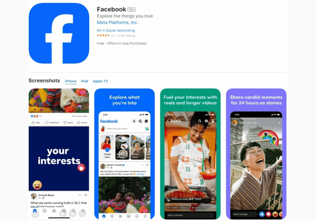
The Facebook App Store preview video uses a fast-paced, device-recorded walkthrough of core app actions: scrolling a feed, posting, and watching Reels. Visual transitions are seamless, with the camera (screen recording) moving logically through different sections of the app.
Check out Facebook’s iOS app page and its preview video.
The opening seconds deliver recognizable interface colors and quick swiping – a visual “hook” that instantly signals what the app is about. Overlays are minimal, keeping the focus on real interaction, and all visuals match what users see post-install.
What Facebook’s app video does well:
TikTok’s preview video starts with a rapid tap into the For You feed, showing the endless scroll of trending videos. The first few moments highlight swiping, liking, and basic sharing – all shot using device screen recording.
Check out TikTok’s iOS app page and its preview video.
Backgrounds are filled with vibrant, high-motion video posts that capture the essence of TikTok’s content. Brief, clear animated overlays highlight key actions such as “swipe up for more” and “like,” always respecting Apple’s limits on text quantity and localizability.
What TikTok’s app video does well:
Amazon’s video seamlessly transitions from home browsing to product pages, mimicking a true “add to cart” experience with just a few taps. The preview demonstrates swiping through deals, quick searching with the magnifying glass, and a tap-to-buy action.
Check out Amazon’s iOS app page and its preview video.
All scenes are high-resolution, focusing on the most relevant journeys (e.g., daily deals, 1-click checkout). Subtle overlays confirm actions (“Deal found!”), but the core video is pure device footage.
What Amazon’s app video does well:
Measuring the effectiveness of your App Store preview videos is essential for ongoing improvement—you need to track conversions, engagement, and user behavior using App Store Connect analytics and adapt your strategy based on the data.
Analyzing the right metrics helps you understand whether your video is helping turn page visitors into new users. It guides you in refining your next version for even greater impact.
Apple’s App Store Connect provides a suite of analytics for every app, including engagement with your preview videos. The most valuable metrics include:
Monitor these stats before and after updating your preview video to see if changes positively impact conversions and engagement.
Apple now allows the creation of Custom Product Pages and Product Page Optimization (PPO) experiments. You can:
Review user ratings and feedback for mentions of features shown (or missing) in your preview video. Look for patterns:
Top-performing teams treat preview videos as an iterative asset:
App Store preview videos quickly show users how your app works, build trust, and boost installs. Successful videos use authentic in-app footage, stay clear and focused, and follow Apple’s rules.
By starting strong, keeping it visual and user-friendly, and updating videos based on data, you’ll maximize both conversions and visibility in the App Store.

