Optimizing Screenshots for Target Markets: SplitMetrics Agency Approach for italki
 Victoria Vlasova
  Victoria Vlasova
 Localization is a key to winning foreign audiences and plays a pivotal role in the success of mobile apps in today’s global marketplace. In the modern highly competitive mobile app landscape, marketers cannot overlook the significance of customizing the app’s product pages for different markets and languages. However, there are some tricks that should be taken into account when implementing localization into your ASO strategy.
App localization implies more than just translating the text, it encompasses the entire user interface, visuals, screenshots, and other marketing elements to cater to the preferences and cultural nuances of specific target markets. There are crucial factors to consider to ensure local users find your creatives relevant enough to install the app.
By effectively localizing the app product page, marketers can enhance user engagement, increase downloads, and ultimately maximize their app’s visibility and success in international markets.
If you were thinking about localizing your app screenshots, but didn’t know where to start, or were looking for use cases, this article is for you. We’ll elaborate on the comprehensive methodology of effectively localizing screenshots specifically tailored to the US market on the App Store, delve into the best practices of ASO, and illustrate these principles through a compelling case study featuring italki, one of the leading language learning apps.
The initial step in the localization process is conducting a thorough research to collect comprehensive information about the market landscape, competitor strategies and user preferences within the chosen country & subcategory. As a result, it will provide you with a broader understanding of market trends and specific dynamics. Moreover, you will also gain insights into the user experience when they scroll through the search results page to choose an app.
What should also be taken into account is that there are several crucial areas that should be looked into for you to have a full picture. Let’s dive into what should be researched:
Note: Do not forget that ASO is a constant process, and you should pay particular attention to direct competitors: observe whether they are increasing their category rankings, visibility or number of installs; what they implemented to achieve this upward trend. This could be an indicator of successful ASO strategy, and can inspire you to start testing different hypotheses.
This stage aims to extensively explore and analyze the characteristics of the target audience. For example, when working with italki, the SplitMetrics Agency ASO team analyzed the users who are interested in learning foreign languages online with certified tutors. By gaining a deep understanding of potential users’ preferences, needs, and aspirations, our team of experts got all the insights to effectively communicate with them through screenshots. SplitMetrics Agency ensured the visuals that resonate and engage with the target audience on a meaningful level.
To have all the insights into your target audience, you should also analyze several aspects. The following points should be explored in detail to get a full picture:
English is the primary language spoken by most individuals in the United States. It is not only the most widely used language for daily communication but also the dominant language in governmental activities. Specifically, 78.3% of the population communicates solely in English, while 13.3% primarily speaks Spanish at home. The remaining 8.4% use a variety of languages, such as Indo-European, Asian, Pacific Islander, etc., when interacting with their family members. Notably, 8.2% of the population reported speaking English at a level below proficiency, indicating a potential target segment for language learning app to address their specific needs and challenges.
In order to optimize the visuals displayed on the app’s product page page and identify areas for improvement, it is crucial to compare the results of the aforementioned researche with the current screenshots. This comparative analysis allows to pinpoint growth opportunities and generate a comprehensive list of hypotheses that can be tested.
After competitor & market research, and target audience analysis, the SplitMetrics Agency team always conducts the app page audit and prepares terms of reference that encompass both general ASO best practices for the specific region and category, as well as individual-specific hypotheses to be tested.
Following a thorough review of the terms of reference together with the Сlient, the next steps involve:
Let’s exemplify this process, let’s get into the details how SplitMetrics Agency worked with their client italki.
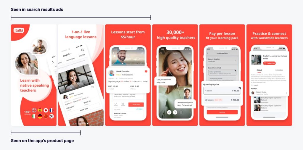
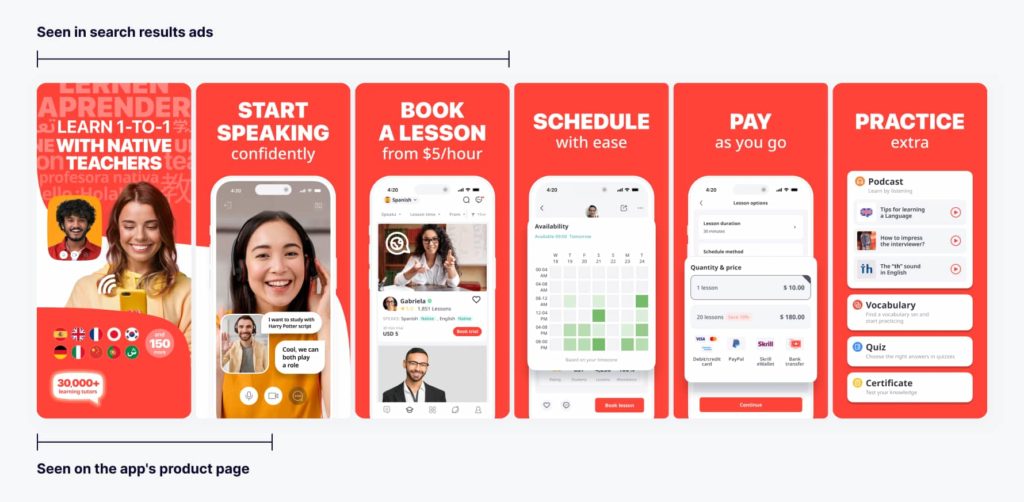
The first three screenshots are the most important ones in terms of the conversion, as they are displayed on the search results page.

However, the first screenshot plays the most pivotal role, as the majority of app installs occur usually after viewing it.
When it comes to creating effective screenshots, SplitMetrics Agency approach involves using concise and compelling headlines that encapsulate the main idea of the visual in 3-5 words. To make them easier to read, they enlarge the font and use compelling CTAs.
What’s more, our team always aims to tell a coherent and engaging story by consistently revealing how the app works, from the first screenshot (representing the app’s general idea) to the last (highlighting specific app features). Thus, each screenshot provides the user with the following information about italki app:
In this case, SplitMetrics Agency specifically focused on learning Spanish, as it’s the most popular foreign language in the US. For example, experts added typical portraits of the target audience on the screenshots. By placing these images within the app’s interface, which included teachers, students, and online lessons, they aimed to captivate users’ attention and swiftly convey the app’s value proposition.
To ensure optimal effectiveness, they incorporated relevant statistics in the first screenshot, allowing users to gain immediate insights into the app’s key benefits (30.000+ tutors, 150+ languages).
The ASO team also decided to move the screenshot dedicated to the lesson from the fourth position to the second. This was driven by the fact that this visual contains large images of people, so it effectively captures users’ attention and conveys the essence of the app.
Furthermore, SplitMetrics Agency generated two distinct variations of the screenshots, both based on the same hypotheses but implemented differently in terms of the design. They collaborated with italki’s team, incorporated their valuable feedback and made necessary adjustments to the screenshots. The resulting versions were then A/B/C tested, allowing our experts to identify the most impactful and effective variation. Once the winning screenshots were determined, they were published on the app’s product page, maximizing their potential to attract and engage users.

