SplitMetrics Supports Enhanced Screenshots Limit in A/B Tests
 Liza Knotko
Liza Knotko
Liza Knotko 
App publishers all over the world started February 22 with news from Apple – now store product pages can feature up to 10 app store screenshots. These screens limit increase is on a per-device basis which means you can upload sets of 10 different screenshots for iPhone, iPad, Apple Watch, and Apple TV.
SplitMetrics, in its turn, is excited to announce that now our platform supports product page A/B tests with 10 screenshots. This update gives marketers an opportunity to check whether it’s worth investing in the design of the 10-screenshot set.
The screenshots allowance was restricted to 5 images before the update. Now 5 extra screens can be added to complement product pages. However, mind that the changes did not concern app preview limit, each app page in the store can still feature maximum of 3 video clips not more than 30 seconds each.
It’s also important to understand that the update doesn’t affect Search results pages or Apple Ads. They’ll continue to depict 3 portrait screenshots or 1 landscape one providing no app preview is available on your product page.
Apple assures publishers that new extended screenshot sets will help to show potential users more of an app’s experience. Indeed, marketers get more space to tell about app’s core features and competitive advantages and lure app store visitors into installing their apps.
It makes a lot of sense but only in theory. The harsh truth is that not that many users scrolled to the fifth screenshot before the update let alone making it to the tenth one.
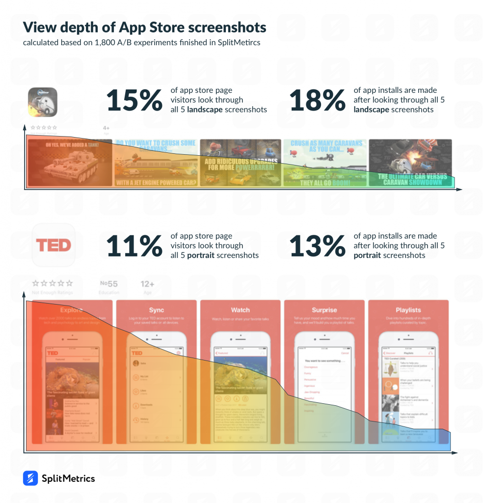
We decided to have a closer look at how users interact with product pages with 5 screenshots. The following study is based on 1,800 A/B tests of store pages with at least 100 views per each 5-image set.
It’s important to bear in mind that the overwhelming majority of the analyzed tests featured optimized screenshots. So, publishers with raw and plain screens shouldn’t expect the same scroll depth and conversion. A/B testing with SplitMetrics is a great way of pushing your metrics closer to ones of the industry leaders.
Screenshot orientation plays an important role here, we analyzed hundreds of SplitMetrics tests to discover the following curious numbers. When it comes to a landscape set of screens, only 15% of users scroll through all 5 images, these metric is even more humble for portrait screenshots – 11%.
This result is quite surprising as publishers tend to think that vertical screenshots are more scrollable. However, our statistics states that horizontal screenshots favor better scroll depth. Furthermore, they can boast a slightly better converting capacity as well.
Providing users got around to the fifth image, they are more likely to install the app if it was a landscape screenshot set. In this case, the average conversion rate is about 18%. When it comes to a fully scrolled through portrait sets, the average conversion is 13%.
Thus, we can assume that if you plan to upload up to 10 screenshots and strive for a better scroll depth and conversion rate, it’s better to opt for horizontal images. However, it would be wrong to shut the door on portrait sets.
Each app and each target audience have their peculiarities. That’s exactly what makes App Store optimization so exciting.
To prevent our clients from coming to rash decisions concerning the upload of 10 screenshots, SplitMetrics latest update provides a tool for measuring the efficiency of 10-image sets. All it takes is launching an A/B test with 10 screenshots and see how users interact with them.
This update is yet another call for reviewing your screenshots. Thousands of tests proved that this product page element can’t be underestimated as on the average its optimization results in 18% conversion increase.
It definitely makes sense to check on the following aspects of your screenshots set:
A complete change of your screenshots set is not that necessary for a significant conversion boost. At times, reordering your already existing screens can perform miracles. The key here is to be smart in the prioritization of features each screenshot represents.
Remember that first screenshots should encapsulate the essence of your app showcasing the features that resonate with your users the most. Another trick that might work is highlighting not merely features themselves but their values and benefits for your potential customers. In case you have a popular brand like SEGA does, it would be a good practice to rely on it and showcase it in your first screenshots.
It’s amazing when publishers manage to tell a story via their screenshots. SEGA managed to succeed in it. They tested several screenshot sets and it wasn’t particularly surprising that the set of images flow in order became the winner.
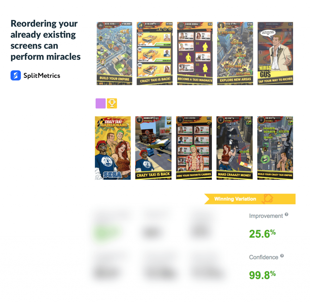
The control version is a bit inconsistent. It starts with the caption ‘Build your Empire’ but the next screenshot doesn’t dwell on this idea. Its caption ‘Crazy taxi is back’ represents another message hinting that it’s a new installment of a well-known game. The third screenshot that says ‘Become a taxi magnate’ calls back to the first screen being repetitive in a way.
The problem here is that a user can’t understand which exact steps are necessary to succeed in the game. Whereas a certain flow can be observed in another variation.
It starts with a banner-like screenshot which represents different characters. Then captions tend to give you the impression of what to expect from the game: ‘Crazy taxi is back’, ‘Hire you favorite cabbies’, ‘Make crazy money’, etc. This consistency paid off in the form of the impressive 25,6% conversion increase.
Running A/B tests is a great way of nailing the most effective screenshot flow.
One of the most important decisions publishers should make is choosing between portrait or landscape screenshots. Such measly detail as screens orientation may become a real game changer for your conversion.
Since the emergence of iOS 11 this dilemma became even harder. The pages with Search results now show either 1 landscape screenshot or 3 portrait ones of a much smaller size. Thus, opting for vertical screenshots, you’ll have to make sure that all details are distinguishable even in the context of Search.
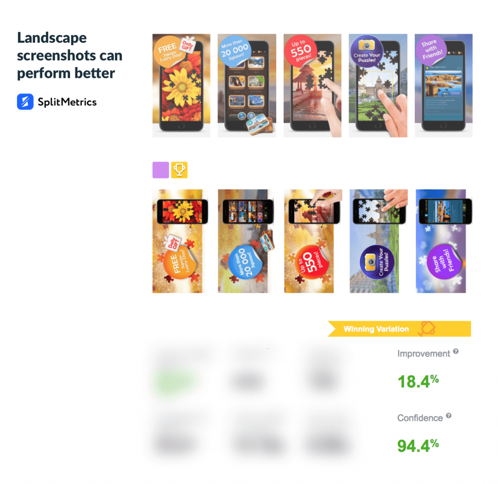
In the light of recent Apple update, another thing should be taken into consideration. It can be assumed that horizontal screenshots would be preferable if you decide to use a 10-image set as even now the average scroll depth of such landscape screens is slightly better. Only 11% of users reach the fifth portrait screenshot while this metric for a set in the landscape mode is 15%.
The recent test launched by ZiMAD proves this theory. Both variations with horizontal sets of screens had better screenshot view rate. It’s not surprising that one of these landscape variations became the winner of the experiment with 18,4% conversion improvement.
It’s the golden rule that captions are to be concise and eloquent. Extended text within screenshots doesn’t make a lot of sense not only because people are longing for visual information these days.
In fact, longer texts normally call for smaller fonts which may be disastrous for users involvement.
Let’s remember about iOS 11 update of the Search results page and consider who on Earth would read something on a caption of a tiny portrait screen. So it’s useless to waste valuable screenshots space on extensive texts which are doomed to be ignored. Our tests prove it.
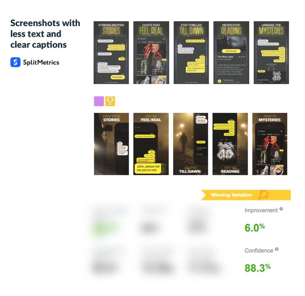
For example, playing around caption fonts and position helped Mandala Apps to get 6% conversion improvement. The variation with a bolder keyword in the text and varying position of captions managed to draw more attention of potential users. It’s worth admitting that the very font in the winning variation transmits a mysterious character of the app.
It’s better to opt for concise captions which will trigger the desire of learning more about an app or installing it immediately.
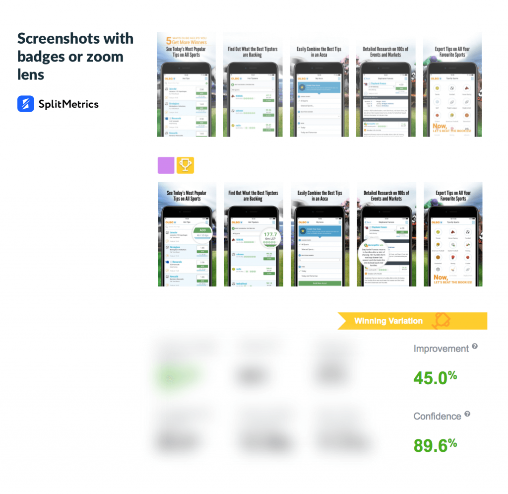
At times it makes sense to use good old tricks like badges or zoom lens to spice up your screenshots a little. In fact, zooming is a great way of highlighting the most important features. It helps to drive users attention to your core message from the very beginning.
OLBG did a great job zooming certain elements in their screenshots. They successfully used this trick to make the app’s UI more readable. Plus, it helped to highlight such features as, for instance, the ability to collect betting tips of your choice in one place. It’s fascinating how such straightforward hack resulted in 45% conversion improvement.
Screenshots give breeding grounds for experimenting with different layouts and cracking the one that will skyrocket your conversion. Apple’s screenshots limit update broadened these creative opportunities even more. To get more inspiration and learn what hacks really work, check out our Guide to App Store Screenshots.
Download your FREE Screenshots Guide