App Store Product Page Mistakes Killing Your App’s Visibility and Conversions
 Victoria Vlasova
  Victoria Vlasova
 This article is written in co-authorship with Yuliya Tsimokhava, ASO Manager at SplitMetrics Agency. In her current role, she helps leading mobile app publishers and developers reach new levels of organic visibility and downloads on the App Store and Google Play.
Content is king. This rule also works for the App Store Product Page world. With 1.6 million apps vying for user’s attention on the App Store, and more being released every day, app publishers and developers need to hold all the cards to make your app successful and stand out from the crowd.
Various elements of App Store product pages – from keywords to visuals (icon, screenshots, app previews) have a huge impact on your app visibility and ranking, as well as the conversion rate. They represent the cover of your app’s book, and despite the saying, users tend to judge the app by its cover. So the role of your app’s product page is to showcase your app’s core value and to drive users that care about your service to download and use your app.
In this article, based on 70+ first-impression audits conducted by our SplitMetrics Agency ASO Team, we’ll discuss the most common mistakes made on the App Store product pages, the impact they have on the app’s overall success, and provide you with the practical advice on how to fix them.
Whether you’re running paid campaigns like Apple Ads or not, when a user starts searching for an app on the App Store, their intent to install it is very high. In fact, 65% of downloads occur directly after the App Store searches.
It means that every element of your app’s product page is a vital one to attract users and drive your app downloads. Therefore, a well-optimized app page will result in a higher conversion rate and lower CPIs for your ad campaigns.
However, not all app publishers and developers adhere to the App Store best practices and recommendations, thereby losing installs.
To help app developers and publishers level up their ASO efforts and maximize ROI of this channel, we’ve analyzed more than 70+ apps in various categories in the US region on the App Store to determine what the most common ASO mistakes on app pages are and their potential impact, moving from category to category.
Distribution by category:
| Category | % of analyzed applications belonging to this category |
|---|---|
| Education | 13% |
| Finance | 13% |
| Health & Fitness | 13% |
| Social | 10% |
| Lifestyle | 8% |
| Photo & Video | 8% |
| Sports | 8% |
| Travel | 8% |
| Entertainment | 6% |
| Food & Drink | 4% |
| Medical | 4% |
| Utilities | 4% |
| Productivity | 2% |
When analyzing the product pages, we’ve come up to the conclusion that the mistakes app publishers and developers frequently make can be divided into two groups based on their impact:
What does it mean?
When having crucial problems with app visibility and ranking, it could lead to not reaching out to your target audience: the app will NOT be displayed for relevant keywords or ranked low in the search results. As a result, the user won’t see it and will install another one that is ranked higher.
While mistakes affecting your app conversion rate will entail loss of installs at another stage of the funnel.
Here’s the example: let’s imagine that the app was viewed 1,000 times, so the daily impressions equals 1,000. If the conversion rate is low, it means that the number of your app’s installs
would be much lower. And if the CR is high, the number of daily installs will be higher.
Example:
| Daily Impressions | CR | Daily Installs |
|---|---|---|
| 1,000 | 8% | =80 |
| 1,000 | 2% | =20,4x loss |
How do you know whether your conversion rate is high enough?
Read our “ASO Benchmarks & Mobile Trends” report to find the answers for not only this question:
What conversion rate should your app have? Needs and search habits of users looking for financial apps or games are far apart. This is why any optimization efforts must take category benchmarks into consideration. Before you make your product page optimized, you have to understand what optimized truly means for apps that resemble yours the most. “ASO Benchmarks & Mobile Trends 2022” explains just that.
Download the latest ASO Benchmarks & Mobile Trends Report
As we’ve covered types of mistakes and their impact on your app, it’s time to tell you more about what exactly those mistakes are and how frequently app publishers and developers made them according to our first impression audits statistics.
| Impact | Issue Name | % of App Store product pages having this mistake |
|---|---|---|
| App visibility & ranking | Absence of ASO cross-localization | 54% |
| Duplicate keywords in app metadata | 38% | |
| Too short title & subtitle | 37% | |
| Low-performing keywords usage | 29% | |
| Ineffective of ASO strategy | 8% | |
| Conversion rate | Screenshots: Inconclusive information (absence of CTA, social proof, app data) | 56% |
| Screenshots: Hard-to-read texts (due to their length, font size, contrast) | 40% | |
| Screenshots: Overcrowding elements (too many details and elements) | 37% | |
| Screenshots: Absence of feature-oriented shots | 35% | |
| Screenshots: Low-quality (lack of contrasting elements, stock photos usage, blurry elements, etc.) | 31% | |
| Icons: Non-associative design | 31% | |
| Unanswered reviews | 19% | |
| Negative reviews predominance | 19% | |
| Lack of ratings / reviews | 17% | |
| Incoherence of visual creatives | 10% | |
| Icons: Indistinctive elements | 2% | |
| Other | Category specific issues, image orientation, screenshot mismatch, etc. | 19% |
As you can see, more than half of analyzed app store product pages lack an ASO cross-localization and properly designed app screenshots, and keyword duplication across app store metadata is in second place. 56% of analyzed app screenshots fail to illustrate product value proposition and do not contain vital converting elements such as call-to-actions, social proofs, and valuable app performance data. We also found that 37% of analyzed app titles and subtitles are too short, which, given the 30-character limits for these fields, is quite a surprising fact.
With all the aces up your sleeve (the list of the most common mistakes), now you can check if your app’s product page has any of them. If yes, below you can find detailed info on mistake description, their examples, tips and tricks on what should be done to optimize your app listing.
With the App Store Connect limits in 30-character app title, 30-character subtitle, and 100-character keywords field, it leaves you only 160-character keywords in total. It leaves you not so much room to describe your app features and include the relevant search terms.
Have you ever wished the App Store could have no character limit and you could add more keywords to your app listing? That’s where cross-localization comes handy. This app-saver-tool allows you to increase the character space for your app’s metadata by using metadata in different country App Stores.
As we’ve mostly analyzed the apps in the US region, let’s show you how it works in this geography in particular.
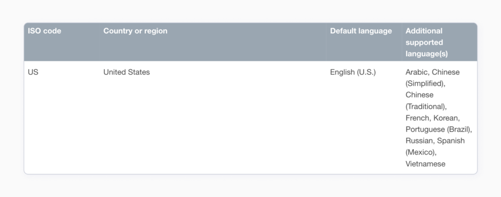
In addition to the English (U.S.) locale, there are another 9 languages (locales) indexed in the US. Basically, it means that you don’t need to incorporate all the relevant keywords in 100-character one locale keyword field, but add more of them to the other ones. This way, the job of incorporating all the relevant keywords into app’s metadata becomes much easier. It allows you to expand your app’s semantic core for the US almost 9 times by using Spanish (Mexico), Chinese (Simplified), Arabic, etc. locales. And your app will rank higher in the US territory for keywords added in all of those locales.
38% of analyzed apps had unfulfilled potential in terms of the 30-character title & subtitle limits. It means that some of the app’s product pages that we’ve analyzed contained the same keywords in title, subtitle and keyword fields.
Keyword duplication does not increase your app’s indexing by the search algorithm, in fact it doesn’t affect your app ranking at all (the App Store algorithms do not take duplicates into account when calculating app relevance). But what it does – it takes away the valuable character space and doesn’t give the user additional information about the app’s functionality.
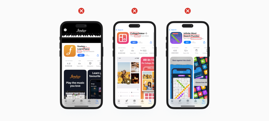
Try replacing the duplicate keywords with other relevant ones or synonyms that allow your app to rank for a broader list of keywords.
Your app’s title and subtitle play a critical role, as they not only influence your app’s performance in search results, but also help people discover apps that are relevant for them. While the title should be unique and catchy, and tell the users what your app is doing, the subtitle provides users with extra information about the app itself, such as its functionality and benefits, but in terms of the character space – it also gives you extra space for keywords.
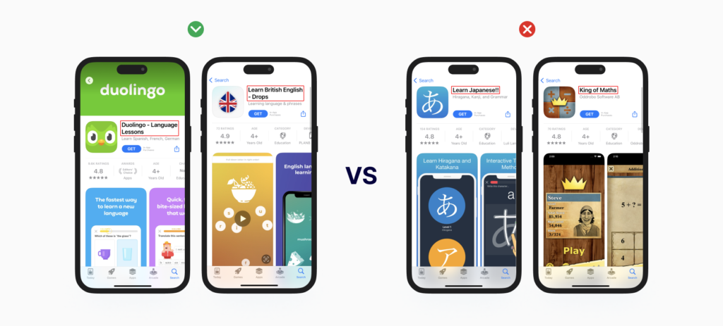
Yet, 37 % of analyzed apps fail to hit the 30-character titles and subtitles limits, leaving precious keyword space. Both these fields have the strongest ranking weights for the App Store algorithms, meaning you should put your most important keywords there.
We recommend using all available 30 characters space in both fields to the maximum and adding high-volume and relevant keywords, creating valuable combinations of search terms and messages that users will easily understand.
“Key-words” – the word itself is the best answer to the question “What keywords should be used to improve my app ranking?”. It’s important to use valuable and relevant keywords that will drive traffic to your app, and also to track their performance. Before using any of the keywords, we recommend you to conduct keyword research. Build a list of keywords (100-200) and prioritize them in terms of search popularity and relevance to your business. Do not forget to avoid the low-performing ones (volume 5-10 out of 100), as that means they are not popular in terms of search queries.
Please note that it also depends on your strategy e.g. if your app does not have the metrics to compete for high volume keywords you can start with less popular ones.
This exercise will help you develop your ASO strategy and see what keywords should be used to bring more organic installs. After including them in your app metadata do not forget to monitor their performance and change in case they do not perform well for you.
Sometimes there are certain cases when fixing previously mentioned mistakes is not enough, and the app is still not ranking high enough. That’s a sign that your ASO strategy is not working.
Well-thought and effective ASO strategy is the most critical factor to ensure app visibility and organic downloads. But what could be wrong with the strategy? At first glance, the text metadata can be filled out without any mistakes: optimal length, no duplicate keywords, a large number of relevant combinations of search phrases, and even cross-localization.
Why does it happen? This may be due to the fact that the app doesn’t have high enough metrics (e.g. downloads, ratings and reviews) to compete with other apps for a place in the top 3, top 10 or even top 100. As a result, the app remains too low in the search results and the users won’t find it.
That’s why when building your semantic core, it’s also important to analyze a broad list of keyword metrics (including the number of search results) and correlate your app’s current performance with apps at the top of the search results for that keyword.
With your app’s metrics and visibility score growing, you can use more and more high-volume and competitive keywords. ASO involves an iterative approach, and creating a step-by-step strategy is crucial to achieve long-term results.
Delta Investment Tracker turned to SplitMetrics Agency to update and optimize the app store product page, including keywords and visuals.
This case study will prove to you that optimizing your product page can give you outstanding results in terms of app visibility and consequently increase sales. 70,1% app visibility score increase in the US storefront and 58% visibility score boost for the French market – really impressive figures, right! But that’s not all! With the help of keyword and text metadata optimization, you can also increase the number of in-app purchases. Read our case study and learn how the SplitMetrics Team helped the client to get 52% paying users increase and 49.6% sales rise.
Now let’s discuss the most common mistakes affecting app conversion rate. The most common one (56% of analyzed apps have this issue) is related to the information displayed on the screenshots. And it’s no wonder why, as the users want to see your app’s features and capabilities before downloading it. Users’ attention span is around 8 seconds, they search for an app, look through the screenshots telling the app’s story and decide to download it or not to download.
What does that mean? The main purpose of screenshots is to convey the value and the main features of the app, but to be competitive and eye-catching in search results, you should not limit yourself to your app’s UI shots and boring descriptions of features.
We recommend you to examine your target audience and direct competitors to assess which information will be most valuable to display on your screenshots. According to our research, if social proof messages (your app’s awards, ratings, number of users, etc.), and calls to action (“Learn”, “Start”, “Explore”, etc.) are displayed on your screenshots, it can double your conversion rate and ultimately help you achieve outstanding results.
You can also impress the user with your app’s data. For example, in education apps you can tell with how many teachers the students can book lessons, in photo & video editing apps – how many templates or filters they have. This information attracts the user’s attention and helps to gain their trust.
According to our experience, almost 50% of users leave the app product page after 3 seconds, meaning they won’t enlarge the images or try to read something on the screenshots. Yet, 40 % of analyzed apps’ product pages have screenshots with hard-to-read captions and texts.
What should be considered, when it comes to texts on the screenshots:
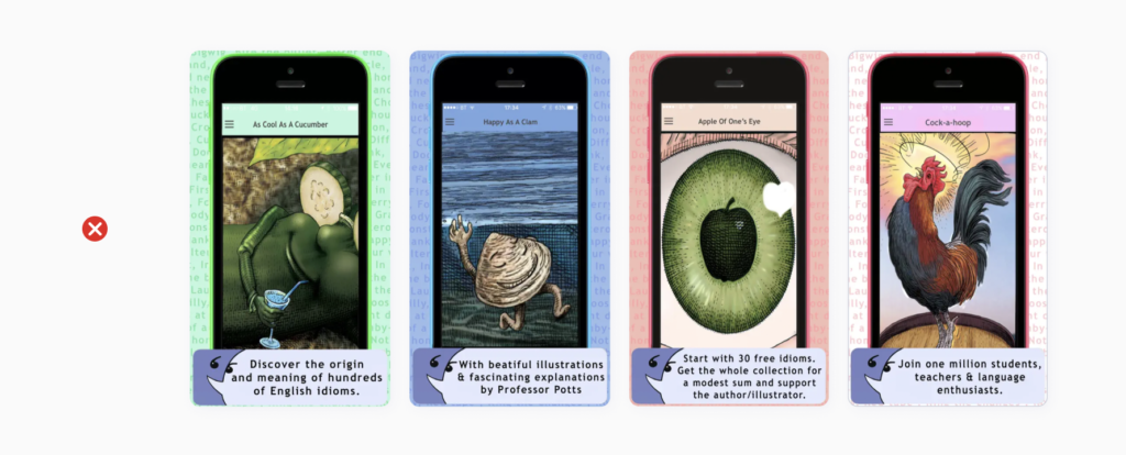
According to our audits, 36% of the apps had unclear screenshots in terms of the design and message. It means that if there are too many design elements on your screenshots, the user won’t get a clear message about your app and its features.
It’s important to keep the screenshots easy-to-grasp and spacious. Try to draw users’ attention to your app’s main features and the key message when creating them. Do not overload your screenshots with unnecessary elements (if this is not part of your strategy according to the analysis of your competitors and target audience). We also recommend to A/B test your screenshots to find the best-performing ones that your target audience likes.
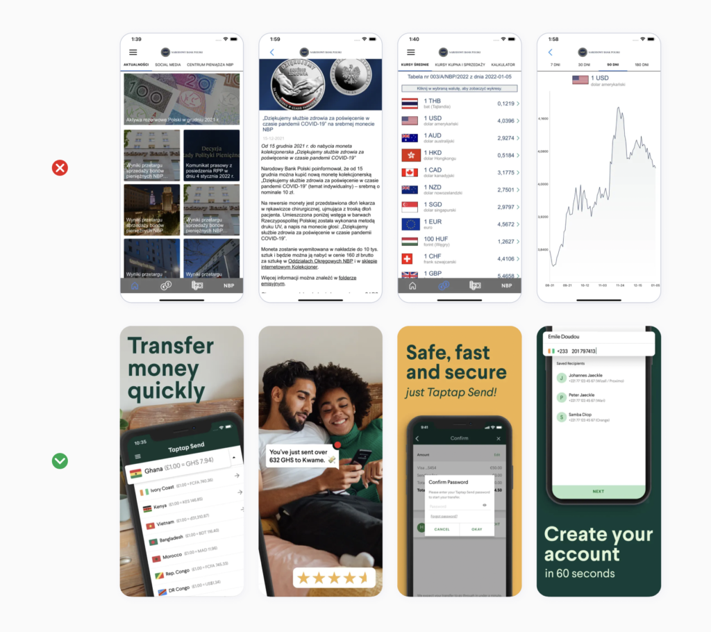
As we’ve mentioned, screenshots are one of the most vital and decision-making elements for users. That’s why they should demonstrate your app’s important features and benefits. However, 35% of the analyzed apps failed to highlight their specific value.
It’s better to display one feature per one screenshot so as not to overcrowd them, and make it easy for the user to grasp your app’s benefits. Keep in mind that the first 1-3 screenshots usually get the highest number of views, which makes them the most important ones. Make sure they contain the most important features and value propositions.
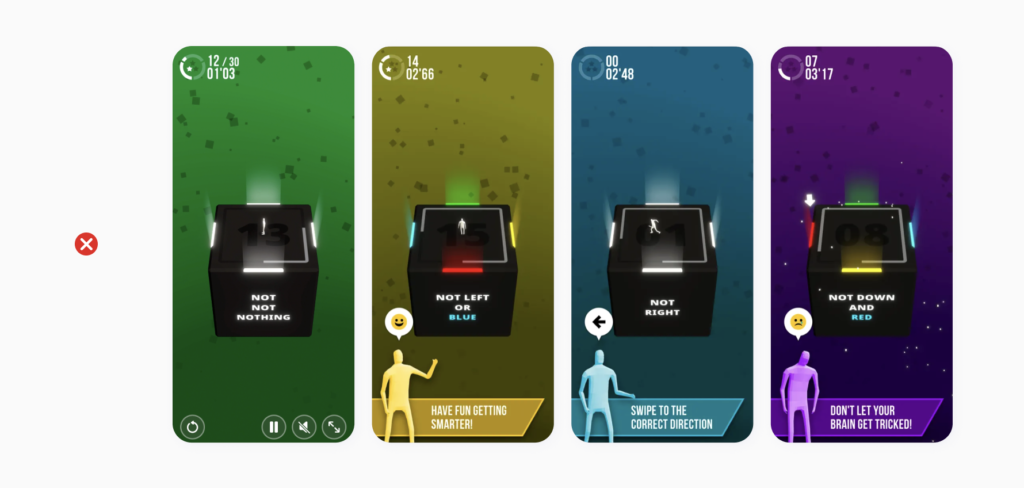
Also, almost every third app product page contained low quality screenshots: as they used clichéd stock photos, blurred elements, which also was of low contrast with each other and hurting users’ perception.
Though the above-mentioned factors can be potentially a deal breaker for conversions, it’s also important to note that without conducting proper A/B tests on a live audience. The target audience varies in behavior and perception across regions, stores, categories and apps, so we recommend that you always back up hypotheses from your marketing analysis with tests.
According to our data, the icon that clearly depicts the main app’s functionality can double the conversion rate, since it helps users associate the app with something they are looking for.
However, 31% of analyzed apps didn’t add expressive associative elements to their icons, and as a result it led to losing users’ attention.
We recommend researching your target audience interests, their expectations and the primary purpose of your app, as well as studying the icons of your direct competitors and app leaders in order to use the best market techniques and still stand out from the competition.

The app rating is one of the crucial factors impacting your app conversion rate. Users tend to download apps with a rating of at least 4 stars. From our experience, they also consider apps with a 3-star rating as a ‘potentially poor product’, and as a result it reduces the conversion rate almost twice. What also can be surprising is that they also think that apps with 5-star ratings are “too good to be true”. It’s also worth mentioning that the App Store team rarely considers apps rated below 4 stars to be featured.
Reviews are also a great source of information about user experience and satisfaction with your app. We recommend responding to all reviews that users leave, as it builds trust and loyalty of your both existing and new users.
ASO is very important, as by implementing it you can control your app’s visibility score to ensure your app gets discovered by your target audience, and also turn their views to downloads.
To maximize your ASO efforts, you should have a fresh look on your product’s page, fix the most common mistakes related to app’s metadata, visual assets and performance metrics. Moreover, you should remember that ASO is not a one-time action — it’s a continuous process, which involves continuous monitoring and improvement.
Success can be achieved only by constant research, iterative approach and hypotheses testing. Do not forget about additional features that you should try for your app to be more visible: launching IAE, creating in-app purchases, getting featured and running ASA.
If you want to outsource an ongoing ASO job to the Team with 8 years experience in mobile marketing and hundreds of optimized apps, SplitMetrics Agency is exactly the Team you’re looking for. They’ll help you get an increased number of conversions & installs, and bring your app to the top 5 in organic ranking with SplitMetrics Optimize platform.
