ASO — 2 Jun 2020
App Overview: DoorDash on the App Store & Google Play Store
 Anastasia Sidoryk
Delivery companies are gaining momentum due to the coronavirus outbreak. As people keep staying at home, they are more likely to purchase restaurant food delivery online. Unsurprisingly, as per the end of April 2020, the sales of meal delivery companies in the U.S. have almost doubled year-over-year.
DoorDash is one of the key industry players, offering door-to-door delivery in more than 4,000 cities across the US, Canada and Australia.
We’ve decided to look at its app on both stores and give an overview of each app page element to identify ASO best practices.
App Category: Food & Drink
These App Store product page elements contribute to the first impression and discoverability of your app.
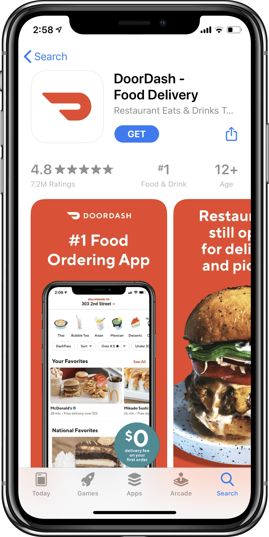
In addition to the very app title, the DoorDash’s app name communicates its key purpose – food delivery:
The App Store subtitle brings additional information in a compelling and catchy manner. Put together, the app name & subtitle fit into the 60 characters limit.
ASO best practice: Stick to the App Store product page requirements – the limit for an app name and a subtitle is 30 characters each.
Both app name and subtitle contain relevant keywords, which are functional and very popular too. As DoorDash is ranked #1 in the category, using such keywords is reasonable. But overall, Apple recommends finding a balance between ranking lower for popular terms and ranking higher for less common terms.
Moreover, DoorDash uses the available space wisely and doesn’t repeat keywords in the app name and subtitle. In fact, there’s no point in repeating, because Apple’s algorithm will only count them once.
ASO best practice: Don’t repeat keywords from the app name in the subtitle and vice versa. Use the available 60-character space to shape your message.
This core element represents your app even outside the App Store product page, in search and category pages.
DoorDash uses a non-functional icon with a “D” letter in it. Branded icons work the best for strong brands, for example, Google, Facebook, eBay, etc. DoorDash is a well-known food delivery company in the US, Canada and Australia. In April 2020, it earned 45% of the US consumers’ meal delivery sales.
As the brand is recognized in the area where it operates, they don’t need a functional icon depicting food.
ASO best practice: If you’re not a big international brand, opt for a functional App Store icon, which illustrates what your app is about.
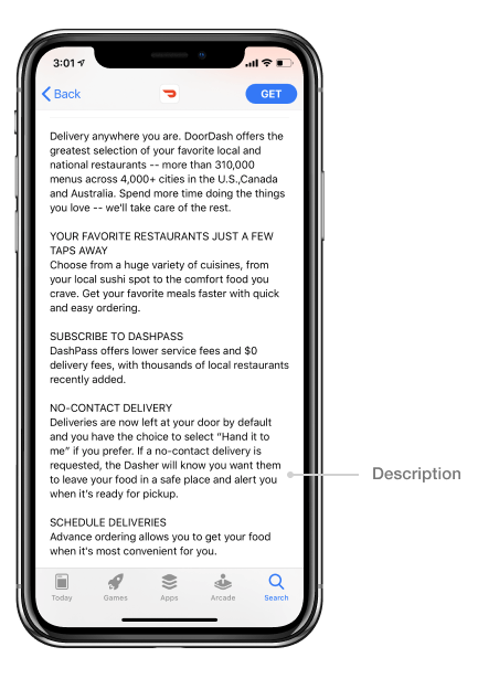
When it comes to theApp Store description, the first 3 lines count the most. DoorDash includes the most important information in the first sentence, and the user can see the number of the offered menus without expanding the description.
Our studies show that fewer than 2% of App Store users tap “more” to read the entire App Store description.
The extended version of the App Store description is well-formatted with big headings and all the information on the available selection of restaurants, the cities where the service is available, delivery and payment terms, etc. Moreover, DoorDash adapted its description to the pandemic context by mentioning no-contact delivery.
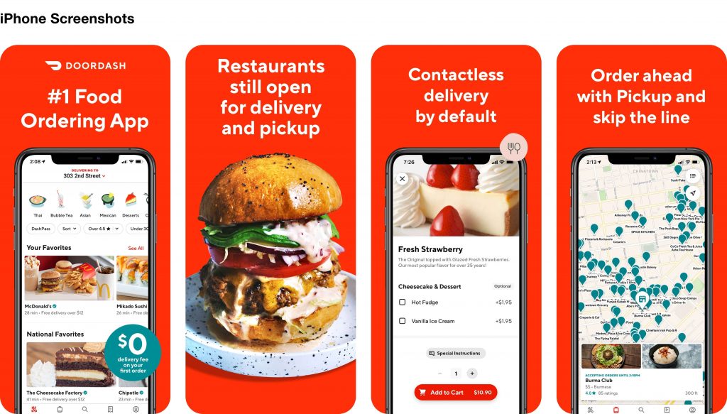
DoorDash leverages 6 out of 10 possible screenshots, using them in portrait mode. There’s no video in the image gallery, which may be reasonable for their category on the App Store.
Users can see two screenshots without scrolling the gallery. Moreover, our studies show that only 7-9% of users view the fourth screenshot.
ASO best practice: Focus on the first three App Store screenshots when optimizing your creatives. Use them wisely to deliver your app’s value, showcase core features and unique selling points.
Back to DoorDash, let’s look at their overall design.
For the food delivery business, red color is probably the best choice, as it prompts users to do the desired impulsive action – taping the “Get” button. White captions are easy-to-read as they are big and contrast with the red-colored background.
ASO best practice: Don’t use captions composed of more than 3 lines – users tend to avoid reading.
DoorDash sticks to the rule, except for the 2nd screenshot. It would be better to fit the same message into three lines.
In screenshot 1, they offer a 0% delivery fee on the first order. Our studies show that such messages are effective conversion boosters because users are attracted to sales, coupons, gifts, etc. However, the text on the green background is quite hard to read. If you use such a hack to improve your conversion, make sure that the text is visible to the audience.
ASO best practice: A viable way to raise your conversion rate is to use “a collection”, or the selection of whatever your app offers.
For example, for a fitness app, a collection may include an offering of exercises for different body parts.
In the first screenshot, DoorDash illustrates different types of restaurants available for the delivery – Thai, Asian, Mexican, etc. Making the collection more visible would probably increase their conversion rates.
Another thing worth mentioning about screenshot #1 is the logo and the company’s name at the top. As they have already been included in the App Store icon and the app name, skipping them in the screenshot would be reasonable.
ASO best practice: Screenshot 1 is the most visible of the image gallery. Use its valuable space for the most important messages about your app.
Screenshot 2 shows what users will get if they download and use the app – a tasty burger, for example. Experienced-based screenshots may as well demonstrate people using the app or people benefiting from what the app offers.
In this case, DoorDash could place a company or a couple enjoying the meal they ordered using the app. Will people with the app (or anything else) convert better for you? To figure it out for sure, you may want to A/B test App Store screenshots.
Screenshots 3-4 showcase the interface. Although it gives users an idea of what the app will look like, which is very good, it makes sense to focus their attention on particular features that might encourage them to tap “Get”.
ASO best practice: Use color, orientation or size to make your strongest features be in focus on screenshots. By highlighting them, you direct user attention to the areas that can generate the conversion uplift.
This technique is called visual salience. When users know what you want them to look at, they don’t make an effort, and the so-called processing fluency increases. Users have a sense of satisfaction and are more likely to download the app.
Explore our DoorDash on Google Play Store
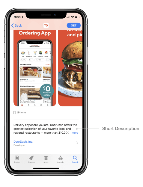
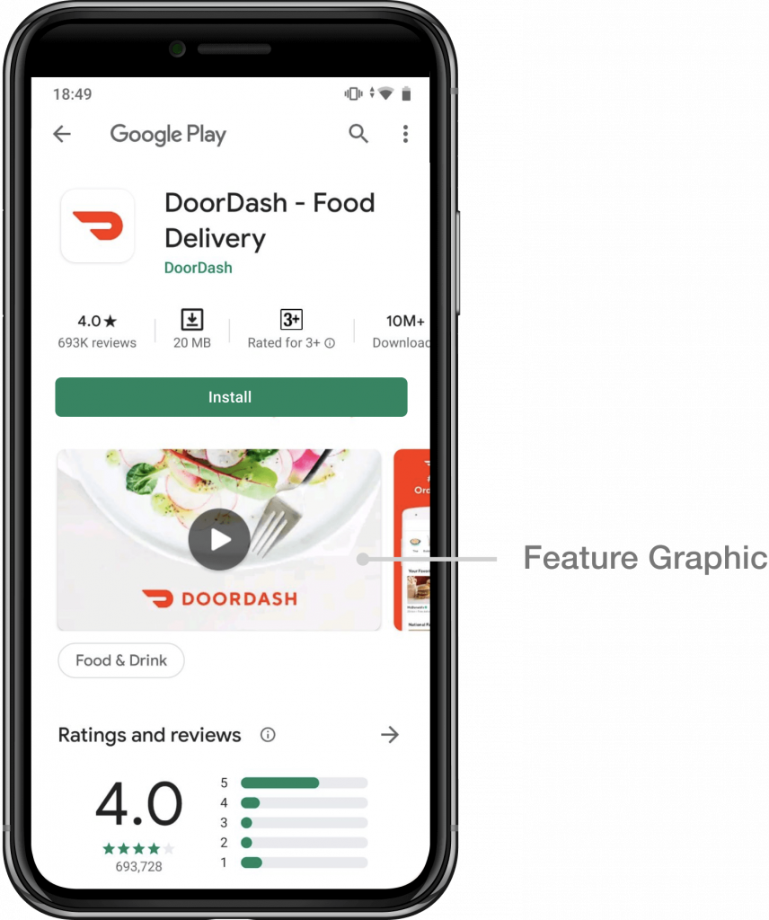
DoorDash on Play Store looks just like on Apple’s App Store, so all comments and suggestions regarding the app name, icon and description are relatable. This element on the Play Store listing page is slightly different. It contains a promotional message and a call to action, encouraging users to explore the app: “Get your favorite restaurants delivered straight to your door”. ASO best practice: In the Play Store short description, summarize your app’s essence and prompt users to give it a try. Fit the message into 80 characters as per Google’s Play Store requirements with the relevant keywords included. Feature graphic is basically a teaser image with a “Play” button on it, which is supposed to prompt users to watch the promo video. This is the first visual asset in the image gallery, and if it’s horizontal, users who don’t scroll the gallery further will see nothing but the feature graphic. So, it makes sense to use this important area wisely. On the Play Store, DoorDash decided to include a promo video, and their feature graphic is in horizontal mode. However, they decided to put a logo and a company name on it, which was already included in the icon, title and publisher’s name: ASO best practice: Instead of repeating a logo on the Play Store feature graphic, place social proof or reinforce the messaging through the caption. By doing this, you leverage the most visible area of your image gallery, which might boost your conversion rate. DoorDash’s promo video is 15 seconds long, which is the optimal duration: our research shows that users hardly ever watch videos for more than 10 seconds. This is relevant to both stores. Another finding of ours is that if the image gallery begins with a horizontal video, users are likely to make decisions based on the video, rather than on the screenshots going further. ASO best practice: Consider repeating the screenshot messaging and showcasing the app in the Play Store promo video, if it’s horizontal: after they’ve watched the video, users are unlikely to scroll further through screenshots. DoorDash sticks to this best practice and repeats the messages from screenshots in their promo video, in different order though. Hopefully, this overview and recommendations will come as helpful to you. However, what works for one app may not for the other. Before introducing changes to your real app pages in the stores, think about A/B testing your assets.Play Store Short Description
Play Store feature graphic
Promo Video
Boost conversion and installs with SplitMetrics A/B testingRequest Demo