App Store Optimization in 2024: Trends and ASO Benchmarks
 Lina Danilchik
  Lina Danilchik
 According to Statista, mobile app revenue in 2021 reached $693 billion (compared to $581.9 in 2020), and is projected to continue to grow.
With a new reality that reigned in 2021 and entailed the evolution of mobile marketing, understanding the latest trends in ASO and app industry benchmarks becomes more than a competitive advantage, but rather a necessity.
As the market evolves, app marketers have to quickly adjust and provide users and players with experience tailored to their specific needs and expectations. Keeping abreast of ASO trends and knowing what target users are looking for helps to make the best first impression. A/B testing and concept validation are becoming more important than ever and constitute a cornerstone for mobile app businesses.
We created ASO Benchmarks and Mobile Trends Report where we compiled together all insights and tips we generated during 2023 and analyzed more than 1000 A/B testing experiments run via the SplitMetrics platform. We’ve integrated these insights, along with mobile trends and benchmarks in the report where you will find:
In this article, we are going to share some findings and insights from the report. But first, let’s remember what App Store Optimization is about.
What is ASO? ASO (App Store Optimization) – is a continuous and complex process of optimizing
a mobile application to improve the visibility of a mobile application in the App Store
and Google Play stores and maximize the conversion from page views or application
cards in search to installs for all types of traffic sources.
This activity is intended to:
In general, mobile app optimization and optimized app listings help app publishers save marketing budgets as among all things ASO triggers free downloads. Every mobile app in the App Store has its own product page which contains the following elements for app optimization:
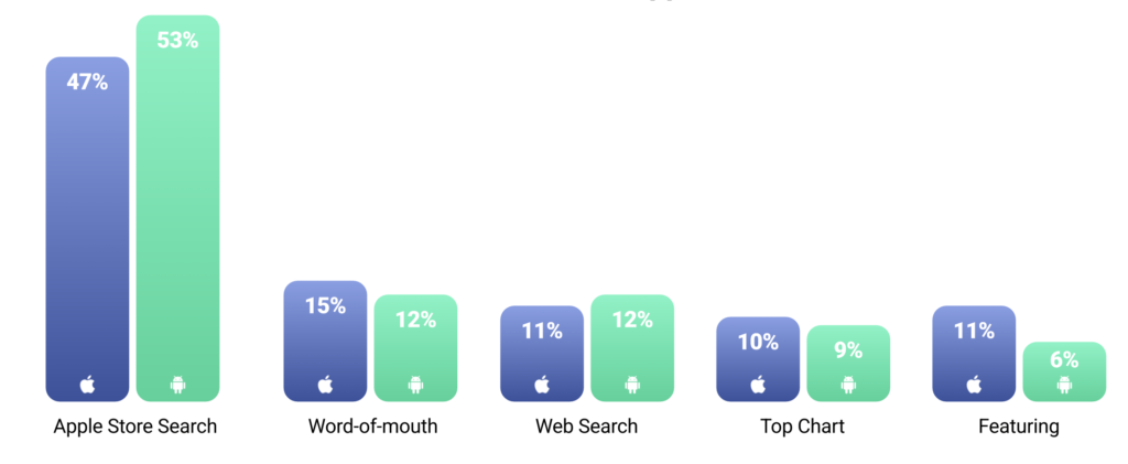
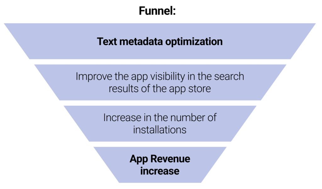
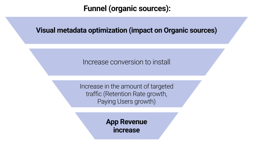
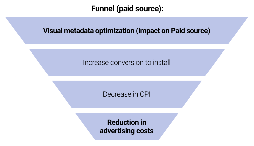
When you start integrating ASO into your app store marketing strategy, it’s important to remember that it consists of two key components:
Unfortunately, hundreds of publishers perceive ASO exclusively as a keyword optimization practice. Indeed, app store keywords are important for app’s discoverability, but the above mentioned approach is quite misleading. After all, nothing makes sense if people don’t install your app.
You should optimize not only metadata containing keywords but also such product page elements as screenshots, icons, video previews, etc. Eventually, these visuals may be deal breakers when it comes to making decisions about downloading your app.
Keywords should be relevant to your app and represent the sensible middle between difficulty and popularity (it’s no problem to increase difficulty and get more popularity after your app gets its first boost). You can find high-quality keywords researching top-ranking competitors’ apps, their titles and descriptions, mining reviews, analyzing related posts in social media, and working with an online thesaurus or a solution like Google Keyword Planner, Google Trends, Keyword Suggestions, Keyword Tool and other ASO tools & app store optimization services.
Make it unique, illustrative, and pronounceable, and add a couple of keywords for the app store search engine, considering the above-mentioned fact that the keywords in the title weigh the most. Mind that the same recommendations on app search optimization best practices apply to refining your app’s subtitle. However, don’t overdo!
If there’s a text that your users are most likely to read (at least first 252 characters of it), it’s the app’s description, so if you’ve got anything good to say about your app, say it in the description box. Keep the text short (no one usually goes beyond the “read more” button), list all the most important features and updates, and add a call to action and your app’s social media links. If you came up with several versions and can’t decide between them, use SplitMetrics A/B testing to see which one will be scrolled to the end and clicked on more often.
Make sure no information related to your app is missing and no information is excessive or irrelevant. In case of doubt, refer to App Store Review Guidelines or Google Play Store requirements.
A good icon pays off 100% and more, so keep it simple and let the graphics speak for you. Of course, there are quite a few specific points like color associations, background gradient, the intricacies of border use, and the choice of design elements. These can be determined with the help of A/B testing. SplitMetrics has a guide to app icon optimization where you can find the full list of the elements to check. Learn more in Guide to App Store Icons: Requirements, Best Practices and Tips
Create a story behind your app and tell it via screenshots. Add a short explanation text at the top or at the bottom to make your message clear. It’s advisable to utilize all screenshot slots but most users don’t tend to go past the second one.
App Store Optimization best practices: “Consider the type of device most users see your app on and resize your screenshots accordingly.”
Learn more about screenshot sizes, styles and ASO best practices in our Guide to App Store Screenshots.
The shorter the better. You literally have about 10 seconds to grip users’ attention, so highlight only the superior features of your app. Be careful, video app preview is one of the trickiest elements of the app page and should be tested first.
App Store Optimization best practices: “Don’t rely on voice-over – too many people will watch it with the sound off.”
Even if you offer a top quality product, people are not always lavish in their praise. If you ask your users to rate you at the right moment (e.g. at the end of a successfully completed mission) you’ll definitely come up with more positive reviews. The same way you can include an intermediary form for collecting feedback from the dissatisfied and thus reduce negative references.
App Store Optimization best practices: “Regular surveys and testing will help you identify the right moment and the right user to be asked for a review.
Let’s dig into three popular app categories that fuel the mobile industry growth: Health & Fitness, Simulation Games and Casino Games — and provide actionable tips on ASO and mobile creatives for each category.
1) Text metadata optimization:
2) Graphic metadata optimization:
What to optimize first? Users in the app stores make decisions very quickly: just 10 seconds – and a user taps on the download button or leaves your app store page. Poorly optimized app store pages are often the main reason for a low conversion rate and ad spend waste. So where to start optimizing the product page from? What element should be the first?
The rates below show the maximum average CVR uplift that can result from different app page elements, if optimized:
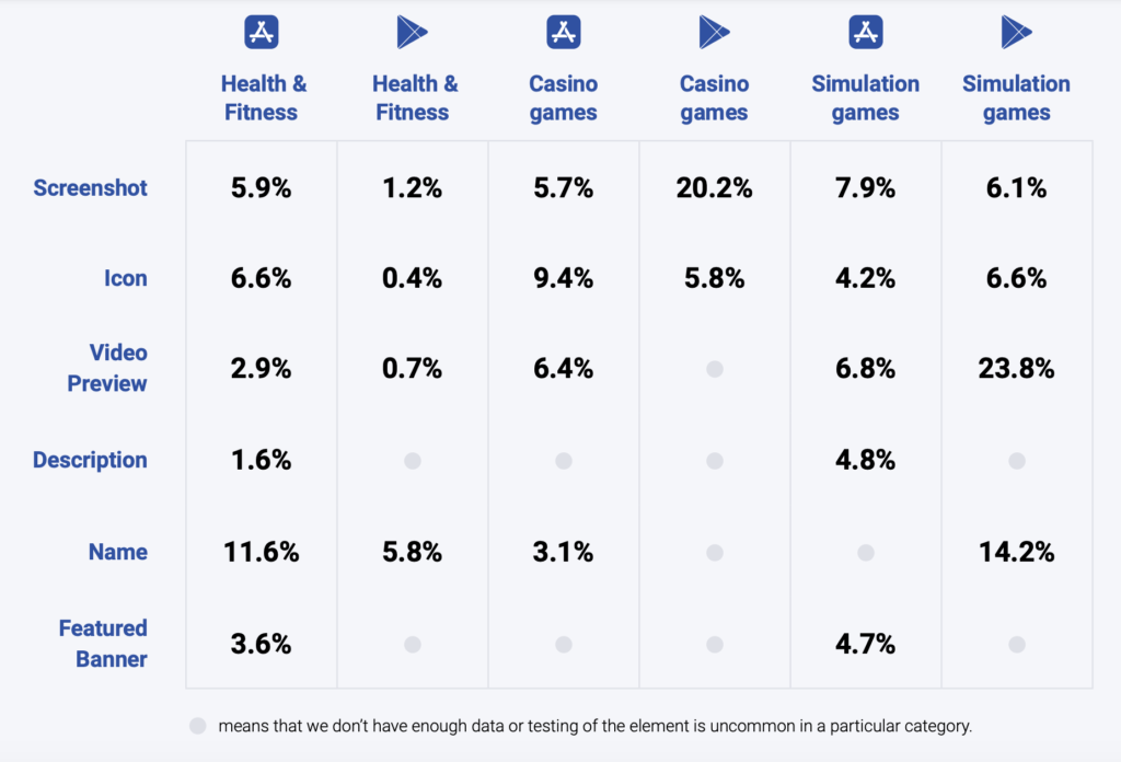
As you can see, screenshots are crucial for Casino games on Google Play, while for Simulation games, video preview is the determining factor when players decide whether to download a game or not. Health & Fitness apps, surprisingly, attract users more with their name than with the visuals.
Below you will find the benchmarks, or averages across the categories, which you can compare your metrics against to navigate the market better.
More ASO benchmarks for other categories you can find in ASO Benchmarks and Mobile Trends Report.

Let’s dig into some popular app categories that fuel the mobile industry growth and provide actionable tips on ASO and mobile creatives for each category.
Simulation games are one of the popular categories in mobile gaming.They replicate activities of real life, such as building cities, fishing, cooking or operating some businesses.
This is also one of the fastest growing mobile gaming genres. Sensor Tower revealed that player spending dedicated to simulation games increased by 61.8% year-over-year. Top 100 revenue-generating simulation games grossed $2 billion in 2020.
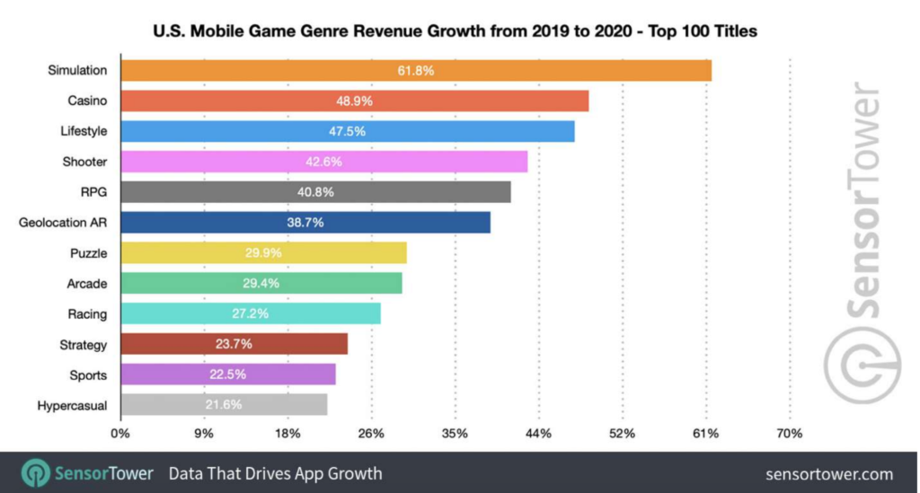
In their Q1 2021 Market Snapshot Report, GameRefinery indicated that the mobile games market in Q1 2021 looked very similar to Q4 2020 and revealed that simulation games stayed in top in the U.S.
The success of this mobile gaming genre might be due to uncertain times when people need a change of pace without leaving their home, enjoy simple things and plunge into the worlds where coronavirus doesn’t exist.
Statista predicts that this trend for simulation games will continue.
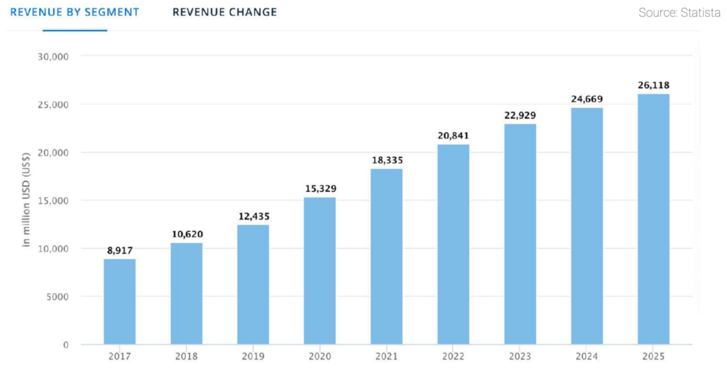
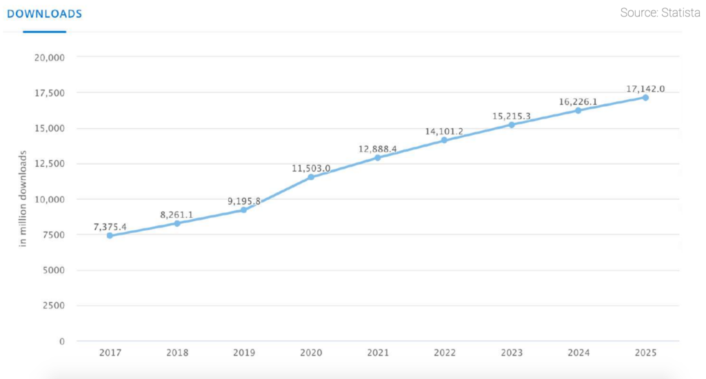
Udonis has shared recent data on user retention for simulation games. Let’s take a look at the day 1 retention statistics.
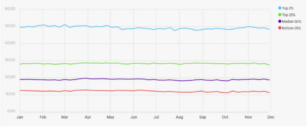
On the graph you can see that for the top 2% of simulation games, day 1 retention was between 47.81% in July and 51.06% in March. For the top 25% of simulation games, day 1 retention was even in November (27.66%) and in March (28.79%).
Day 1 retention for the simulation games that were in the median 50% category ranged from 18.25% in October to 19.76% in March. Bottom 25% of simulation games retained players at day 1 retention from 11.25% in October to 12.93% in March.
This KPI shows how many players return after 1 day of playing a simulation game.
Tip: Pay attention to day 1 retention to understand the first impression of players in regard to your game. If this indicator is too low, one of the reasons can be a dissonance between your app store creatives and the game itself.
2. Сharacters with mouth open, smile or grin and occupying the most part of the icon tend to show good performance. It’s better to avoid using many small elements.
3. Show the plot from the perspective of players. Simulate the players’ position on the icon
4. Try different orientation for objects on the icon. You may also place an object of a different size among objects of the same size, since size disparity is another stimuli that attracts the attention of users.
You can also try to adopt the top trends in your category (popular TV shows, series), but keep in mind that trendy images are time-limited.
5. Human brain distinguishes objects in sharp contrast to the other things surrounding them. Use bright colors & glare-free images.
6. Keep preparing for the holidays. Test creatives with holiday symbols and update your product page.

1. Variation with gameplay elements performs better. Try adding more gameplay elements to the screenshot.
It’s important to show the most important features that gain customer attention and display CTA in a bright color that catches the eye.
Test the hypothesis: use a character in different roles (princess/beggar), visualize character progress
Vertical screenshots perform better when games are aimed for horizontal use and vice versa.
2. Try to use captions in different colors, highlight one word that seems the most important, and describes the game feature.
3. CTA shown in different colors works great, 5 screenshots were more successful than 8 screens.
Screenshot gallery without video in the first position collects more installs than with video.
And total view rate (video + screenshot) on variation without video is higher (45% vs 32% in one of the experiments).
Tip: It makes sense to run an A/B experiment with/without video.
Use video to show gameplay. Focus more on bright color (blue)
With the above insights and recommendations, you have every chance to significantly increase the conversion rate and installs for your mobile game. However, before introducing any changes to your Google Play Store or App Store creatives, consider running an A/B test. Understand the behavior of users backed by our analytics to make informed ASO decisions.
To find more insights in other categories, download ASO Benchmarks and Mobile Trends Report. Inside you will also find the comments of industry leaders and get a view of the market trends along with a deeper understanding of your target audience. This can help you to make informed choices, starting from the choice of concepts to building the right strategy.
Download full report
